In their introduction to the previous issue of The Journal of Interactive Technology and Pedagogy, the editors wrote of the profound and ongoing loss they felt assembling a collection of essays as the global crisis of COVID-19 unfolded. We have built Issue 18 under these same circumstances. This issue is a testament to the efforts of the JITP editorial community and our authors, who continued to collaborate on pedagogy scholarship amid increased burden. Its contributors, reviewers, editors, and stagers have endured radical shifts in their work and family lives—especially true for those who are caregivers and members of marginalized communities—and have fielded the emotional, economic, and physical toll of the pandemic. To be mindful of our colleagues’ current realities and our own, and to try to mitigate the pandemic’s often inequitable impacts, we attempted to be flexible with deadlines and offer increased opportunities for feedback where we could. We balanced this commitment with retaining JITP’s editorial workflow and publication schedule, which aims to provide space for the needs of early-career scholars as both editors and authors.
While these articles in some cases represent several years of work, a number of them speak specifically to how our teaching responds to such immediate external pressures. The COVID-19 pandemic has resurfaced some long-standing tensions about the role of educational technologies in teaching and learning. Instructors may be forced to adopt proprietary platforms that come with troubling implications for data privacy. An increasingly shifting landscape drives us to learn these new technologies while anticipating the continual changes in data standards, provenance practices, and platform ubiquity and ownership that will require future time and effort. Since exciting new research and teaching methods require extensive training, instructors set out to extend their network of collaborators and provide supportive infrastructure to this challenge. Individual scholars continue to incorporate technological and data literacy into their classes, impelling students to experiment with analytical practices that vary with institutional context and intellectual tradition.
A number of the articles deal explicitly with questions of loss, recovery, and intervention. In “Reading Texts in Digital Environments: Applications of Translation Alignment for Classical Language Learning,” Chiara Palladino argues for the creative use of translation alignment technologies as a means of facilitating Classical language learning. Classical studies requires that scholars attempt to synthesize information themselves without the benefit of consulting native speakers, and so Palladino offers translation pedagogy involving the comparison of multiple sources as a unique way of teaching slow, methodical information processing, a skill set particularly relevant to our present moment of information saturation. Palladino discusses a series of digital tools and assignments from her own course that, together, carry the pedagogical lesson that all reading is a reflective process. The translation process she describes does not establish one-to-one equivalences, but, rather, requires students to consider the “continuous dialogue between cultural and linguistic systems.”
In “Back in a Flash: Critical Making Pedagogies to Counter Technological Obsolescence,” Sarah Whitcomb Laiola seeks a similar remedy in the face of software expiration. As 2020 ends, so too does Adobe’s support of Flash, a medium in which e-lit has thrived. An NEH-funded project, AfterFlash, offers some balm to the loss, preserving access to texts born digitally in Flash and Shockwave, but it fails to preserve a means for generating them, and such generation, Laiola argues, is essential to student understanding of the texts themselves. She shares her experimentation to simulate that creative process, specifically investigating Stepworks as a classroom alternative, but also suggesting a path forward as one technology inevitably gives way to another. Preservation, after all, isn’t about rescuing only artifacts, but also the processes and pedagogies those artifacts enable.
Courtney Jacobs, Marcia McIntosh, and Kevin M. O’Sullivan are on a rescue mission of their own to collect and provide access to models of the printmaking tools of the past. In “Make Ready: Fabricating a Bibliographic Community,” they share their experiences creating 3Dhotbed, a repository of 3D-printable models, to investigate book production and printmaking. For scholars of book history, the files themselves can enable the critical hands-on work that has informed the discipline for nearly seventy years. The collection, though, is greater than the sum of its replicated parts. As the authors put it, “The future success of 3Dhotbed is not solely based on the volume, diversity, or rarity of individual items, but also on the ability of the platform to put these items in conversation.” Jacobs, McIntosh, and O’Sullivan’s work is meaningful to those outside their fields as well. In constructing 3Dhotbed, they have identified pitfalls and opportunities in navigating institutional partnerships, striking the balance between academic protocols and broader access, and continuing to expand the field beyond the Global North.
In “Using Wikipedia in the Composition Classroom and Beyond: Encyclopedic ‘Neutrality,’ Social Inequality, and Failure as Subversion,” Cherrie Kwok explores a different kind of loss—the damaging effects that can occur when attempts at neutrality gloss over difficult truths. Kwok invites instructors and students alike to leverage the power of failure to explore the very nature of language. Like others in her field, Kwok notes that Wikipedia can serve as a tool for teaching tight writing and edit-a-thons can generate deep student investment in intervening in the cultural record. But Kwok sees even greater value in what her students learn as they try to achieve Wikipedia’s second foundational principle of writing articles “from a neutral point of view.” They learn that language is not neutral and our attempts to make it seem so only cloak the systematic biases and issues of positionality.
As much of this issue makes clear, the people engaged in digital-pedagogy teaching and research provide essential infrastructure for this work. In “Interdisciplinarity and Teamwork in Virtual Reality Design,” Ole Molvig and Bobby Bodenheimer describe the evolution in logistics and pedagogy of a course they taught, Virtual Reality Design, at Vanderbilt University. In particular, they note that the interdisciplinary and collaborative requirements of their team-based course gave rise to a community of like-minded researchers over time. Regarding a growing demand for support of data visualization, Negeen Aghassibake, Justin Joque, and Matthew L. Sisk offer a different approach to cultivating such interdisciplinary collaboration: leveraging the library. In “Supporting Data Visualization Services in Academic Libraries,” the authors identify a host of factors that can lead to more successful support of responsible data visualization and the fundamental literacies that underpin it. Data visualization, they note, is not just about products, but about the scholarly processes that require well-aimed questions, research, data and data management, ethical practices, and design—in addition to software and hardware decisions.
The articles in our Forum on Data and Computational Pedagogy attend to how these concerns arise in the classroom when using computational methods to teach processes of data collection, transformation, and presentation. In our call for papers, we asked submitters to address the challenges and opportunities that arise when teaching with data and promoting data literacy. We were especially interested in how students and instructors grappled with issues of power and agency when acting as “data users” (Gonzalez and DeVoss 2016). The authors of the articles in this Forum span academic job roles and work in a wide variety of institutional contexts that inform their data pedagogy. What coheres their contributions is a humanistic approach to data analysis—one that understands working with data as an exploratory and iterative analytical process of regularization, and which foregrounds data’s context-embeddedness and malleability. As Katie Rawson and Trevor Muñoz (2016) remind us, this feature of data is too often obscured when we think about data “cleaning” as its preparation for scholarly work rather than recognizing “messiness” as an integral part of the work itself. By recognizing the analytical agency we have to remediate data, we may develop the commitment to using data-driven methods for justice, resisting the potential of data analysis’s associations with correctness and order to propagate bias and do harm (D’Ignazio and Klein 2020).
In “Ethnographies of Datasets: Teaching Critical Data Analysis through R Notebooks,” Lindsay Poirier writes on how her students confront datasets as cultural objects in an undergraduate course called Data Sense and Exploration at the University of California, Davis. Here, she draws from cultural anthropology’s experimental ethnography to guide students through a series of weekly lab assignments in which students record field notes while performing analysis of dataframes in R. Each of these labs invokes a concept: routines and rituals, semantics, classifications, calculations and narrative, chrono-politics, and geo-politics. She characterizes her students’ work with data as “ethnography” because of “their consistent, hands-on engagement with the data” and the opportunity it provides for “reflections on their own positionality.” This approach encourages students to see themselves as “critical data practitioners” who can account for, as well as critique, the “incompleteness, inconsistencies and biases” of publicly available data.
In “Thinking Through Data in the Humanities and in Engineering,” Elizabeth Alice Honig, Deb Niemeier, Christian F. Cloke, and Quint Gregory assess how students in two disparate fields engage with data’s embedded context. The authors describe an interdisciplinary effort at the University of Maryland, College Park, to teach the same historical network dataset to students in art history and engineering, as each group of students brought their entrenched disciplinary assumptions about data analysis and visualization to the same assignments. While the authors’ engineering students tended to value consistent design conventions in an approach framed by a pre-set analytical objective, their art history students tended to want to bring insights from visualization back to the dataset. On the flip side, the engineering students were less likely to incorporate context and “texture” in their visualizations, while the art history students tended to be less adept at properly labeling their graphs or ensuring their visualizations made effective communication choices. From the authors’ exploratory study, they conclude that emphases on digital training within humanities courses and project-based learning in engineering courses may not be enough alone for students to overcome these tendencies, and that additional formal training may be required.
In “Numbering Ulysses: Digital Humanities, Reductivism, and Undergraduate Research,” Erik Simpson describes the pedagogical implications of humanities data creation for Ashplant, a collaborative digital project developed in conjunction with Grinnell College students. As the students worked to describe James Joyce’s Ulysses in tabular form for presentation online, they were forced to reckon with the frustrations posed by data entry involving complex humanities materials. In the process, students found their digital humanities work placed in dialogue with analog methods of analyzing Ulysses, which already used numerical and hierarchical systems of classification. The piece closes by building on these pedagogical lessons to suggest a series of ways that undergraduate research might engage with the “creativity, resistance, and questioning” of digital work.
In “Data Fail: Teaching Data Literacy with African Diaspora Digital Humanities,” Jennifer Mahoney, Roopika Risam, and Hibba Nassereddine reflect, too, on the frustrations and failures of a data curation and visualization project. Situating their work within scholarship on Black Digital Humanities, they articulate the difficulty of reconciling “fragments of information” when trying to avoid reproducing or amplifying gaps in the archives they used for research. Having set out to plot networks of participation in Pan-Africanist intellectual and social movements, the authors describe the “virtually meaningless” initial results that revealed some flawed assumptions of their project’s methodology. Their writing, however, exceeds mere process narrative by reflecting on this realization’s implications for their own and others’ projects—their non-result, it turns out, provided an opportunity to reappraise their methods and identify the aspects of their dataset the methods didn’t capture. Moreover, as secondary-education teachers and students, the authors argue that high school students might have similar data epiphanies were such digital humanities projects featured in high school English language arts curricula, using students’ development of data literacy to promote inclusivity by way of representation and equity in the cultural record.
“Data Literacy in Media Studies: Strategies for Collaborative Teaching of Critical Data Analysis and Visualization” addresses intra-institutional partnerships between librarians and faculty to support teaching critical data literacy. In this article, Andrew Battista, Katherine Boss, and Marybeth McCartin provide a template they use to encourage a variety of instructors to teach visualization instruction sessions each term. The model distributes the labor of teaching across a set of collaborators and supports the professional development of these instructors as they create shared and reproducible pedagogical materials. The program they describe is one that is ultimately more sustainable and “has a broad and demonstrated impact on student learning, strengthens ties between the library and the departments we serve, and allows librarians and data services specialists the opportunity to learn and grow from each other.” While directed toward teaching librarians, the piece also proves useful for faculty considering library partnerships to enrich the data or information literacy offerings of their programs.
Like teaching, this issue results from the work of many hands. The editors would like to thank every member of JITP’s editorial board who contributed energy to its publication under such difficult circumstances. An issue of this size required an especially large number of reviewers, and the editors deeply appreciate their willingness to entertain the unexpected requests. And, of course, we are grateful to all the authors who shared their work with us for consideration. Future issues of JITP will, undoubtedly, share work specific to the particular pedagogies of the pandemic itself. Nonetheless, we hope that this collection of essays will encourage reflection on how our teaching has always been called upon to respond to changing circumstances and must continue to do so. What we need, especially now, is more teachers sharing what works and what doesn’t, more authors responding to change as they see it happening in their work, and more voices calling out for change where it is not yet happening.
Bibliography
D’Ignazio, Catherine, and Lauren F. Klein. 2020. Data Feminism. Cambridge: The MIT Press.
Gonzales, Lauren and Dànielle Nicole DeVoss. 2016. “Digging into Data: Professional Writers as Data Users.” In Writing in an Age of Surveillance, Privacy, and Net Neutrality, edited by Cheryl E. Ball, special issue, Kairos: A Journal of Rhetoric, Technology, and Pedagogy 20, no. 2 (Spring). http://technorhetoric.net/20.2/topoi/beck-et-al/gon_devo.html.
Kelly Hammond has focused on the intersection of humanities and technology in the classroom for over twenty years. She is currently the Director of Digital Pedagogy at the Chapin School in New York City. She is also pursuing her master’s degree in Digital Humanities at the City University of New York’s Graduate Center, and she serves on the editorial collective of The Journal of Interactive Technology and Pedagogy. Kelly is particularly interested in building online communities to facilitate dialogue and collaboration within the small but growing number of DH practitioners in K–12 environments. She is developing and testing the efficacy of micro-pd—tiny and targeted professional development to help faculty grow, even in times of crisis. She’s also a budding writer. Her fiction has appeared in online journals such as drafthorse and earned an Editor’s Prize from the Chautauqua Journal.
Gregory J. Palermo is a PhD candidate in English at Northeastern University. His research and teaching focus on the metaphors for disciplinary knowledge that structure digital methods used for plotting academic fields. His dissertation argues that citation analysis can be a tactical means of bringing together work from disparate traditions and promoting equity in scholarly publishing. His pedagogy foregrounds the implications of borrowing methods, rhetorical choices with data, and how algorithmic processes increasingly used for pattern-seeking analysis and surveillance can be useful for remix, intervention, and resistance. He has been a Research Associate and Project Manager for the Digital Scholarship Group in Northeastern University Library, a Graduate Fellow of the NULab for Texts, Maps, and Networks, and a co-instructor at the Digital Humanities Summer Institute (DHSI). His work has appeared in the Journal of Writing Analytics and Digital Humanities Quarterly (DHQ). He has been a managing editor of DHQ and now serves as an editor of The Journal of Interactive Technology and Pedagogy.
Brandon Walsh is Head of Student Programs in the Scholars’ Lab in the University of Virginia Library. Prior to that, he was Visiting Assistant Professor of English and Mellon Digital Humanities Fellow in the Washington and Lee University Library. He received his PhD and MA from the Department of English at the University of Virginia, where he also held fellowships in the Scholars’ Lab and acted as Project Manager of NINES. His dissertation examined modern and contemporary literature and culture through the lenses of sound studies and digital humanities, and these days he works primarily at the intersections of digital pedagogy and digital humanities. He serves on the editorial boards of The Programming Historian and The Journal of Interactive Technology and Pedagogy. He is a regular instructor at HILT, and he has work published or forthcoming with Programming Historian, Insights, the Digital Library Pedagogy Cookbook, Pedagogy, Digital Pedagogy in the Humanities, and Digital Scholarship in the Humanities, among others.
Issue Editors
Kelly Hammond
Gregory J. Palermo
Brandon Walsh
Managing Editor
Patrick DeDauw
Copyeditors
Param Ajmera
Elizabeth Alsop
Patrick DeDauw
Jojo Karlin
Benjamin Miller
Angel David Nieves
Nicole Zeftel
Dominique Zino
Staging Editors
Danica Savonick
Patrick DeDauw
Laura Wildemann Kane
Anna Alexis Larsson
Krystyna Michael
Teresa Ober
sava saheli singh
Inés Vañó García
Luke Waltzer
This essay examines the authors’ experiences working collaboratively on Power Players of Pan-Africanism, a data curation and data visualization project undertaken as a directed study with undergraduate students at Salem State University. It argues that data-driven approaches to African diaspora digital humanities, while beset by challenges, promote both data literacy and an equity lens for evaluating data. Addressing the difficulties of undertaking African diaspora digital humanities scholarship, the authors discuss their research process, which focused on using archival and secondary sources to create a data set and designing data visualizations. They emphasize challenges of doing this work: from gaps and omissions in the archives of the Pan-Africanism social movement to the importance of situated data to the realization that the original premises of the project were flawed and required pivoting to ask new questions of the data. From the trials and tribulations—or data fails—they encountered, the authors assess the value of the project for promoting data literacy and equity in the cultural record in the context of high school curricula. As such, they propose that projects in African diaspora digital humanities that focus on data offer teachers the possibility of engaging reluctant students in data literacy while simultaneously encouraging students to develop an ethical lens for interpreting data beyond the classroom.
What can data visualization tell us about the scope and spread of Pan-Africanism during the first half of the 20th century, and what insights does undertaking this research offer for teaching data literacy? These questions were at the heart of a directed study during the 2019–2020 academic year, where we, a professor (Roopika Risam) and two students (initially Jennifer Mahoney in Fall 2019, with Hibba Nassereddine joining in Spring 2020), examined the utility of data visualization for African diaspora digital humanities and its possibilities for cultivating students’ interest in and knowledge of data-driven research. Part of Mahoney’s participation in Salem State University’s Digital Scholars Program, which introduces students to humanities research using computational research methods, the directed study offered her the experience of undertaking interdisciplinary independent research (a rare opportunity in the humanities at Salem State University), an introduction to working with data and data visualization, and the opportunity to broaden her knowledge of African diaspora literature and history. While the process of undertaking this research included many twists and turns and, ultimately, did not yield the insights we had anticipated, it opened up new areas of inquiry for computational approaches to the African diaspora, critical insights about the value of introducing students to African diaspora digital humanities, and the pedagogical imperatives of data literacy. As we propose, data projects on the African diaspora offer the possibility of both introducing students to important stories and voices that are often underrepresented in curricula and to the ethics of working with data in the context of communities that have been dehumanized and oppressed by unethical uses of data.
The State of Data in African Diaspora Digital Humanities
In recent years, Black Digital Humanities has grown tremendously in scope. The African American Digital Humanities (AADHum) Initiative at the University of Maryland, College Park, led initially by Catherine Knight Steele and now by Marisa Parham, and the Center for Black Digital Research at Penn State, led by P. Gabrielle Foreman, Shirley Moody-Turner, and Jim Casey, attest to increased institutional investment in digital approaches to Black culture. An extensive list of projects, created by the Colored Conventions Project, demonstrates the variety of methodologies, histories, and voices being explored through Black Digital Humanities scholarship. Since Kim Gallon outlined the case for Black Digital Humanities in her essay in the 2016 volume of the Debates in the Digital Humanities series, she has, indeed, “set in motion a discussion of the black digital humanities by drawing attention to the ‘technology of recovery’ that undergirds black digital scholarship, showing how it fills the apertures between Black studies and digital humanities” (Gallon 2016, 42–43). Black Digital Humanities is, as scholars like Gallon (2016), Parham (2019), Safiya Umoja Noble (2019), and others propose, fundamentally transnational. An emphasis on the African diaspora has, thus, become an essential dimension of Black Digital Humanities. The Digital Black Atlantic (University of Minnesota Press, 2021), which Risam co-edited with Kelly Baker Josephs for the Debates in the Digital Humanities series, will be the first volume to articulate the scope and span of African diaspora digital humanities as a multidisciplinary, transnational assemblage of diverse scholarly practices spanning a range of disciplines (e.g., literary studies, history, library and information science, musicology) and methodologies (e.g., community archives, library collection development, textual analysis, network analysis).
African diaspora digital humanities, we contend, offers students opportunities to engage in active learning through participation in civically engaged scholarship. Such forms of authentic learning are “participatory, experimental, and carefully contextualized via real-world applications, situations, or problems” (Hancock et al. 2010, 38). They draw on scholarship that supports deep learning through the experiences of actively constructing knowledge (Downing et al. 2009; Ramsden 2003; Vanhorn et al. 2019). In the context of digital humanities, as Tanya Clement (2012), suggests, “Project-based learning in digital humanities demonstrates that when students learn how to study digital media, they are learning how to study knowledge production as it is represented in symbolic constructs that circulate within information systems that are themselves a form of knowledge production” (366). As Risam (2018) has argued, undertaking this work in the context of postcolonial and diaspora studies “empowers students to not only understand but also intervene in the gaps and silences that persist in the digital cultural record” (89–90). As projects like Amy E. Earhart and Toniesha L. Taylor’s White Violence, Black Resistance demonstrate, authentic learning through research-based projects in African diaspora studies “teach recovery, research, and digitization skills while expanding the digital canon” (Earhart and Taylor 2016, 252). Such projects allow undergraduate students to develop both digital and data literacy skills, which are often only implicitly taught in undergraduate courses, particularly in the humanities (Carlson et al. 2015; Battershill and Ross 2017; Anthonysamy 2020).
Approaches to the African diaspora that foreground working with data have shown particular promise as the technologies of recovery for which Gallon advocates. The Transatlantic Slave Trade Database, which aggregates data from slave ship records, was first conceived in the early 1990s by David Eltis, David Richardson, and Stephen Behrendt, researchers who were compiling data on enslavement and decided to join forces. Over the decades, the team and database expanded to include 36,000 voyages. The Transatlantic Slave Trade Database is now partnering with other projects on enslavement through Michigan State University’s Enslaved project, which is working to develop interoperable linked open data between these various databases. Projects like In the Same Boats, directed by Kaiama L. Glover and Alex Gil, with contributions from a team of scholars of the African diaspora (including Risam), demonstrate the value of a transnational, data-driven approach to more recent facets of African diasporic culture. The directors compiled data sets from their partners identifying the locations where Black writers and artists found themselves throughout the twentieth century and created data visualizations that show their intersections. While co-location of these figures at a given time does not necessarily mean they met, the project opens up new research questions about relationships and collaborations between them. The possibility of creating new avenues of transnational research is, perhaps, the most critical contribution of African diaspora digital humanities projects that focus on data.
But working with data in the context of the African diaspora is not an unambiguous proposition. Writing about the Transatlantic Slave Trade Database in her essay “Markup Bodies,” Jessica Marie Johnson argues, “Metrics in minutiae neither lanced historical trauma nor bridged the gap between the past itself and the search for redress” (2018, 62). In Dark Matters, Simone Brown notes that data has played a role in racialized surveillance from transatlantic slavery to the present and has been complicit with social control (2015, 16). COVID Black, a task force on Black health and data, directed by Kim Gallon, Faithe Day, and Nishani Frazier, along with a team, addresses racial disparities from the COVID-19 pandemic through data. Recognizing and addressing these issues is critical for African diaspora digital humanities projects that focus on data, particularly when working with undergraduate humanities students because of the twin challenges of students’ general lack of exposure to African diaspora studies and to data literacy in curricula.
Understanding Data through the Lens of Pan-Africanism
All of these issues came together in our project, Power Players of Pan-Africanism, which collects data on and develops data visualizations of attendees of Pan-Africanist gatherings from 1900 to 1959. Pan-Africanism, a social movement of great significance during the 20th century, fostered a sense of solidarity and political organization between people in Africa and African-descended people around the world. The timeframe encompasses the First Pan-African Conference in 1900, Pan-African Congresses held between 1919 and 1945, the Bandung Conference held in 1955, the Congresses of Black Writers and Artists in 1956 and 1959, the Afro-Asian Writers’ Conference in 1958, and assorted events during this time period that created space for people of Africa and its diaspora to meet and discuss their common political, social, and economic concerns. We chose to include events including Afro-Asian connections as well because they offered opportunities for Pan-Africanist connections in the broader context of Afro-Asian solidarity. Additionally, we ended in 1959 because 1960—widely known as the “Year of Africa”—saw the successes of decolonization movements in Africa and significantly changed the stakes of the conversation among Pan-Africanists.
While the idea for Power Players of Pan-Africanism emerged as a side project from Risam’s work on The Global Du Bois, a data visualization project that explores how computational data-driven research challenges, complicates, and assists with how we understand W.E.B. Du Bois’s role as a global actor in anticolonial struggles, and from her contribution of the Du Bois data set to Glover and Gil’s In the Same Boats, this project was undertaken as a collaboration between Risam and Mahoney, who together designed a plan for research, data collection and curation, and data modeling. We were joined in the Spring 2020 semester by Hibba Nassereddine, another student in the Digital Scholars Program, who collaborated with us on research for the data set, the iterative process of designing research questions based on the data, and prototyping of data visualizations.
The first challenge we encountered is that Pan-Africanism is largely unexamined within both high school and college curricula in the US. Despite its significance for understanding anti-colonial and anti-racist movements in the US and abroad, Pan-Africanism is a topic that goes largely unexplored in the classroom. However, its emphasis on global cooperation between Africa and its diaspora is poised to open up significant insights on the African diaspora, global history, political science, and literary studies, among others. The thriving network of intellectuals, artists, writers, and politicians who participated in Pan-Africanist movements reveals rich global connections and world travel that brought Black people of the US, Caribbean, Europe, and Africa into communication and collaboration during the first half of the 20th century. Thus, Mahoney, and later Nassereddine, first had to learn about an entirely new area of study in preparation for their participation in this project.
Data literacy is also a sorely missing part of curricula in high schools and colleges in the US. Therefore, both Mahoney and Nassereddine had to learn about working with data as well. We focused on the concept that data is situated, an idea that Jill Walker Rettberg has articulated (Rettberg 2020; Risam 2020). Data is not, as many think, objective and neutral but is a factor of how it is collected—who is collecting it, what terms are they using, what are their biases—and how it is represented—what choices are being made in data visualization and how does that affect how data is interpreted and received by audiences. We examined principles of data visualization, influenced by the work of Edward Tufte, Alberto Cairo, and Isabel Mereilles, to consider how data visualization risks misrepresenting or skewing data. Thus, to be prepared to undertake the project, Mahoney, and later Nassereddine, needed a firm grounding in data literacy and data ethics, which they had not received elsewhere in their education.
Recognizing the challenges of working with data in the context of the African diaspora, Risam and Mahoney set out to identify connections between attendees at Pan-Africanist events. By identifying conferences and other events that created space for Pan-Africanists to meet, we believed we could bring to life a data set that would reveal connections between figures in Pan-Africanist networks. Would network analysis reveal new key figures beyond names like Du Bois, George Padmore, Kwame Nkrumah, Marcus Garvey, Jomo Kenyatta, and Léopold Sédar Senghor?
Right away, we encountered another issue: the lack of readily available data sets for this work. The absence was not particularly surprising, as it reflects historical and ongoing marginalization of scholarship on the African diaspora more generally and Pan-Africanism specifically within academic knowledge production and archives. As Risam (2018) argues, the lack of preservation and digitization of material related to communities within the African diaspora and in the Global South is a major deterrent to undertaking digital humanities projects. Therefore, research to create a data set was a necessary precursor to data visualization.
This process turned out to be a lot more difficult than expected. We spent months digging into the history of Pan-Africanism, using monographs, journal articles, digital archives, theses and dissertations, historic Black newspapers, organization newsletters, and primary source documents from the events, such as published pamphlets listing attendees and photographs with captions to identify events where Pan-Africanism was an important focus and uncover names of delegates and other participants. Explicitly named “Pan-African” events (First Pan-African Conference, First Pan-African Congress, Second Pan-African Congress, etc.) were the easiest to identify. However, Pan-Africanist conferences went by many other names: writers’ conferences, peace conferences, and anti-colonial conferences. Furthermore, a single event often appears under multiple names, a factor of the relative lack of attention Pan-Africanism has received in academic discourse. In these cases, we labeled events by the names with which they most commonly appear in academic and archival sources. For example, we identify one event as the “All-African People’s Conference,” held in Accra, Ghana in December 1958 based on corroboration of sources, but this event is also referred to as the “Congress of African Peoples” (Adi and Sherwood 2003). Even more confusingly, Immanuel Geiss’s The Pan-African Movement (1974), arguably the first scholarly treatment of Pan-Africanism, refers to the All-African People’s Conference as the “Sixth Pan-African Congress,” while the Sixth Pan-African Congress typically refers to an event held in Dar es Salaam, Tanzania in 1974 in the lineage of earlier Pan-African Congresses but in a different mode given the acceleration of decolonization from 1960 on. Some events were also unnamed. In one such case, we learned that West-African activist, editor, and teacher, Garan Kouyauté held an event in Paris in 1934, and we internally referred to this as “Kouyauté’s Event.” While we kept running into Kouyauté’s name in other sources, we were unable to find substantially more information about that particular event. This became a common theme in our research, where individuals clearly played important roles in the Pan-African movement but do not commonly appear among the most cited figures in scholarship on Pan-Africanist thought. These omissions suggest that there is still much more research on Pan-Africanism that needs to be done, but their inclusion in our data set offers researchers new names of figures whose influence on Pan-Africanism should be pursued.
Despite this challenge, the research process often delivered moments of validation, when the simple act of locating multiple obscure sources confirming an event made us grateful that we could prove that it happened. Therefore, the work of creating the data set was itself a scholarly activity, using both primary and secondary sources to validate the existence of lesser-known Pan-Africanist gatherings that deserve better recognition. For example, in The Pan-African Movement (1974), Geiss introduces an event called, “The Negro in the World Today.” Harold Moody, a Jamaican-born physician residing in London, hosted said event in July 1934 to coincide with a visit from a Gold Coast delegation, including prince and politician Nana Ofori Atta. Geiss explains, “One of the motives given for convening was the racial discrimination which faced coloured workers and students in Britain” (1974, 357). This event, among others, led to the Fifth Pan-African Congress in October 1945 in Manchester, England. However, finding any details of who attended “The Negro in the World Today” proved fruitless, and we almost started to question if this event was significant enough to be included in the data set. A bright moment in our research occurred when we found the event named in a newspaper article titled, “Africans Hold Important Three-Day Conference in London” in the July 21, 1934 issue of The Pittsburgh Courier (ANP 1934, 2). Confirming the existence of this event was celebratory, and these exuberant moments made many excruciating hours of research where we turned up nothing worth it. All told, we identified close to seventy events within our timeframe that fit our criteria of explicitly creating space for Pan-African connections among Black participants from around the world.
More obstacles appeared as we worked to identify the names of delegates and other participants in these events. In some cases, sources only identify the names of organizations being represented and did not include the names of people from the organization who were in attendance. Often, we had much more success identifying the numbers of delegates and attendees at events than locating their names. Knowing the numbers, however, gave us a sense of the percentage of attendee names that we had confirmed. For example, we know that there were over 200 delegates and 5,000 participants at the Fourth Pan-African Congress, held in New York in 1927, but we have only successfully identified twenty-six of those names. In our most successful case, the Conference on Africa, held in New York in 1944, we identified names of all 112 delegates, as well as additional participants and observers.
Among the many names that we added to our data set, we encountered further discrepancies we had to address. Some of the same participants were listed under different names in multiple sources, requiring additional research to verify. In some cases, this was a matter of typos within the sources. For example, a participant named “William Fonaine” attended the First International Conference of Negro Writers and Artists, and a participant named “W. F. Fontaine” attended the Second International Conference of Negro Writers and Artists. We were able to confirm that William F. Fontaine attended both events. In other cases, delegates had changed their names, which was not unusual at the time. In some instances, people changed their names to embrace their African roots and resist the imposition of colonial languages on their identities. T. Ras Makonnen was born George Thomas N. Griffiths in 1900 but changed his name in 1935. Kwame Nkrumah, born Francis Nwia Kofi Nkrumah in 1909, changed his name to Kwame Nkrumah in 1945 (and later became the first Prime Minister and then first President of Ghana). In other cases, differences in non-Anglophone names reflected divergent transliteration practices. We chose to include delegates’ country or colony of origin as well, which introduced a further level of inconsistency. Of course, we encountered changes in names reflecting transitions from colony to independent nation, such as Gold Coast to Ghana. But there were more puzzling inconsistencies as well. In many cases this reflected the mobility of participants in Pan-Africanism, their shifting national allegiances, and/or their affiliation with multiple locales. For others, however, it reflects inconsistencies in archival materials. In perhaps the oddest case, we found “Miguel Francis Delanang” from Ethiopia attending the Bandung Conference and a “Miguel Francis Delanang” from Ghana at the same conference. Based on our research, this is the same person. While we have done our best to identify as many discrepancies as we could, we fully expect that others exist that we have not caught because they are less obvious, such as aliases or pseudonyms that we have not yet connected to another name. Therefore, we view our data set not as a static and finished object but a living, collaborative document for other researchers who want to contribute to it.
Although we could easily spend years continuing our research, we decided that we had a substantial enough amount of data for a subset of twenty-one events that we could use to begin prototyping our data visualizations. When we began the project, we were curious about the networks among the participants. Would a network show significant connections among participants? How dense would these networks be? Which figures would be the hubs in the network? Would they be the usual suspects or might new voices emerge? To explore these questions, we created a force-directed graph—and the results were virtually meaningless. There was little density in the network and few connections among attendees. Light clustering in the network appeared around W.E.B. Du Bois, widely known as the father of Pan-Africanism, which was hardly surprising.
These disappointing results prompted several teachable moments about data and research design. We looked closely at our data set to understand why the network visualization seemed little more than noise. While we had expected to find participants attending more than one event, our twenty-one events gave us over one thousand names with the majority only attending one event. Logically, it was unsurprising that better-known figures like Du Bois attended more events because they had access to the means to do so. Also, since our events spanned six decades punctuated by major events like World Wars I and II, the rise of the Soviet Union, and the beginning of decolonization, the power players in the movement changed as their investment in Pan-Africanism waxed and waned over time. We also know, based on the information we had found about the total numbers of participants, that some of our data sets were incomplete—and may always be incomplete. Without accounting for the situatedness of the data we had curated, the results simply did not make sense.
We also recognized that our initial hypothesis about the existence of a network with well-defined connections was an erroneous assumption. Engagement of delegates with an event did not necessarily imply extended participation in the global dimensions of a movement. This realization led us to reconsider how we imagine what “participating” in a social movement means. In a conversation about these challenges, digital humanist Quinn Dombrowski suggested that perhaps what is most meaningful lies not in the network but in the brokenness of the network—in what a network visualization cannot represent. There may, for example, be forms of participation that cannot be captured within the bounds of face-to-face gatherings. These might be captured, instead, through correspondence between those engaged in Pan-Africanism. There might also be local effects of an individual’s attendance at an event that similarly would not manifest in a network visualization of participants. Rather than offer a clear picture of Pan-Africanism, our data set and meaningless network visualization opened up a new set of questions about the role of digital humanities in understanding Pan-Africanism.
This misstep was also an opportunity to explore the iterative nature of project design with students. Digital humanists, after all, are not unaccustomed to encountering failure and pivoting with research questions and methods to see what these methods make possible (Dombrowski 2019; Graham 2019). Engaging with iterative project design and negotiating the inevitable errors offers undergraduate students the opportunity to develop both creativity and problem solving skills (Pierrakos et al. 2010; Shernoff et al. 2011; Wood and Bilsborow 2013). We began to ask new questions about our data set and continued developing prototypes to see if they offered more meaningful insight on the data. One question that emerged was how to visualize the data in a way that would make the events and delegate information more easily navigable than reading a spreadsheet. We experimented with a sunburst data visualization, which shows hierarchical relationships between data. The top level of the hierarchy focused on decades, then years, then events, and finally participants. The sunburst visualization allowed us to organize the data and provide easy access to a complex data set, while also representing the data proportionally (which decades and years included the most events and which events included the largest numbers of delegates). Another question we considered was how our data might speak to the reach of Pan-Africanism both geographically and temporally. We created two maps to examine this question. The first, a static map, simply dropped pins at the locations of the nearly seventy events we had identified, revealing a broad geographical scope for Pan-Africanist gatherings—in the US, the Caribbean, Europe, Africa, and Asia. A second map, focusing on the twenty-one events for which we had identified a significant number of participants, mapped the attendees’ colonies and countries of origin. This dynamic heat map, animated to aggregate participant data over time, demonstrated the significant geographic scope of Pan-Africanism and its growth and spread over the first sixty years of the 20th century. Critically, we understood these visualizations as representations of particular elements of our data set, each shedding light on different details within the data but none showing the entire picture. While this is a feature of digital humanities scholarship that engages with data more generally—data visualizations are representations and slice and sample data sets, showing particular aspects of the data—it is a critical way of understanding data-driven approaches to African diaspora digital humanities.
Teaching (and Learning) Data Literacy with African Diaspora Digital Humanities
Despite the challenges of this work, we came away from the experience with key insights for both scholarship of the African diaspora and pedagogy. Risam was reminded that when working in the context of a subject that has been marginalized in the broader landscape of scholarly knowledge production, we are inherently limited by what archives have preserved and what scholarship has covered. Our research is encumbered by what Risam (2018) has described as the omissions of the cultural record, and as much as we can undertake the important work—like curating data sets—to avoid reproducing and amplifying these gaps, we inevitably must contend with fragments of information and the larger question of what data can and cannot reveal about the African diaspora. Although this knowledge ultimately proved frustrating, it was profound for Mahoney and Nassereddine in their first foray into working with data. Risam also found the experience an instructive lesson in how to teach humanities students to engage with data when we miss the mark—e.g. when our presumptions about the network failed to pan out. While scientific methods in STEM prompt students to contemplate and negotiate failure, this is not typically foregrounded in humanities methodologies (Henry et al. 2019; Melo et al. 2019; Croxall and Warnick 2020). However, this project offered Risam the opportunity to encourage students to move away from assumptions and be open to the new insights that emerge from a challenge. As Mahoney and Nassereddine are both students pursuing their teaching licenses in English, Risam used this experience as an opportunity to model reflective practice for the heartbreaks we encounter in both digital humanities research and in teaching—sometimes one’s brilliant idea does not prove to be so in execution, and the appropriate response is not to shut down and yield to failure but to pivot—ask questions, reassess, and re-plan.
From this experience, Mahoney had the opportunity to delve deeply into archival research and scholarship on the African diaspora for the first time. She was also surprised to learn that many high school teachers and professors with whom she discussed her work had not heard of Pan-Africanism, reflecting the lack of coverage of this powerful movement within high school and college curricula. Conversely, projects like ours are examples of how we can engage students in addressing these gaps in both curriculum and the cultural record (Risam 2018; Hill and Dorsey 2019; Thompson and McIlnay 2019; Dallacqua and Sheahan 2020; Davila and Epstein 2020). This project also led Mahoney to realize that often we are left with more questions than answers. For example, what breakthroughs or achievements for the African diaspora did Pan-Africanist gatherings create? How were these participants, who faced travel or visa restrictions, funding their travels for these events? Mahoney also discovered the moments of serendipity, joy, and surprise that are part of the research experience, in the way it opens up a virtually limitless garden of forking paths to explore. She was particularly excited to uncover the significance of women to Pan-Africanism. The Fourth-Pan African Congress in New York in 1927, for example, was organized primarily by women. Although women’s names are not counted among the key figures of Pan-Africanism, through the curation of our data set, Mahoney identified that Amy Ashwood Garvey, the first wife of well-known Pan-Africanist Marcus Garvey, arguably played a more significant role in Pan-Africanism than her husband. Aside from one out-of-print biography, Lionel M. Yard’s Biography of Amy Ashwood Garvey, 1897–1969, there is little research focused on Ashwood Garvey, but Mahoney was able to reconstruct her role. Ashwood Garvey used her father’s credit to help Garvey found the Universal Negro Improvement Association in Jamaica, and she worked with Garvey in the US, where they were married and divorced within two years. After their separation, Ashwood Garvey committed herself to Pan-Africanism, co-founding the Nigerian Progress Union and the International African Friends of Abyssinia (later the International African Service Bureau). Additionally, she was a respected speaker at Pan-Africanist and other political events throughout Europe, the Caribbean, the United States, and Africa. After organizing the Fifth Pan-African Congress in Manchester, England in 1945, Ashwood Garvey spent several years in Africa speaking to women and children and raising money for schools, lecturing in Nigeria, residing for two years as a guest of the Asantehene in Kumasi, Ghana, and adopting two daughters in Monrovia, Liberia. Later in her life, she opened the Afro-Woman Service Bureau in London. Mahoney began to recognize the questions that emerged as a factor of the relative lack of scholarly attention that Pan-Africanism has received in spite of its significance, which is a reflection of the biases within the cultural record—and in curriculum—that favor knowledge production on canonical histories, figures, and movements of the Global North over the stories and voices of the Global South (Akua 2019; Lehner and Ziegler 2019; Span and Sanya 2019; Caldwell and Chávez 2020). This experience also led Mahoney to recognize the importance of incorporating the voices of Black writers and artists engaged in Pan-Africanism into her classroom as a high school teacher.
From her crash course in data literacy while working on the project, Mahoney also realized that digital humanities must be included in the high school English Language Arts classroom. Contextualizing her experiences in her prior coursework on English teaching methods and technology teaching methods, Mahoney came to understand digital humanities as a way of teaching data literacy to her own students. In Massachusetts, where Mahoney will be teaching, high school teachers are beholden to the Massachusetts Curriculum Frameworks, which are based on Common Core Standards. In 2016, Massachusetts released Digital Literacy Standards, but there has been no incentive, accountability, or professional development provided to support their implementation. African diaspora digital humanities, in particular, Mahoney recognized, facilitates students’ digital literacy while furthering the essential goal of expanding the canon in the classroom to ensure inclusive representation for all students. Focusing on the two together allows teachers to move past perceived barriers—such as the cost of adding new books to curriculum or lack of interest from colleagues—to work towards justice and equity through students’ engagement with data. In the context of working with informational texts in the Common Core Standards, data literacy encourages students to understand the ethics of data and data visualizations—How was data collected? Who collected the data? What questions were asked? What terminology was used to ask the questions and how might that have informed the response? What is the difference between quantitative and qualitative data? What implicit messages appear in data visualizations? What stories can they tell and what are their limits?
We, therefore, propose that African diaspora digital humanities has an essential role to play in pedagogy, particularly at the high school level. Reading and analyzing data sets and data visualization is a cross-disciplinary skill that needs to be incorporated across the curriculum, and English Language Arts teachers have a responsibility to ensure that students are prepared to understand data, as a cornerstone of literacy. Teaching data literacy holds the possibility of appealing to students who might struggle with or be less interested in literature, allowing teachers to leverage their engagement with data sets and data visualization into deeper connections to the practices of reading and analyzing texts, while building their knowledge of the social value of data literacy (Kjelvik and Schultheis 2019; Špiranec et al. 2019; Bergdahl et al. 2020). Furthermore, it acquaints students with the iterative nature of research and interpretation, while building their capacity to recognize failure and to redirect their efforts towards new avenues of inquiry that may be more fruitful. This is not a matter of “grit”—the troubling emphasis on underserved students’ attitudes towards perseverance rather than on the structural oppressions that impede learning (Barile 2014; Duckworth 2016; Stitzlein 2018)—but strengthening critical thinking skills, particularly when working with English language learners (Parris and Estrada 2019; Smith 2019; Yang et al. 2020). Working with data of the African diaspora also contributes to greater diversity within curricula, while encouraging students to recognize the power dynamics at play in whose voices and experiences are preserved in the artifacts that form our cultural record. Ensuring that students have the opportunity to learn about the Black writers and artists who were the power players of Pan-Africanism in the context of data literacy offers teachers the possibility of promoting equity in the classroom and developing students’ ability to use their knowledge to interpret data through an ethical lens beyond the classroom.
Bibliography
Akua, Chike. 2019. “Standards of Afrocentric Education for School Leaders and Teachers.” Journal of Black Studies 51, no. 2 (December): 107–27. https://doi.org/10.1177/0021934719893572.
Associated Negro Press. 1934. “Africans Hold Important Three-Day Conference in London.” The Pittsburgh Courier, July 21, 1934.
Adi, Hakim, and Marika Sherwood. 2003. Pan-African History: Political Figures From Africa and the Diaspora Since 1787. London: Routledge.
Anthonysamy, Lilian. 2020. “Digital Literacy Deficiencies in Digital Learning Among Undergraduates” In Understanding Digital Industry, edited by Siska Noviaristanti, Hasni Mohd Hanafi, and Donny Trihanondo, 133–36. London: Routledge.
Barile, Nancy. 2014. “Is “Getting Gritty” the Answer?: Can Grit Solve All Your Students’ Problems? This Urban High School Teacher Shares Her Experiences.” Educational Horizons 93, no. 2 (December): 8–9. https://doi.org/10.1177/0013175X14561418.
Battershill, Claire and Shawna Ross. 2017. Using Digital Humanities in the Classroom: A Practical Introduction for Teachers, Lecturers, and Students. London: Bloomsbury Academic.
Bergdahl, Nina, Jalal Nouri, and Uno Fors. 2019. “Disengagement, Engagement and Digital Skills in Technology-enhanced Learning.” Education and Information Technologies 25: 957–983. https://doi.org/10.1007/s10639-019-09998-w.
Brown, Simone. 2015. Dark Matters: On the Surveillance of Blackness. Durham, NC: Duke University Press.
Cairo, Alberto. 2019. How Charts Lie: Getting Smarter about Visual Information. NY: Norton.
Caldwell, Kia Lilly, and Emily Susanna Chávez. 2020. Engaging the African Diaspora in K–12 Education. New York: Peter Lang Publishing Group.
Carlson, Jake, Megan Sapp Nelson, Lisa R. Johnston, and Amy Koshoffer. 2015. “Developing Data Literacy Programs: Working with Faculty, Graduate Students and Undergraduates.” Bulletin of the Association for Information Science and Technology 41, no. 6 (August/September): 14–17.
Clement, Tanya. 2012. “Multiliteracies in the Undergraduate Digital Humanities Curriculum: Skills, Principles, and Habits of Mind.” In Digital Humanities Pedagogy: Practices, Principles, and Politics, edited by Brett D. Hirsch, 365–88. Cambridge: Open Book Publishers.
Croxall, Brian, and Quinn Warnick. 2020. “Failure.” In Digital Pedagogy in the Humanities: Concepts, Models, and Experiments, edited by Rebecca Frost Davis, Matthew K. Gold, Katherine D. Harris, and Jentery Sayers. https://digitalpedagogy.hcommons.org/keyword/Failure.
Dallacqua, Ashley K., and Annmarie Sheahan. 2020. “Making Space: Complicating a Canonical Text Through Critical, Multimodal Work in a Secondary Language Arts Classroom.” Journal of Adolescent & Adult Literacy 64, no. 1 (July/August): 67–77. https://doi.org/10.1002/jaal.1063.
Davila, Denise, and Elouise Epstein. 2020. “Contemporary and Pre–World War II Queer Communities: An Interdisciplinary Inquiry Via Multimodal Texts.” English Journal 110, no. 1 (September): 72–79.
Downing, Kevin, Theresa Kwong, Sui-Wah Chan, Tsz-Fung Lam, and Woo-Kyung Downing. 2009. “Problem-based Learning and the Development of Metacognition.” Higher Education 57: 609–621.
Duckworth, Angela. 2016. Grit: The Power of Passion and Perseverance. New York: Scribner.
Earhart, Amy E. and Toniesha L. Taylor. 2016. “Pedagogies of Race: Digital Humanities in the Age of Ferguson.” In Debates in the Digital Humanities 2016, edited by Matthew K. Gold and Lauren F. Klein, 251–264. Minneapolis: University of Minnesota Press.
Gallon, Kim. 2016. “Making the Case for Black Digital Humanities.” In Debates in the Digital Humanities 2016, edited by Matthew K. Gold and Lauren F. Klein, 43–49. Minneapolis: University of Minnesota Press.
Graham, Shawn. 2019. Failing Gloriously and Other Essays. Grand Forks, ND: The Digital Press.
Hancock, Thomas, Stella Smith, Candace Timpte, and Jennifer Wunder. 2010. “PALs: Fostering Student Engagement and Interactive Learning.” Journal of Higher Education Outreach and Engagement 14, no. 4. https://openjournals.libs.uga.edu/jheoe/article/view/798/798.
Henry, Meredith A., Shayla Shorter, Louise Charkoudian, Jennifer M. Heemstra, and Lisa A. Corwin. 2019. “FAIL Is Not a Four-Letter Word: A Theoretical Framework for Exploring Undergraduate Students’ Approaches to Academic Challenge and Responses to Failure in STEM Learning Environments.” CBE—Life Sciences Education 18, no. 1 (Spring): 1–17. https://doi.org/10.1187/cbe.18-06-0108.
Hill, Craig, and Jennifer Dorsey. 2020. “Expanding the Map of the Literary Canon Through Multimodal Texts.” In Handbook of the Changing World Language Map, edited by Stanley D. Brunn and Roland Kehrein, 77–89. Cham, Switzerland: Springer.
Johnson, Jessica Marie. 2018. “Markup Bodies: Black [Life] Studies and Slavery [Death] Studies at the Digital Crossroads.” Social Text 36, no. 4 (2018): 57–79. https://doi.org/10.1215/01642472-7145658.
Johnston, Brenda, Peter Ford, Rosamond Mitchell, and Florence Myles. 2011. Developing Student Criticality in Higher Education: Undergraduate Learning in the Arts and Social Sciences. London: Bloomsbury Publishing.
Kjelvik, Melissa K., and Elizabeth H. Schultheis. 2019. “Getting Messy with Authentic Data: Exploring the Potential of Using Data from Scientific Research to Support Student Data Literacy.” CBE—Life Sciences Education 18, no. 2 (Summer): 1–18. https://doi.org/10.1187/cbe.18-02-0023.
Lehner, Edward and John R. Ziegler. 2019. “Re-Conceptualizing Race in New York City’s High School Social Studies Classrooms.” In Handbook of Research on Social Inequality and Education, edited by Sherrie Wisdom, Lynda Leavitt, and Cynthia Bice, 24–45. Hershey, Pennsylvania: IGI Global.
Meirelles, Isabel. 2013. Design for Information. Beverly, Massachusetts: Rockport Press.
Melo, Marijel, Elizabeth Bentely, Ken S. McAllister, and José Cortez. 2019. “Pedagogy of Productive Failure: Navigating the Challenges of Integrating VR into the Classroom.” Journal of Virtual Worlds Research 12, no. 1 (January): 1–20. https://doi.org/10.4101/jvwr.v12i1.7318.
Noble, Safiya Umoja. 2019. “Toward a Critical Black Digital Humanities.” In Debates in the Digital Humanities, edited by Matthew K. Gold and Lauren F. Klein, 25–35. Minneapolis: University of Minnesota Press.
Pangrazio, Luci, and Julian Sefton-Green. 2020. “The Social Utility of ‘Data Literacy.’” Learning, Media, and Technology 45, no. 2 (June): 208–20. https://doi.org/10.1080/17439884.2020.1707223.
Parham, Marissa. 2019. “Sample | Signal | Strobe: Haunting, Social Media, and Black Digitality.” In Debates in the Digital Humanities, edited by Matthew K. Gold and Lauren F. Klein, 101–122. Minneapolis: University of Minnesota Press.
Parris, Heather, and Lisa M. Estrada. 2019. “Digital Age Teaching for English Learners.” In The Handbook of TESOL in K‐12, edited by Luciana C. de Oliveria, 149–62. Hoboken, New Jersey: Wiley-Blackwell.
Pierrakos, Olga, Anna Zilberberg, and Robin Anderson. 2010. “Understanding Undergraduate Research Experiences through the Lens of Problem-based Learning: Implications for Curriculum Translation.” Interdisciplinary Journal of Problem-Based Learning 4, no. 2 (September): 35–62. https://doi.org/10.7771/1541–5015.1103.
Ramsden, Paul. 2003. Learning to Teach in Higher Education. New York: Routledge.
Rettberg, Jill Walker. 2020. “Situated Data Analysis: A New Method for Analysing Encoded Power Relationships in Social Media Platforms and Apps.” Humanities and Social Sciences Communications 7, no. 5 (2020). https://doi.org/10.1057/s41599-020-0495-3.
Risam, Roopika. 2018. New Digital Worlds: Postcolonial Digital Humanities in Theory, Praxis, and Pedagogy. Evanston, Illinois: Northwestern University Press.
Shernoff, Elisa S., Ane M. Maríñez-Lora, Stacy L. Frazier, Lara J. Jakobsons, Marc S. Atkins, and Deborah Bonner. 2011. “Teachers Supporting Teachers in Urban Schools: What Iterative Research Designs Can Teach Us.” School Psychology Review 40, no. 4 (December): 465–85. https://doi.org/10.1080/02796015.2011.12087525.
Span, Christopher M., and Brenda N. Sanya. 2019. “Education and the African Diaspora.” In The Oxford Handbook of History Education, edited by John L. Rury and Eileen H. Tamura, 399–412. New York: Oxford University Press.
Špiranec, Sonja, Denis Kos, and Michael George. 2019. “Searching for Critical Dimensions in Data Literacy.” In Proceedings of CoLIS, the Tenth International Conference on Conceptions of Library and Information Science, Ljubljana, Slovenia, June 16–19, 2019. Information Research 24, no. 4 (December). http://informationr.net/ir/24-4/colis/colis1922.html.
Thompson, Riki, and Matthew McIlnay. 2019. “Nobody Wants to Read Anymore! Using a Multimodal Approach to Make Literature Engaging.” Journal of English Language and Literature 7, no. 1 (January): 21–40. https://www.researchgate.net/publication/341312737.
Tufte, Edwards. 2001. The Visual Display of Quantitative Information, 2nd edition. Cheshire, Connecticut: Graphics Press.
Wood, Denise, and Carolyn Bilsborow. 2015. “‘I am not a Person with a Creative Mind’: Facilitating Creativity in the Undergraduate Curriculum Through a Design-Based Research Approach.” In Leading Issues in e-Learning Research MOOCs and Flip: What’s Really Changing?, edited by Mélanie Ciussi, 79–107. United Kingdom: Academic Conferences and Publishing Limited.
Yang, Ya-Ting Carolyn, Yi-Chien Chen, and Hsui-Ting Hun. 2020. “Digital Storytelling as an Interdisciplinary Project to Improve Students’ English Speaking and Creative Thinking.” Computer Assisted Language Learning. https://doi.org/10.1080/09588221.2020.1750431.
Acknowledgments
The authors gratefully acknowledge Krista White for thoughtful feedback on this essay; Gail Gasparich, Regina Flynn, Elizabeth McKeigue, and J.D. Scrimgeour at Salem State University for supporting the Digital Scholars Program; and Haley Mallett for her support preparing the manuscript.
About the Authors
Jennifer Mahoney is an MEd student at Salem State University. She received her Bachelor of Arts in English from Salem State and is currently completing her Master’s in Secondary Education. Mahoney is currently a teaching fellow at Revere High School, an urban public school just outside of Boston, MA. She was the inaugural recipient of the Richard Elia Scholarship and her research interests include contemporary pedagogical approaches, underrepresented historical events, and digital humanities.
Roopika Risam is Chair of Secondary and Higher Education and Associate Professor of Secondary and Higher Education and English at Salem State University. Her research interests lie at the intersections of postcolonial and African diaspora studies, humanities knowledge infrastructures, and digital humanities. Risam’s monograph, New Digital Worlds: Postcolonial Digital Humanities in Theory, Praxis, and Pedagogy was published by Northwestern University Press in 2018. She is co-editor of Intersectionality in Digital Humanities (Arc Humanities/Amsterdam University Press, 2019). Risam’s co-edited collection The Digital Black Atlantic for the Debates in the Digital Humanities series (University of Minnesota Press) is forthcoming in 2021.
Hibba Nassereddine is an MEd student at Salem State University. She received her Bachelor of Arts in English from Salem State and is currently completing her Master’s in Secondary Education. Nassereddine is currently a teaching fellow at Holten Richmond Middle School in Danvers, Massachusetts.
Elizabeth Alice Honig, University of Maryland, College Park
Deb Niemeier, University of Maryland, College Park
Christian F. Cloke, University of Maryland, College Park
Quint Gregory, University of Maryland, College Park
Abstract
This article considers how the same data can be differently meaningful to students in the humanities and in data science. The focus is on a set of network data about Renaissance humanists that was extracted from historical source materials, structured, and cleaned by undergraduate students in the humanities. These students learned about a historical context as they created first travel data, and then the network data, with each student working on a single historical figure. The network data was then shared with a graduate engineering class in which students were learning R. They too were assigned to acquaint themselves with the historical figures. Both groups then created visualizations of the data using a variety of tools: Palladio, Cytoscape, and R. They were encouraged to develop their own questions based on the networks. The humanists’ questions demanded that the data be reembeded in a context of historical interpretation—they wanted to reembrace contingency and uncertainty—while the engineers tried to create the clarity that would allow for a more forceful, visually comprehensible presentation of the data. This paper compares how humanities and engineering pedagogy treats data and what pedagogical outcomes can be sought and developed around data across these very different disciplines.
In the humanities, we train students to interpret their material within a larger context. Facts exist to be contextualized, biases uncovered, problems revealed. Students in many corners of the humanities are rarely confronted with something termed data, which they imagine as dry and quantitative and unyielding. Art history in particular is still a discipline of printed books and, especially, of material objects. Of course data do exist in our field, adhering to objects as physical information or tagged contents, or to the objects’ makers, as in the University of Amsterdam’s monumental ECARTICO project (Manovich 2015; Bok et al. n.d.). But introducing students to data is normally much less central to our work than persuading them to engage in close examination of the visual, and to use libraries to gather information.
Modern engineering is distinguished by production of massive data, most of which can be accessed from all over the world. Engineering students often take computer science and statistics classes, in addition to a curriculum in their chosen field, as a way of acquiring the expertise to deal with modern data. In the engineering realm, quantitative data are central and the context from which data arises is usually not discussed. As a result, engineering educators have devised pedagogy to motivate students to contextualize findings. One of the primary ways that engineering pedagogy has changed in the past twenty years to meet this challenge is the introduction of experiential and project-based learning (Crawley et al. 2007; Savage, Chen, and Vanasupa 2008). Both of these approaches are designed to couple the development of technical skills with increasing contextual awareness and cultural literacy. In this paper, we unpack key assumptions at the heart of the current state of pedagogy in both engineering and digital humanities by posing two questions:
Does digital training in the humanities alone motivate students to consider an outward focus for their contextual learning, and
Does project-based learning in engineering motivate students sufficiently to dig below the exploration of data and production of visualizations, and into context.
We implicitly challenge the notion that teaching digital humanities and the construction and meaning of “data” is enough to create a digital scholar. In engineering, we challenge the notion that a shift to project-based instruction is sufficient to motivate student learning beyond digital skills and computational methods.
To conduct this study, we consider how one data set functioned pedagogically in a humanities course taught within an art history department, and how the same data and core assignment was used in parallel in a data science course taught in engineering. In both cases, the process of working with data was meant to unsettle the ways in which students had normally been asked to work in their discipline. “Data” was framed as both a subject of analysis and a pedagogical tool to make students question their habits of thought, further empowering them to ask questions they had never thought to ask before. In both cases, students had to move back and forth between interpretability and quantification, recognizing the limitations and opportunities of approaching their data as (historical) material, and organizing their historical material as data.
The Humanities Class
The course “Humanists on the Move” introduced liberal arts undergraduates to data gathering and structuring as well as visualization and analysis. The goal of the class was to make students engage with the most fundamental humanities source material—primary written historical documents—as well as with data: the former should make the analysis of the latter meaningful. In fact, by the end of the semester, the class would not merely have learned about the early sixteenth century, about individual humanist figures, and about data and their analysis, but as a group the students would have produced new knowledge about this historical period, things that could not have been found in any published source.
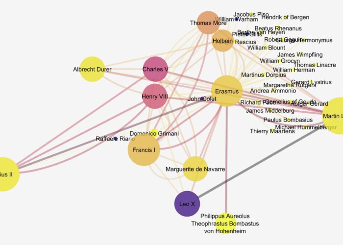
Each student took on a single humanist figure for the semester. The characters ranged from Martin Luther to Isabella d’Este, Erasmus to Copernicus, Henry VIII to Cellini and Leonardo da Vinci. Students worked in groups according to the type of figure they were studying: Rulers, Artists, Scientists, and Thinkers. Every week the class read and discussed a primary source text, “met” its author, and investigated the historical context within which that figure had lived and ruled, painted, or written. Students learned enough about their own figure’s life to provide both a short written introduction and a longer oral presentation about them to the class. Having attained familiarity with their figures, other students’ figures, and a sense of the period based on contemporary writings, students then moved on to consider how the humanists’ historical roles were impacted by mobility and network-building—and, further, how other variables (gender, profession, national origin) factored into these complexities. This process required original research, and would necessitate collecting, structuring, cleaning, visualizing and analyzing data.
Using biographical sources, particularly actual printed books (which many in the class had never thought to consult before), students first gathered information on the travels of their figure: locations visited, and dates of travel. They geocoded each location so that it could be mapped, and they structured their material as data, each creating a three-sheet Excel spreadsheet. The members of each group then combined their data into a single spreadsheet, so that all Rulers, or all Artists, would eventually be visualized and analyzed together.
The class was initially held at UMD’s Collaboratory, where Collaboratory staff introduced students to OpenRefine, an open source platform created in Google Labs (originally as GoogleRefine) to clean and parse data using a simple set of tools (Muñoz 2013a; 2013b; 2014). This introduction covered installation and basic use. Each time it is opened, OpenRefine creates a server instance on the host computer, which is interfaced via a web browser. Users can open a local dataset (the default choice), as well as live data accessed via a URL (e.g., that of the City Permit Office of Toronto, Canada which is the basis for the tutorials on using Open Refine found in the Documentation section at openrefine.org).
Using a dataset contained within an Excel spreadsheet, “Sample Messy Humanist Data” provided by Professor Elizabeth Honig, Christian Cloke and Quint Gregory demonstrated the use of basic tools within OpenRefine, such as Common Transforms, Faceting, and Clustering, which allow the user quickly to reconcile data values that may be similar though not the same (such as capitalized/not-capitalized entries; misspellings; those with a space after or before a string). Through such operations, which require one to think carefully about how the data are structured, the user develops a deeper awareness of the dataset and confidence in its soundness and consistency. In addition, students were shown how different columns of data could be joined or split, depending on the desired outcome, to make new data expressions. The resulting “cleaned” dataset could be exported to a data table in any number of preferred formats (CSV/TSV, Excel, JSON, etc.).
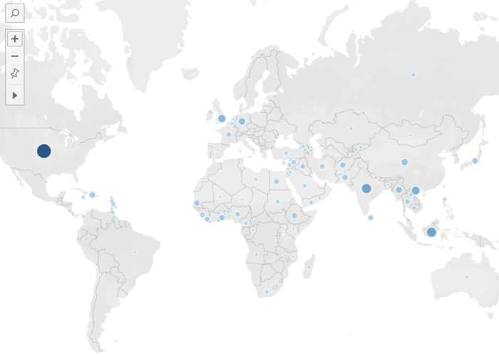
To visualize their travel data, students were trained to use the Stanford-based platform Palladio (Humanities + Design n.d.). Palladio is an open source tool that was originally conceived of to visualize data from the “Mapping the Republic of Letters” project, which had collected material on scholarly networks in early modern Western Europe. Its main capabilities are therefore the visualization of networks and the creation of maps. Designed to be usable by humanists, Palladio does still necessitate correctly structured data, and students explored how that structuring impacted the generation of maps in Palladio’s system. Within its map function, Palladio also allows the visualization of chronological data linked to travels as both a timeline and timespans, so that the user can see the locations mapped (with locations sized according to criteria such as number of times visited) and the years in which travels occurred (Figure 1). Palladio also allows for “faceting,” i.e. dividing and recategorizing elements of data so that it can be examined in another dimension. For example, faceting enabled students to study over what distances female humanists were able to travel, or what cities attracted the most scientists vs. the most theologians, or which figures might have been together in Rome during a given year.
Figure 1. Visualization of the travels of artists, with faceted timeline overlaying the underlying map of locations visited.
Based on the maps and faceting, and on their research on individual figures whose travels were now visualized together, the class was able to explore what life events, ambitions, and exigencies led to travel in the Renaissance, and how travel mattered differently to figures with different professions.
The Data Set
The data set shared between humanists and engineers was created in the next phase of “Humanists on the Move,” which concerned humanist networks. Historical networks have been thoroughly studied and, more recently, elegantly visualized. The vast and remarkable website The Six Degrees of Francis Bacon, hosted by the Carnegie Mellon University Libraries, is a model of what a collaborative project using humanities data can accomplish (Lincoln 2016; Moretti 2011). Nevertheless, network material as we imagined it would be considerably less clear-cut as data than travel had been. A person is or isn’t in a given location at a given time, but a connection—in network terms, an edge—is harder to define. There are obvious connections such as family, colleagues, allies, collaborators. But when a figure read a book by another humanist, did that make them connected? And if so, how deeply connected had they become? How would the importance of that connection compare to, say, attending a performance in which another figure had acted, being present at a diplomatic meeting but not as a main player, writing a letter but (as far as we know) never receiving a reply to it? Historical resources are often fragmentary, and the class tangled with how to account for that as they assembled data. These were issues that most undergraduates had never confronted as they studied history, but now, history’s lacunae were of immediate relevance to their work.
In structuring their data, students were asked first to come up with a limited set of labels that would describe relationships. These might include patronage, respect, influence, friendship, antagonism. Often they encountered an example that none of their labels seemed to fit, but which was not sufficiently different, or representative, to warrant a new label. They learned how to compromise. Next, the students had to agree on criteria by which those edges could be weighted on a scale of one to three.
Another way of thinking about this exercise entails recognizing that it involved phases of translation, from humanist ways of thinking about material into quantifiable terms and then back again (Handelman 2015; Bradley 2018). Describing relationships, even determining what makes a relationship and why it matters, is a perfect example of humanistic work. Art historians love to talk about influence, patronage, and collaboration; this is all fundamental to how we write our histories. We could all probably say who was an important patron or a minor influence. But the students were asked to take information they had gathered and make it numerically regular, working against the humanist instinct to value irregularity and to see each instance of a given relationship, whether patronage or correspondence, as essentially a unique event with its own characteristics that are not simple to equate with those of a comparable event (Rawson and Muñoz 2016). Now every relationship had to be described using a fixed term from a limited list; every edge had to have a weight, from one to three. Long discussions were involved, although the COVID pandemic was widespread and we were meeting via Zoom.
The class gathered nearly 700 connections representing the ways in which over 450 different persons were connected to our core of twenty humanist figures (Figure 2). All of the groups combined their data into one large class spreadsheet. Every person (node) was described by a profession, every relationship (edge) had a label, sometimes several, and a numerical weight. This was the data set that we passed along to the engineers.
Figure 2. Part of the network spreadsheet, in progress. Each line represents an edge, with our key figures in column C and their connected nodes in column G. Information about each figure includes profession terms and gender; relationships are characterized in terms of type of connection and edge weight.
Engineers, Data, and a Humanities Data Set
The course “Data in the Built Environment” is designed to teach data science skills to graduate engineering students. One of its main aims is to motivate students to dig deeper into context via project-based learning concepts (Hicks and Irizarry 2018). To do this, students are given a new dataset each week with which to practice a newly introduced data science technique. Students practice the technique in class in groups and then use new data (also in groups) for homework as a way of deepening and solidifying their understanding (Paul Alexander Horton, Weiner, and Lande 2018; Neff et al. 2017). In short, each week students are challenged to synthesize the technical knowledge and then apply this learning through a practical data application with questions relevant to the data rather than to the technique. This approach is designed to create a tension between data as viewed by engineers and problems that require a deeper analysis to really understand the contextual story. Throughout the semester, the class pedagogy (and grading) emphasized the importance of characterizing data analysis results within the context in which data emerges. The network class was taught toward the end of the semester, so students had practice with linking data subtleties to context—but only in data reflective of the built environment (e.g., transportation, water, and housing data).
The underlying assumption of most engineering students is that data are data, mostly the same in all applications. Rarely do engineering students grapple with data that are unfamiliar to them. The Humanists on the Move data offered a completely novel opportunity to practice network visualization, motivating students to understand the underlying data in a way that they would not normally worry about.
The engineering class assignment mimicked the instructions for the humanist class, but compressed the time allocated for background research. Each student was assigned three humanists, who themselves were selected because they provided students the opportunity to uncover interesting contextual information. The engineering students prepared a one-page summary of basic background information for each figure, including important acquaintances, and any documented travel using three or more sources of information. Because the time allocated for background research was compressed, Wikipedia was an allowable source of information. It was notable that even this limited information gathering exercise threw engineering students into new terrain. Many had questions about how to decide what was important, how to find sources of information, even why they were working on these data in particular. The exercise of preparing them for the data both energized and confused them.
The engineering students were organized into groups of three. Because each student had background sheets on three humanists, groups were assigned so that each group had multiple sources of information on one or more humanists. This deliberate tactic was intended to motivate them to think more about the information that their networks were conveying. The exercise was structured so that groups started by developing standard networks and then moved to allow each group to design more elaborate or situational networks.
Visualizing Network Data
Each class now visualized the network data. For the engineering students, this was the entire point of the class: to visualize data with the implicit assumption that they would draw on the contextual information that they had gathered prior to the class. For students from art history and other humanities disciplines, this was new terrain. A map is a reasonably familiar object, even from the Renaissance, and students understood all of its basic parameters (Harley 2001). Superimposing information about travels onto it was not in itself a vast step. A network, however, was not something they were used to thinking about in visual form, nor were they adept at analyzing a network. A visible network gathers data and presents it in a way that will suggest new questions and will demand interpretation in and of itself—humanistic interpretation, that will return the uncertain and the variable while also incorporating the regular and quantified.
In engineering, visualization is essential for exploring, cleaning, understanding and explaining data. In the class, students master programming for data visualization that makes data exploration easier and more productive, and allows an engineer to both better understand the data and to present data in a way that has impact, particularly on audiences such as policy makers and the public. Students are taught appropriate (and inappropriate) uses of different kinds of charts and graphs, graphical composition, and the design aspects of effectively conveying information such as selecting colors, minimizing chartjunk and emphasizing key features of the data. The focus in engineering is on the mechanics of visualization. As noted earlier though, the transition to project-based learning in our field has ideally involved preparing students to explore context more deeply, even contexts with which they were truly unfamiliar.
The engineering class used a variety of network packages within R, which is a language that provides an environment for statistics and visualization (R Core Team n.d.). The language is open-source, rooted in statistical computing and provides a reproducible platform for engineering calculations. One of R’s major strengths is that it can be easily extended through packages to include modern computing methods and approaches. The network packages within R that were used in the class included igraph, ggraph, tidygraph, and visNetwork.
The igraph package provides functions that implement a wide range of graphing algorithms and can handle very large graphs (Nepusz 2016). The ggraph package extends ggplot (a core package for visualization) to handle networks using the grammar of graphics approach (Wickham 2010). Next, tidygraph provides tools to manipulate and analyze networks and is a wrapper for most of the igraph capabilities (Pedersen 2020). Finally, visNetwork allows for interactive visualization. Students were given the opportunity to work with any of these tools on this exercise.
The humanities students had started their visualization process using Palladio again. As in its mapping function, Palladio allows for faceting networks, so at this stage students could see all the connections based on friendship, for example, or isolate how and where clerics fit into the network (Figure 3).
Figure 3. Rulers’ network, as visualized using Palladio.
Palladio, however, is a tool for visualization and not for computational analysis. It can’t actually work with edge weights, which as humanists we had found to be such an important and complex issue. So at this point the Collaboratory stepped in again with an introduction to Cytoscape. Cytoscape would allow students to visualize the data, while at the same time furnishing a richer understanding of the underlying mathematical analysis of their networks. Cytoscape was developed for analyzing networks of data in systems biology research, as practitioners in this field were not proficient in the use of R (Shannon 2003). As a platform, however, it is discipline-agnostic: data sets of all types and from varied fields, including the humanities, can be analyzed and visualized, and as a result Cytoscape has become a platform researchers in the humanities are comfortable using.
Students were introduced to Cytoscape on the last day of class, and because it was introduced so late in the semester it was advertised as a way for interested students to build another skill and continue querying the dataset they had thus far created and visualized. Students were fascinated by the insights gained from network analyses possible in Cytoscape, but unavailable in Palladio. In addition, they responded favorably to the powerful suite of options within the visualization environment of Cytoscape. For instance, the appearance of nodes and edges can be customized prior to analysis to isolate certain types of values, or the researcher can use the results of statistical analysis to draw out nodes and connections of greater importance within the network. Also of considerable value is the ability of Cytoscape to parse larger datasets, or focus in on specific nodes to make sense of networks within networks, which can be selected and excised into separate visualizations (Figure 4).
Figure 4. Visualization in Cytoscape version 3.7.2, showing a sub-network centering on Erasmus. The nodes are scaled in correspondence with their betweenness centrality (i.e., how much a node bridges other nodes, indicating a key player in a network) and color-coded according to their clustering coefficient (the degree to which nodes cluster together, moving from light to dark as values increase), and the edges are scaled and color-coded (from light to dark) according to their weight.
Interpreting the Visualized Data
For the humanities students, it was the process and outcome of visualization that made the data intriguing to interpret. But crucially, the data had been created by them, over a period of months, before they could move ahead with visualizing and interpreting it. It was only then that they could see, for instance, that certain thinkers held key positions between powerful figures while others, extremely famous in our day, were on the margins of the main humanist network. Persons who wrote a great deal, be it sermons or conduct books or even letters, might have an enormous “degree centrality” (or number of connections), even while the edge weight of many of their connections was relatively low. Some secondary figures who we would have thought to be quite outside our network assumed rather central positions in it. What, we asked, should we make of these unexpected findings?
Because students had developed the data themselves, and had in the process become very familiar with individual figures within the network, they were better able to interpret the positions of each major person. And because of their previous experience with mapping, they had extra knowledge that informed their interpretation of the network. For instance, a figure who travelled very little—say, Raphael—was hampered in his network-building despite his enormous historical influence. This led the class to question both their art-historical preconceptions—for example, that as a superstar, Raphael would be at the center of a network—but also to pose further humanistic questions that the data could not answer. Network-building was crucial for some figures (Aretino springs to mind) but of limited importance for others. What were the alternatives? Creating, visualizing, and then interpreting data was a means of creating new knowledge and a stimulus to further thinking. This further thinking was based on humanistic knowledge and posed questions that would be answered through those means. The shuttle back and forth between quantifiable data and humanistic inquiry through data and its visualization was a hugely fruitful exercise (Drucker 2011).
While producing reasonably well-designed networks, the engineering students studiously avoided connecting networks to a more textual analysis. For example, Figure 5 on the left shows the most common output (from ~90% of the groups) when students were asked to portray the network (an open-ended question). When asked to focus on one or more attributes, every group produced a gender network (Figure 5 on the right). This happened despite the relative abundance of other types of attributes and of group and individual knowledge specific to each of the humanists.
Figure 5. Humanist networks as visualized in R by engineering students. The full network, and a network distinguished by gender.
Conclusion
Humanists were challenged by the idea of extracting data from context, taking facts (“Do we believe in facts in this class?” one student had asked) and turning them into quantifiable data. The more they discretized and structured the data, the more resistant they became to compromise, to what they perceived as flattening out the nuance of individual relationships or even professional identities. However, once the data were visualized, class members were well prepared to read those results and return them to a humanist framework. Without caring particularly how the networks themselves looked, they approached the data with a more historically informed eye than did the engineers and moved quickly to interpretation. For instance, they already knew well the limitations on women’s travel and connections—we had read primary sources about women’s education—and so that and other historical aspects of the network were more revealing to them.
Much of engineering pedagogy focuses on design techniques to solve a problem. In the engineering R class, the design techniques were tuned toward learning about visualization (e.g., color ramps), how to code and design visualization features that draw attention to features of the visualization that are relevant to the analytical objective. This approach to the exercise resulted in networks that lacked texture, despite the interesting and often provocative information on the humanists that students gathered prior to the class. Engineers tend to gravitate toward well-produced visualizations (e.g. appropriately labeled axes, titles that are descriptive, etc.) or portray some important design feature. When the data cannot be understood without context, engineers are less able to navigate the tension between accuracy and context.
Engineers are, however, more alert to the subtleties of the visualization itself and how it communicates information about the data. The caveat here is that the engineering students seem unable to bring noted visualization subtleties back to the data context. In other words, they produce beautiful graphics but do not reflexively use these visualizations to think more about the problem from which their data emerges. Alternatively, humanists, even art historians, have not been trained to care about the aesthetic and persuasive presentation of data. Perhaps this is because humanists see themselves as talking mostly with one another, moving rather quickly from visualized data back to humanistic queries and a written argument. It may be that the humanist students need to be formally trained to make their visualizations an integral part of their textual analysis story. It might also be useful to the future of the humanities, particularly a public-facing humanities, if humanists were not only more comfortable with data, but also with using it to speak beyond the confines of the classroom or the pages of a scholarly journal.
Bibliography
Bok, Marten Jan, Harm Nijboer, and Judith Brouwer, eds. n.d. ECARTICO: Linking cultural industries in the early modern Low Countries, ca. 1475 – ca. 1725. Accessed October 17, 2020. http://www.vondel.humanities.uva.nl/ecartico/.
Bradley, Adam James. 2018. “Visualization and the Digital Humanities.” IEEE Computer Graphics and Applications 38, no. 6: 26–38.
Csárdi, Gábor, and Tamás Nepusz. 2006. “The igraph software package for complex network research.” InterJournal Complex Systems: 1695. https://igraph.org.
Crawley, Edward, Johan Malmqvist, Soren Ostlund, Doris Brodeur, and Kristina Edstrom. 2007. “Rethinking Engineering Education.” The CDIO Approach 302: 60–62.
Handelman, Matthew. 2015. “Digital Humanities as Translation: Visualizing Franz Rosenzweig’s Archive.” TRANSIT 10, no. 1. https://escholarship.org/uc/item/69d0g81v.
Harley, J.B. 2001. “Maps, Knowledge, and Power” and “Silences and Secrecy: The Hidden Agenda of Cartography in Early Modern Europe.” In The New Nature of Maps, 51–107. Johns Hopkins.
Lincoln, Matthew. 2016. “Social Network Centralization Dynamics in Print Production in the Low Countries, 1550–1750.” International Journal of Digital Art History 2: 134–152.
Manovich, Lev. 2015. “Data Science and Digital Art History.” International Journal for Digital Art History, no. 1 (June). https://doi.org/10.11588/dah.2015.1.21631.
Moretti, Franco. 2011. “Network Theory, Plot Analysis.” New Left Review 68: 80–102.
Neff, Gina, Anissa Tanweer, Brittany Fiore-Gartland, and Laura Osburn. 2017. “Critique and contribute: A practice-based framework for improving critical data studies and data science.” Big Data 5, no. 2: 85–97.
Paul Alexander Horton, S.S. Jordan, Steven Weiner, and Micah Lande. 2018. “Project-Based Learning among Engineering Students during Short-Form Hackathon Events.” In ASEE Annual Conference and Exposition, Conference Proceedings.
Pedersen, Thomas Lin. 2020. “A Tidy API for Graph Manipulation.” A Tidy API for Graph Manipulation. Accessed October 17, 2020. https://tidygraph.data-imaginist.com/.
Savage, Richard, Katherine Chen, and Linda Vanasupa. 2008. “Integrating Project-Based Learning throughout the Undergraduate Engineering Curriculum.” Journal of STEM Education 8, no. 3.
Shannon, Paul. 2003. “Cytoscape: A Software Environment for Integrated Models of Biomolecular Interaction Networks.” Genome Research 13: 2498–2504.
Wickham, Hadley. “A Layered Grammar of Graphics.” Journal of Computational and Graphical Statistics 19, no. 1 (January 2010): 3–28. https://doi.org/10.1198/jcgs.2009.07098.
Acknowledgments
Thanks to Rebecca Levitan, who originally suggested to Elizabeth Honig the idea for this course, and who acted as her teaching assistant when she taught the class at UC Berkeley.
About the Author
Elizabeth Alice Honig is Professor of Northern European Art at the University of Maryland. She is the author of, most recently, Pieter Bruegel and the Idea of Human Nature (Reaktion, 2019), while her current research is about the experience of captivity in renaissance Europe. She curates the websites janbrueghel.net, pieterbruegel.net, and brueghelfamily.net, and her work in digital art history deriving from those projects has focused on mapping patterns of similarity between pictures produced in the Brueghel workshop network.
Deb Niemeier is the Clark Distinguished Chair in Energy and Sustainability at the University of Maryland, College Park and a professor in the Department of Civil and Environmental Engineering. She works with sociologists, planners, geographers, and education faculty to study the formal and informal governance processes in urban landscapes and the risks and disparities associated with outcomes in the intersection of finance, housing, infrastructure and environmental hazards. She is an AAAS Fellow, a Guggenheim Fellow, and a member of the National Academy of Engineering.
Christian Cloke specializes in the archaeology of the ancient Mediterranean world, employing a range of digital methods and technologies to do so. In service to his archaeological fieldwork (in Italy, Jordan, Armenia, Albania, and Greece), he builds and works with custom databases, Geographical Information Systems (GIS), and a wide array of imaging techniques. He holds a PhD in Classical Archaeology from the University of Cincinnati and is currently the associate director of the Michelle Smith Collaboratory for Visual Culture at the University of Maryland, College Park, where he works on varied digital research and pedagogical projects with students and faculty.
Quint Gregory specializes in seventeenth-century Dutch and Flemish art, as well as museum theory and practice. He is the creator and director of the Michelle Smith Collaboratory for Visual Culture, a center within the University of Maryland’s Department of Art History and Archaeology committed to supporting students, faculty, staff, and members of the broader community who are interested in adopting digital humanities methods and tools in their work and practice. He is especially interested in using offline and online platforms and skills in the causes of social and racial justice and to repair our relationship with the planet.
With the growth of data science in industry, academic research, and government planning over the past decade, there is an increasing need to equip students with skills not only in responsibly analyzing data, but also in investigating the cultural contexts from which the values reported in data emerge. A risk of several existing models for teaching data ethics and critical data literacy is that students will come to see data critique as something that one does in a compliance capacity prior to performing data analysis or in an auditing capacity after data analysis rather than as an integral part of data practice. This article introduces how I integrate critical data reflection with data practice in my undergraduate course Data Sense and Exploration. I introduced a series of R Notebooks that walk students through a data analysis project while encouraging them, each step of the way, to record field notes on the history and context of their data inputs, the erasures and reductions of narrative that emerge as they clean and summarize the data, and the rhetoric of the visualizations they produce from the data. I refer to the project as an “ethnography of a dataset” not only because students examine the diverse cultural forces operating within and through the data, but also because students draw out these forces through immersive, consistent, hands-on engagement with the data.
Introduction
Last Spring one of my students made an important discovery regarding the politics encoded in data about California wildfires. Aishwarya Asthana was examining a dataset published by California’s Department of Forestry and Fire Protection (CalFIRE), documenting the acres burned for each government-recorded wildfire in California from 1878 to 2017. The dataset also included variables such as the fire’s name, when it started and when it was put out, which agency was responsible for it, and the reason it ignited. Asthana was practicing applying techniques for univariate data analysis in R—taking one variable in the dataset and tallying up the number of times each value in that variable appears. Such analyses help to summarize and reveal patterns in the data, prompting questions about why certain values appear more than others.
Tallying up the number of times each distinct wildfire cause appeared in the dataset, Asthana discovered that CalFIRE categorizes each wildfire into one of nineteen distinct cause codes, such as “1—Lightning,” “2—Equipment Use,” “3—Smoking,” and “4—Campfire.” According to the analysis, 184 wildfires were caused by campfires, 1,543 wildfires were caused by lightning, and, in the largest category, 6,367 wildfires were categorized with a “14—Unknown/Unidentified” cause code. The cause codes that appeared the fewest number of times (and thus were attributed to the fewest number of wildfires) were “12—Firefighter Training” and the final code in the list: “19—Illegal Alien Campfire.”
fires %>%
  ggplot(aes(x = reorder(CAUSE,CAUSE,
                     function(x)-length(x)), fill = CAUSE)) +
  geom_bar() +
  labs(title = "Count of CalFIRE-documented Wildfires since 1878 by Cause", x = "Cause", y = "Count of Wildfires") +
  theme_minimal() +
  theme(legend.position = "none",
        plot.title = element_text(size = 12, face = "bold")) +
  coord_flip()
Figure 1. Plot of CalFIRE-documented wildfires by cause, produced in R.
Interpreting the data unreflectively, one might say, “From 1878 to 2017, four California wildfires have been caused by illegal alien campfires—making it the least frequent cause.” Toward the beginning of the quarter in Data Sense and Exploration, many students, particularly those majoring in math and statistics, compose statements like this when asked to draw insights from data analyses. However, in only reading the data on its surface, this statement obscures important cultural and political factors mediating how the data came to be reported in this way. Why are “illegal alien campfires” categorized separately from just “campfires”? Who has stakes in seeing quantitative metrics specific to campfires purportedly ignited by this subgroup of the population—a subgroup that can only be distinctly identified through systems of human classification that are also devised and debated according to diverse political commitments?
While detailing the history of the data’s collection and some potential inconsistencies in how fire perimeters are calculated, the data documentation provided by CalFIRE does not answer questions about the history and stakes of these categories. In other words, it details the provenance of the data but not the provenance of its semantics and classifications. In doing so, it naturalizes the values reported in the data in ways that inadvertently discourage recognition of the human discernment involved in their generation. Yet, even a cursory Web search of the key phrase “illegal alien campfires in California” reveals that attribution of wildfires to undocumented immigrants in California has been used to mobilize political agendas and vilify this population for more than two decades (see, for example, Hill 1996). Discerning the critical import of this data analysis thus demands more than statistical savvy; to assess the quality and significance of this data, an analyst must reflect on their own political and ethical commitments.
Data Sense and Exploration is a course designed to help students reckon with the values reported in a dataset so that they may better judge their integrity. The course is part of a series of undergraduate data studies courses offered in the Science and Technology Studies Program at the University of California Davis, aiming to cultivate student skill in applying critical thinking towards data-oriented environments. Data Sense and Exploration cultivates critical data literacy by walking students through a quarter-long research project contextualizing, exploring, and visualizing a publicly-accessible dataset. We refer to the project as an “ethnography of a dataset,” not only because students examine the diverse cultural forces operating within and through the data, but also because students draw out these forces through immersive, consistent, hands-on engagement with the data, along with reflections on their own positionality as they produce analyses and visualizations. Through a series of labs in which students learn how to quantitatively summarize the features in a dataset in the coding language R (often referred to as a descriptive data analysis), students also practice researching and reflecting on the history of the dataset’s semantics and classification. In doing so, the course encourages students to recognize how the quantitative metrics that they produce reflect not only the way things are in the world, but also how people have chosen to define them. Perhaps, most importantly, the course positions data as always already structured according to diverse biases and thus aims to foster student skill in discerning which biases they should trust and how to responsibly draw meaning from data in spite of them. In this paper, I present how this project is taught in Data Sense and Exploration and some critical findings students made in their projects.
Teaching Critical Data Analysis
With the growth of data science in industry, academic research, and government planning over the past decade, universities across the globe have been investing in the expansion of data-focused course offerings. Many computationally or quantitatively-focused data science courses seek to cultivate student skill in collecting, cleaning, wrangling, modeling, and visualizing data. Simultaneously, high-profile instances of data-driven discrimination, surveillance, and mis-information have pushed universities to also consider how to expand course offerings regarding responsible and ethical data use. Some emerging courses, often taught directly in computer and data science departments, introduce students to frameworks for discerning “right from wrong” in data practice, focusing on individual compliance with rules of conduct at the expense of attention to the broader institutional cultures and contexts that propagate data injustices (Metcalf, Crawford, and Keller 2015). Other emerging courses, informed by scholarship in science and technology studies (STS) and critical data studies (CDS), take a more critical approach, broadening students’ moral reasoning by encouraging them to reflect on the collective values and commitments that shape data and their relationship to law, democracy, and sociality (Metcalf, Crawford, and Keller 2015).
While such courses help students recognize how power operates in and through data infrastructure, a risk is that students will come to see the evaluation of data politics and the auditing of algorithms as a separate activity from data practice. While seeking to cultivate student capacity to foresee the consequences of data work, coursework that divorces reflection from practice end up positioning these assessments as something one does after data analysis in order to evaluate the likelihood of harm and discrimination. Research in critical data studies has indicated that this divide between data science and data ethics pedagogy has rendered it difficult for students to recognize how to incorporate the lessons of data and society into their work (Bates et al. 2020). Thus, Data Sense and Exploration takes a different approach—walking students through a data analysis project while encouraging them, each step of the way, to record field notes on the history and context of their data inputs, the erasures and reductions of narrative that emerge as they clean and summarize the data, and the rhetoric of the visualizations they produce. As a cultural anthropologist, I’ve structured the class to draw from my own training in and engagement with “experimental ethnography” (Clifford and Marcus 1986). Guided by literary, feminist, and postcolonial theory, cultural anthropologists engage experimental ethnographic methods to examine how systems of representation shape subject formation and power. In this sense, Data Sense and Exploration positions data inputs as cultural artifacts, data work as a cultural practice, and ethnography as a method that data scientists can and should apply in their work to mitigate the harm that may arise from them. Importantly, walking students into awareness of the diverse cultural forces operating in and through data helps them more readily recognize opportunities for intervention. Rather than criticizing the values and political commitments that they bring to their work as biasing the data, the course celebrates such judgments when bent toward advancing more equitable representation.
The course is predominantly inspired by literature in data and information infrastructure studies (Bowker et al. 2009). These fields study the cultural and political contexts of data and the infrastructures that support them by interviewing data producers, observing data practitioners, and closely reading data structures. For example, through historical and ethnographic studies of infrastructures for data access, organization, and circulation, the field of data infrastructure studies examines how data is made and how it transforms as it moves between stakeholders and institutions with diverse positionalities and vested interests (Bates, Lin, and Goodale 2016). Critiquing the notion that data can ever be pure or “raw,” this literature argues that all data emerge from sites of active mediation, where diverse epistemic beliefs and political commitments mold what ultimately gets represented and how (Gitelman 2013). Diverting from an outsized focus on data bias, Data Sense and Exploration prompts students to grapple with the “interpretive bases” that frame all data—regardless of whether it has been produced though personal data collection, institutions with strong political proclivities, or automated data collection technologies. In this sense, the course advances what Gray, Gerlitz, and Bounegru (2018) refer to as “data infrastructure literacy” and demonstrates how students can apply critical data studies techniques to critique and improve their own day-to-day data science practice (Neff et al. 2017).
Studying a Dataset Ethnographically
Data Sense and Exploration introduces students to examining a dataset and data practices ethnographically through an extended research project, carried out incrementally through a series of weekly labs.[1] While originally the labs were completed collaboratively in a classroom setting, in the move to remote instruction in Spring 2020, the labs were reformulated as a series of nine R Notebooks, hosted in a public GitHub repository that students clone into their local coding environments to complete. R Notebooks are digital documents, written in the scripting language Markdown, that enable authors to embed chunks of executable R code amidst text, images, and other media. The R Notebooks that I composed for Data Sense and Exploration include text instruction for how to find, analyze, and visualize a rectangular dataset, or a dataset in which values are structured into a series of observations (or rows) each described by a series of variables (or columns). The Notebooks also model how to apply various R functions to analyze a series of example datasets, offer warnings of the various faulty assumptions and statistical pitfalls students may encounter in their own data practice, and demonstrate the critical reflection that students will be expected to engage in as they apply the functions in their own data analysis.
Interspersed throughout the written instruction, example code, and reflections, the Notebooks provide skeleton code for students to fill in as they go about applying what they have learned to a dataset they will examine throughout the course. At the beginning of the course, when many students have no prior programming experience, the skeleton code is quite controlled, asking students to “fill-in-the-blank” with a variable from their own dataset or with a relevant R function.
# Uncomment below and count the distinct values in your unique key. Note that you may need to select multiple variables. If so, separate them by a comma in the select() function.
#n_unique_keys <- _____ %>% select(_____) %>% n_distinct()

# Uncomment below and count the rows in your dataset by filling in your data frame name.
#n_rows <- nrow(_____)

# Uncomment below and then run the code chunk to make sure these values are equal.
# n_unique_keys == n_rows
Figure 2. Example of skeleton code from R Notebooks.
However, as students gain familiarity with the language, each week, they are expected to compose code more independently. Finally, in each Notebook, there are open textboxes, where students record their critical reflections in response to specific prompts.
Teaching this course in the Spring 2020 quarter, I found that the structure provided by the R Notebooks overall was particularly supportive to students who were coding in R for the first time and that, given the examples provided throughout the Notebooks, students exhibited greater depth of reflection in response to prompts. However, without the support of a classroom once we moved online, I also found that novice students struggled more to interpret what the plots they produced in R were actually showing them. Moreover, advanced students were more conservative in their depth of data exploration, closely following the prompts and relying on code templates. In future iterations of the course, I thus intend to spend more synchronous time in class practicing how to quantitatively summarize the results of their analysis. I also plan to add new sections at the end of each Notebook, prompting students to leverage the skills they learned in that Notebook in more creative and free-form data explorations.
Each time I teach the course, individual student projects are structured around a common theme. In the iteration of the course that inspired the project that opens this article, the theme was “social and environmental challenges facing California.” In the most recent iteration of the course, the theme was “social vulnerability in the wake of a pandemic.” In an early lab, I task students with identifying issues warranting public concern related to the theme, devising research questions, and searching for public data that may help answer those questions. Few students entering the course have been taught how to search for public research, let alone how to search for public data. In order to structure their search activity, I task the students with imagining and listing “ideal datasets”—intentionally delineating their topical, geographic, and temporal scope—prior to searching for any data. Examining portals like data.gov, Google’s dataset search, and city and state open data portals, students very rarely find their ideal datasets and realize that they have to restrict their research questions in order to complete the assignment. Grappling with the dearth of public data for addressing complex contemporary questions around equity and social justice provides one of the first eye-opening experiences in the course. A Notebook directive prompts students to reflect on this.
Throughout the following week, I work with groups of students to select datasets from their research that will be the focus of their analysis. This is perhaps one of the most challenging tasks of the course for me as the instructor. While a goal is to introduce students to the knowledge gaps in public data, some public datasets have so little documentation that the kinds of insights students could extrapolate from examinations of their history and content would be considerably limited. Further, not all rectangular datasets are structured in ways that will integrate well with the code templates I provide in the R Notebooks. I grapple with the tension of wanting to expose students to the messiness of real-world data, while also selecting datasets that will work for the assignment.
Once datasets have been assigned, the remainder of the labs provide opportunities for immersive engagement with the dataset. In what follows, I describe a series of concepts (i.e. routines and rituals, semantics, classifications, calculations and narrative, chrono-politics, and geo-politics) around which I have structured each lab, and provide some examples of both the data work that introduced students to these concepts and the critical reflections they were able to make as a result.
Data Routines and Rituals
In one of the earlier labs, students conduct a close reading of their dataset’s documentation—an example of what Geiger and Ribes (2011) refer to as a “trace ethnography.” They note the stakeholders involved in the data’s collection and publication, the processes through which the data was collected, the circumstances under which the data was made public, and the changes in the data’s structure. They also search for news articles and scientific articles citing the dataset to get a sense of how governing bodies have leveraged the data to inform decisions, how social movements have advocated for or against the data’s collection, and how the data has advanced other forms of research. They outline the costs and labor involved in producing and maintaining the data, the formal standards that have informed the data’s structure, and any laws that mandate the data’s collection.
From this exercise, students learn about the diverse “rituals” of data collection and publication (Ribes and Jackson 2013). For instance, studying the North American Breeding Bird Survey (BBS)—a dataset that annually records bird populations along about 4,100 roadside survey routes in the United States and Canada—Tennyson Filcek learned that the data is produced by volunteers skilled in visual and auditory bird identification. After completing training, volunteers drive to an assigned route with a pen, paper, and clipboard and count all of the bird species seen or heard over the course of three minutes along each designated stop on the route. They report the data back to the BBS Office, which aggregates the data and makes them available for public consumption. While these rituals shape how the data get produced, the unruliness of aggregating data collected on different days, by different individuals, under different weather and traffic conditions, and in different parts of the continent has prompted the BBS to implement recommendations and routines to account for disparate conditions. The BBS requires volunteers to complete counts around June, start the route a half-hour before sunrise, and avoid completing counts on foggy, rainy, or windy days. Just as these routines domesticate the data, the heterogeneity of the data’s contexts demands that the data be cared for in particular ways, in turn patterning data collection as a cultural practice. This lab is thus an important precursor to the remaining labs in that it introduces students to the diverse actors and commitments mediating the dataset’s production and affirms that the data could not exist without them.
While I have been impressed with students’ ability to outline details involving the production and structure of the data, I have found that most students rarely look beyond the data documentation for relevant information—often missing critical perspectives from outside commentators (such as researchers, activists, lobbyists, and journalists) that have detailed the consequences of the data’s incompleteness, inconsistencies, inaccuracies, or timeliness for addressing certain kinds of questions. In future iterations of the course, I intend to encourage students to characterize the viewpoints of at least three differently positioned stakeholders in this lab in order to help illustrate how datasets can become contested artifacts.
Data Semantics
In another lab, students import their assigned dataset into the R Notebook and programmatically explore its structure, using the scripting language to determine what makes one observation distinct from the next and what variables are available to describe each observation. As they develop an understanding for what each row of the dataset represents and how columns characterize each row, they refer back to the data documentation to consider how observations and variables are defined in the data (and what these definitions exclude). This focused attention to data semantics invites students to go behind-the-scenes of the observations reported in a dataset and develop a deeper understanding of how its values emerge from judgments regarding “what counts.”
Figure 3. Basic examination of the structure of the CA Crimes and Clearances dataset.
For instance, studying aggregated totals of crimes and clearances for each law enforcement agency in California in each year from 1985 to 2017, Simarpreet Singh noted how the definition of a crime gets mediated by rules in the US Federal Bureau of Investigation (FBI)’s Uniform Crime Reporting Program (UCR)—the primary source of statistics on crime rates in the US. Singh learned that one such rule, known as the hierarchy rule, states that if multiple offenses occur in the context of a single crime incident, for the purposes of crime reporting, the law enforcement agency classifies the crime only according to the most serious offense. In descending order, these classifications include 1. Criminal Homicide 2. Criminal Sexual Assault 3. Robbery 4. Aggravated Battery/Aggravated Assault 5. Burglary 6. Theft 7. Motor Vehicle Theft 8. Arson. This means that in the resulting data, for incidents where multiple offenses occurred, certain classes of crime are likely to be underrepresented in the counts.
Sidhu also acknowledged how counts for individual offense types get mediated by official definitions. A change in the FBI’s definition of “forcible rape” (including only female victims) to “rape” (focused on whether there had been consent instead of whether there had been physical force) in 2014 led to an increase in the number of rapes reported in the data from that year on. From 1927 (when the original definition was documented) up until this change, male victims of rape had been left out of official statistics, and often rapes that did not involve explicit physical force (such as drug-facilitated rapes) went uncounted. Such changes come about, not in a vacuum, but in the wake of shifting norms and political stakes to produce certain types of quantitative information (Martin and Lynch 2009). By encouraging students to explore these definitions, this lab has been particularly effective in getting students to reflect not only on what counts and measures of cultural phenomena indicate, but also on the cultural underpinnings of all counts and measures.
Data Classifications
In the following lab, students programmatically explore how values get categorized in the dataset, along with the frequency with which each observation falls into each category. To do so, they select categorical variables in the dataset and produce bar plots that display the distributions of values in that variable. Studying a US Environmental Protection Agency (EPA) dataset that reported the daily air quality index (AQI) of each county in the US in 2019, Farhat Bin Aznan created a bar plot that displayed the number of counties that fell into each of the following air quality categories on January 1, 2019: Good, Moderate, Unhealthy for Sensitive Populations, Unhealthy, Very Unhealthy, and Hazardous.
aqi$category <- factor(aqi$category, levels = c("Good", "Moderate", "Unhealthy for Sensitive Groups", "Unhealthy", "Very Unhealthy", "Hazardous"))

aqi %>%
  filter(date == "2019-01-01") %>%
  ggplot(aes(x = category, fill = category)) +
  geom_bar() +
  labs(title = "Count of Counties in the US by Reported AQI Category on January 1, 2019", subtitle = "Note that not all US counties reported their AQI on this date", x = "AQI Category", y = "Count of Counties") +
  theme_minimal() +
  theme(legend.position = "none",
        plot.title = element_text(size = 12, face = "bold")) +
  scale_fill_brewer(palette="RdYlGn", direction=-1)
Figure 4. Barplot of counties in each AQI category on January 1, 2019.
Studying the US Department of Education’s Scorecard dataset, which documents statistics on student completion, debt, and demographics for each college and university in the US, Maxim Chiao created a bar plot that showed the number of universities that fell into each of the following ownership categories: Private, Public, Non-profit.
scorecard %>%
  mutate(CONTROL_CAT = ifelse(CONTROL == 1, "Public",
                          ifelse(CONTROL== 2, "Private nonprofit",
                                 ifelse(CONTROL == 3, "Private for-profit", NA)))) %>%
           ggplot(aes(x = CONTROL_CAT, fill = CONTROL_CAT)) +
           geom_bar() +
           labs(title ="Count of Colleges and Universities in the US by Ownership Model, 2018-2019", x = "Ownership Model", y = "Count of Colleges and Universities") +
           theme_minimal() +
           theme(legend.position = "none",
                 plot.title = element_text(size = 12, face = "bold"))
Figure 5. Barplot of colleges and universities in the US by ownership model.
I first ask students to interpret what they see in the plot. Which categories are more represented in the data, and why might that be the case? I then ask students to reflect on why the categories are divided the way that they are, how the categorical divisions reflect a particular cultural moment, and to consider values that may not fit neatly into the identified categories. As it turns out, the AQI categories in the EPA’s dataset are specific to the US and do not easily translate to the measured AQIs in other countries, where for a variety of reasons, different pollutants are taken into consideration when measuring air quality (Plaia and Ruggieri 2011). The ownership models categorized in the Scorecard dataset gloss over the nuance of quasi-private universities in the US such as the University of Pittsburgh and other universities in Pennsylvania’s Commonwealth System of Higher Education.
For some students, this Notebook was particularly effective in encouraging reflection on how all categories emerge in particular contexts to delimit insight in particular ways (Bowker and Star 1999). For example, air pollution does not know county borders, yet, as Victoria McJunkin pointed out in her labs, the EPA reports one AQI for each county based on a value reported from one air monitor that can only detect pollution within a delimited radius. AQI is also reported on a daily basis in the dataset, yet for certain pollutants in the US, pollution concentrations are monitored on an hourly basis, averaged over a series of hours, and then the highest average is taken as the daily AQI. The choice to classify AQI by county and day then is not neutral, but instead has considerable implications for how we come to understand who experiences air pollution and when.
Still, I found that, in this lab, other students struggled to confront their own assumptions about categories they consider to be neutral. For instance, many students categorizing their data by state in the US suggested that there were no cultural forces underlying these categories because states are “standard” ways of dividing the country. In doing so, they missed critical opportunities to reflect on the politics behind how state boundaries get drawn and which people and places get excluded from consideration when relying on this bureaucratic schema to classify data. Going forward, to help students place even “standard” categories in a cultural context, I intend to prompt students to produce a brief timeline outlining how the categories emerged (both institutionally and discursively) and then to identify at least one thing that remains “residual” (Star and Bowker 2007) to the categories.
Data Calculations and Narrative
The next lab prompts students to acknowledge the judgment calls they make in performing calculations with data, including how these choices shape the narrative the data ultimately conveys. Selecting a variable that represents a count or a measure of something in their data, students measure the central tendency of the variable—taking an average across the variable by calculating the mean and the median value. Noting that they are summarizing a value across a set of numbers, I remind students that such measures should only be taken across “similar” observations, which may require first filtering the data to a specific set of observations or performing the calculations across grouped observations. The Notebook instructions prompt students to apply such filters and then reflect on how they set their criteria for similarity. Where do they draw the line between relevant or irrelevant, similar or dissimilar? What narratives do these choices bring to the fore, and what do they exclude from consideration?
For instance, studying a dataset documenting changes in eligibility policies for the US Supplemental Nutrition Assistance Program (SNAP) by state since 1995, Janelle Marie Salanga sought to calculate the average spending on SNAP outreach across geographies in the US and over time. Noting that we could expect there to be differences in state spending on outreach due to differences in population, state fiscal politics, and food accessibility, Salanga decided to group the observations by state before calculating the average spending across time. Noting that the passing of the American Recovery and Reinvestment Act of 2009 considerably expanded SNAP benefits to eligible families, Salanga decided to filter the data to only consider outreach spending in the 2009 fiscal year through the 2015 fiscal year. Through this analysis, Salanga found California to have, on average, spent the most on SNAP outreach in the designated fiscal years, while several states spent nothing.
snap %>%
  filter(month(yearmonth) == 10 & year(yearmonth) %in% 2009:2015) %>% #Outreach spending is reported annually, but this dataset is reported monthly, so we filter to the observations on the first month of each fiscal year (October)
  group_by(statename) %>%
  summarize(median_outreach = median(outreach * 1000, na.rm = TRUE),
            num_observations = n(),
            missing_observations = paste(as.character(sum(is.na(outreach)/n()*100)), "%"),
            .groups = 'drop') %>%
  arrange(desc(median_outreach))
statename
median_outreach
num_observations
missing_observations
California
1129009.3990
7
0 %
New York
469595.8557
7
0 %
Texas
422051.5137
7
0 %
Washington
273772.9187
7
0 %
Minnesota
261750.3357
7
0 %
Arizona
222941.9250
7
0 %
Nevada
217808.7463
7
0 %
Illinois
195910.5835
7
0 %
Connecticut
184327.4231
7
0 %
Georgia
173554.0009
7
0 %
Pennsylvania
153474.7467
7
0 %
South Carolina
126414.4135
7
0 %
Ohio
125664.8331
7
0 %
Rhode Island
99755.1651
7
0 %
Tennessee
98411.3388
7
0 %
Massachusetts
97360.4965
7
0 %
Wisconsin
87527.9999
7
0 %
Maryland
81700.3326
7
0 %
Vermont
69279.2511
7
0 %
North Carolina
62904.8309
7
0 %
Indiana
58047.9164
7
0 %
Oregon
57951.0803
7
0 %
Michigan
53415.1688
7
0 %
Florida
37726.1696
7
0 %
Hawaii
29516.3345
7
0 %
New Jersey
23496.2501
7
0 %
Missouri
23289.1655
7
0 %
Louisiana
20072.0005
7
0 %
Colorado
19113.8344
7
0 %
Iowa
18428.9169
7
0 %
Virginia
15404.6669
7
0 %
Delaware
14571.0001
7
0 %
Alabama
11048.8329
7
0 %
District of Columbia
9289.5832
7
0 %
Kansas
8812.2501
7
0 %
North Dakota
8465.0002
7
0 %
Mississippi
4869.0000
7
0 %
Alaska
3199.3332
7
0 %
Arkansas
3075.0833
7
0 %
Nebraska
217.1667
7
0 %
Idaho
0.0000
7
0 %
Kentucky
0.0000
7
0 %
Maine
0.0000
7
0 %
Montana
0.0000
7
0 %
New Hampshire
0.0000
7
0 %
New Mexico
0.0000
7
0 %
Oklahoma
0.0000
7
0 %
South Dakota
0.0000
7
0 %
Utah
0.0000
7
0 %
West Virginia
0.0000
7
0 %
Wyoming
0.0000
7
0 %
Table 1. Median of annual SNAP outreach spending from 2009 to 2015 per US state.
The students then consider how their measures may be reductionist—that is, how the summarized values erase the complexity of certain narratives. For instance, Salanga went on to plot a series of boxplots that displayed the dispersion of outreach spending across fiscal years for each state from 2009 to 2015. She found that, while outreach spending had been fairly consistent in several states across these years, in other states there had been a difference in several hundred thousand dollars from the fiscal year with the maximum outreach spending to the year with the minimum.
snap %>%
  filter(month(yearmonth) == 10 & year(yearmonth) %in% 2009:2015) %>%
  ggplot(aes(x = statename, y = outreach * 1000)) +
  geom_boxplot() +
  coord_flip() +
  labs(title = "Distribution of Annual SNAP Outreach Spending per State from 2009 to 2015", x = "State", y = "Outreach Spending") +
  scale_y_continuous(labels = scales::comma) +
  theme_minimal() +
  theme(plot.title = element_text(size = 12, face = "bold"))
Figure 6. Boxplot showing distribution of annual SNAP outreach spending from 2009 to 2015.
This nuanced story of variations in spending over time gets obfuscated when relying on a measure of central tendency alone to summarize the values.
This lab has been effective in getting students to recognize data work as a cultural practice that involves active discernment. Still, I have noticed that some students complete this lab feeling uncomfortable with the idea that the choices they make in data work may be framed, at least in part, by their own political and ethical commitments. In other words, in their reflections, some students describe their efforts to divorce their own views from their decision-making: they express concern that their choices may be biasing the analysis in ways that invalidate the results. To help them further grapple with the judgment calls that frame all data analyses (and especially the calls that they individually make when choosing how to filter, sort, group, and visualize the data), the next time I run the course I plan to ask students to explicitly characterize their own standpoint in relation to the analysis and reflect on how their unique positionality both influences and delimits the questions they ask, the filters they apply, and the plots they produce.
Data Chrono-Politics and Geo-Politics
In a subsequent lab, I encourage students to situate their datasets in a particular temporal and geographic context in order to consider how time and place impact the values recorded. Students first segment their data by a geographic variable or a date variable to assess how the calculations and plots vary across geographies and time. They then characterize, not only how and why there may be differences in the phenomena represented in the data across these landscapes and timescapes, but also how and why there may be differences in the data’s generation.
dom_violence_calls %>%
  ggplot(aes(x = YEAR_MONTH, y = TOTAL_CALLS, group = 1)) +
  stat_summary(geom = "line", fun = "sum") +
  facet_wrap(~COUNTY) +
  labs(title = "Domestic Violence Calls to California Law Enforcement Agencies by County", x = "Month and Year", y = "Total Calls") +
  theme_minimal() +
  theme(plot.title = element_text(size = 12, face = "bold"),
        axis.text.x = element_text(size = 5, angle = 90, hjust = 1),
        strip.text.x = element_text(size = 6))
Figure 7. Timeseries of domestic violence calls to California law enforcement agencies by county.
One student, Laura Cruz, noted how more calls may be reported in certain counties not only because domestic violence may be more prevalent or because those counties had a higher or denser population, but also due to different cultures of police intervention in different communities. Trust in law enforcement may vary across California communities, impacting which populations feel comfortable calling their law enforcement agencies to report any issues. This creates a paradox in which the counts of calls related to domestic violence can be higher in communities that have done a better job responding to them.
Describing how the values reported may change over time, Hipolito Angel Cerros further noted that cultural norms around domestic violence have changed over time for certain social groups. As a result of this cultural change, certain communities may be more likely to call law enforcement agencies regarding domestic violence in 2020 than they were a decade ago, while other communities may be less likely to call.
This was one of the course’s more successful labs, which helped students discern the ways in which data are products of the cultural contexts of their production. Dividing the data temporally and geographically helped affirm the dictum that “all data are local” (Loukissas 2019)—that data emerge from meaning-making practices that are never completely stable. Leveraging data visualization techniques to situate data in particular times and contexts demonstrated how, when aggregated across time and place, datasets can come to tell multiple stories from multiple perspectives at once. This called on students, in their role as data practitioners, to convey data results with more care and nuance.
Conclusion
Ethnographically analyzing a dataset can draw to the fore insights about how various people and communities perceive difference and belonging, how people represent complex ideas numerically, and how they prioritize certain forms of knowledge over others. Programmatically exploring a dataset’s structure, schemas, and contexts helped students see datasets not just as a series of observations, counts, and measurements about their communities, but also as cultural objects, conveying meaning in ways that foreground some issues while eclipsing others. The project also helped students see data science as a practice that is always already political, as opposed to something that can potentially become politicized when placed into the wrong hands or leveraged in the wrong ways. Notably, the project helped students cultivate these insights by integrating a computational practice with critical reflection, highlighting how they can incorporate social awareness and critique into their work. Still, the course content could be strengthened to encourage more critical examinations of categories students consider to be standard, and to better connect their choices in data analysis with their own political and ethical commitments.
Notably, there is great risk to calling attention to just how messy public data is, especially in a political moment in the US where a growing culture of denialism is undermining the credibility of evidence-based research. I encourage students to see themselves as data auditors and their work in the course as responsible data stewardship, and on several occasions, we have worked together to compose emails to data publishers describing discrepancies we have found in the datasets. In this sense, rather than disparaging data for its incompleteness, inconsistencies, or biases, the project encourages students to rethink their role as critical data practitioners, responsible for considering when and how to advocate for making datasets and data analysis more comprehensive, honest, and equitable.
Notes
[1] I typically assign Joe Flood’s The Fires as the course text. The book tells a gripping and sobering story of how a statistical model and a blind trust in numbers contributed to the burning of the NYC’s poorest neighborhoods in the 1970s.
Bibliography
Bates, Jo, David Cameron, Alessandro Checco, Paul Clough, Frank Hopfgartner, Suvodeep Mazumdar, Laura Sbaffi, Peter Stordy, and Antonio de la Vega de León. 2020. “Integrating FATE/Critical Data Studies into Data Science Curricula: Where Are We Going and How Do We Get There?” In Proceedings of the 2020 Conference on Fairness, Accountability, and Transparency, 425–435. FAT* ’20. Barcelona, Spain: Association for Computing Machinery. https://dl.acm.org/doi/abs/10.1145/3351095.3372832.
Bates, Jo, Yu-Wei Lin, and Paula Goodale. 2016. “Data Journeys: Capturing the Socio-Material Constitution of Data Objects and Flows.” Big Data & Society 3, no. 2. https://doi.org/10.1177/2053951716654502.
Bowker, Geoffrey, Karen Baker, Florence Millerand, and David Ribes. 2009. “Toward Information Infrastructure Studies: Ways of Knowing in a Networked Environment.” In International Handbook of Internet Research, edited by Jeremy Hunsinger, Lisbeth Klastrup, and Matthew Allen, 97–117. Springer Netherlands. https://doi.org/10.1007/978-1-4020-9789-8_5.
Bowker, Geoffrey C., and Susan Leigh Star. 1999. Sorting Things Out: Classification and Its Consequences. Cambridge, Massachusetts: MIT Press.
Clifford, James, and George E. Marcus. 1986. Writing Culture: The Poetics and Politics of Ethnography: A School of American Research Advanced Seminar. Berkeley: University of California Press.
Geiger, R. Stuart, and David Ribes. 2011. “Trace Ethnography: Following Coordination through Documentary Practices.” In 2011 44th Hawaii International Conference on System Sciences, 1–10. https://doi.org/10.1109/HICSS.2011.455.
Gitelman, Lisa, ed. 2013. “Raw Data” Is an Oxymoron. Cambridge, Massachusetts: MIT Press.
Gray, Jonathan, Carolin Gerlitz, and Liliana Bounegru. 2018. “Data Infrastructure Literacy:” Big Data & Society, July. https://doi.org/10.1177/2053951718786316.
Loukissas, Yanni Alexander. 2019. All Data Are Local: Thinking Critically in a Data-Driven Society. Cambridge, Massachusetts: The MIT Press.
Martin, Aryn, and Michael Lynch. 2009. “Counting Things and People: The Practices and Politics of Counting.” Social Problems 56, no. 2: 243–66. https://doi.org/10.1525/sp.2009.56.2.243.
Neff, Gina, Anissa Tanweer, Brittany Fiore-Gartland, and Laura Osburn. 2017. “Critique and Contribute: A Practice-Based Framework for Improving Critical Data Studies and Data Science.” Big Data 5, no. 2: 85–97. https://doi.org/10.1089/big.2016.0050.
Plaia, Antonella, and Mariantonietta Ruggieri. 2011. “Air Quality Indices: A Review.” Reviews in Environmental Science and Bio/Technology 10, no. 2: 165–79. https://doi.org/10.1007/s11157-010-9227-2.
Ribes, David, and Steven J Jackson. 2013. “Data Bite Man: The Work of Sustaining a Long-Term Study.” In Gitelman 2013, 147–166.
Star, Susan Leigh, and Geoffrey C. Bowker. 2007. “Enacting Silence: Residual Categories as a Challenge for Ethics, Information Systems, and Communication.” Ethics and Information Technology 9, no. 4: 273–80. https://doi.org/10.1007/s10676-007-9141-7.
Acknowledgments
Thanks are due to the students enrolled in STS 115: Data Sense and Exploration in Spring 2019 and Spring 2020, whose work helped refine the arguments in this paper. I also want to thank Matthew Lincoln and Alex Hanna for their thoughtful reviews, which not only strengthened the arguments in the paper but also my planning for future iterations of this course.
About the Author
Lindsay Poirier is Assistant Professor of Science and Technology Studies at the University of California, Davis. As a cultural anthropologist working within the field of data studies, Poirier examines data infrastructure design work and the politics of representation emerging from data practices. She is also the Lead Platform Architect for the Platform for Experimental Collaborative Ethnography (PECE).
Email us at [email protected] so we can respond to your questions and requests. Please email from your CUNY email address if possible. Or visit our help site for more information: