Tagged Data Visualization

Network of Erasmus’s network, visualized using Cytoscape. Both nodes and edges are colored, and the nodes are sized, so that more information about centrality, edge weight, and clustering coefficient can be seen.
0

Thinking Through Data in the Humanities and in Engineering

Abstract

This article considers how the same data can be differently meaningful to students in the humanities and in data science. The focus is on a set of network data about Renaissance humanists that was extracted from historical source materials, structured, and cleaned by undergraduate students in the humanities. These students learned about a historical context as they created first travel data, and then the network data, with each student working on a single historical figure. The network data was then shared with a graduate engineering class in which students were learning R. They too were assigned to acquaint themselves with the historical figures. Both groups then created visualizations of the data using a variety of tools: Palladio, Cytoscape, and R. They were encouraged to develop their own questions based on the networks. The humanists’ questions demanded that the data be reembeded in a context of historical interpretation—they wanted to reembrace contingency and uncertainty—while the engineers tried to create the clarity that would allow for a more forceful, visually comprehensible presentation of the data. This paper compares how humanities and engineering pedagogy treats data and what pedagogical outcomes can be sought and developed around data across these very different disciplines.

In the humanities, we train students to interpret their material within a larger context. Facts exist to be contextualized, biases uncovered, problems revealed. Students in many corners of the humanities are rarely confronted with something termed data, which they imagine as dry and quantitative and unyielding. Art history in particular is still a discipline of printed books and, especially, of material objects. Of course data do exist in our field, adhering to objects as physical information or tagged contents, or to the objects’ makers, as in the University of Amsterdam’s monumental ECARTICO project (Manovich 2015; Bok et al. n.d.). But introducing students to data is normally much less central to our work than persuading them to engage in close examination of the visual, and to use libraries to gather information.

Modern engineering is distinguished by production of massive data, most of which can be accessed from all over the world. Engineering students often take computer science and statistics classes, in addition to a curriculum in their chosen field, as a way of acquiring the expertise to deal with modern data. In the engineering realm, quantitative data are central and the context from which data arises is usually not discussed. As a result, engineering educators have devised pedagogy to motivate students to contextualize findings. One of the primary ways that engineering pedagogy has changed in the past twenty years to meet this challenge is the introduction of experiential and project-based learning (Crawley et al. 2007; Savage, Chen, and Vanasupa 2008). Both of these approaches are designed to couple the development of technical skills with increasing contextual awareness and cultural literacy. In this paper, we unpack key assumptions at the heart of the current state of pedagogy in both engineering and digital humanities by posing two questions:

  1. Does digital training in the humanities alone motivate students to consider an outward focus for their contextual learning, and
  2. Does project-based learning in engineering motivate students sufficiently to dig below the exploration of data and production of visualizations, and into context.

We implicitly challenge the notion that teaching digital humanities and the construction and meaning of “data” is enough to create a digital scholar. In engineering, we challenge the notion that a shift to project-based instruction is sufficient to motivate student learning beyond digital skills and computational methods.

To conduct this study, we consider how one data set functioned pedagogically in a humanities course taught within an art history department, and how the same data and core assignment was used in parallel in a data science course taught in engineering. In both cases, the process of working with data was meant to unsettle the ways in which students had normally been asked to work in their discipline. “Data” was framed as both a subject of analysis and a pedagogical tool to make students question their habits of thought, further empowering them to ask questions they had never thought to ask before. In both cases, students had to move back and forth between interpretability and quantification, recognizing the limitations and opportunities of approaching their data as (historical) material, and organizing their historical material as data.

The Humanities Class

The course “Humanists on the Move” introduced liberal arts undergraduates to data gathering and structuring as well as visualization and analysis. The goal of the class was to make students engage with the most fundamental humanities source material—primary written historical documents—as well as with data: the former should make the analysis of the latter meaningful. In fact, by the end of the semester, the class would not merely have learned about the early sixteenth century, about individual humanist figures, and about data and their analysis, but as a group the students would have produced new knowledge about this historical period, things that could not have been found in any published source.

Each student took on a single humanist figure for the semester. The characters ranged from Martin Luther to Isabella d’Este, Erasmus to Copernicus, Henry VIII to Cellini and Leonardo da Vinci. Students worked in groups according to the type of figure they were studying: Rulers, Artists, Scientists, and Thinkers. Every week the class read and discussed a primary source text, “met” its author, and investigated the historical context within which that figure had lived and ruled, painted, or written. Students learned enough about their own figure’s life to provide both a short written introduction and a longer oral presentation about them to the class. Having attained familiarity with their figures, other students’ figures, and a sense of the period based on contemporary writings, students then moved on to consider how the humanists’ historical roles were impacted by mobility and network-building—and, further, how other variables (gender, profession, national origin) factored into these complexities. This process required original research, and would necessitate collecting, structuring, cleaning, visualizing and analyzing data.

Using biographical sources, particularly actual printed books (which many in the class had never thought to consult before), students first gathered information on the travels of their figure: locations visited, and dates of travel. They geocoded each location so that it could be mapped, and they structured their material as data, each creating a three-sheet Excel spreadsheet. The members of each group then combined their data into a single spreadsheet, so that all Rulers, or all Artists, would eventually be visualized and analyzed together.

The class was initially held at UMD’s Collaboratory, where Collaboratory staff introduced students to OpenRefine, an open source platform created in Google Labs (originally as GoogleRefine) to clean and parse data using a simple set of tools (Muñoz 2013a; 2013b; 2014). This introduction covered installation and basic use. Each time it is opened, OpenRefine creates a server instance on the host computer, which is interfaced via a web browser. Users can open a local dataset (the default choice), as well as live data accessed via a URL (e.g., that of the City Permit Office of Toronto, Canada which is the basis for the tutorials on using Open Refine found in the Documentation section at openrefine.org).

Using a dataset contained within an Excel spreadsheet, “Sample Messy Humanist Data” provided by Professor Elizabeth Honig, Christian Cloke and Quint Gregory demonstrated the use of basic tools within OpenRefine, such as Common Transforms, Faceting, and Clustering, which allow the user quickly to reconcile data values that may be similar though not the same (such as capitalized/not-capitalized entries; misspellings; those with a space after or before a string). Through such operations, which require one to think carefully about how the data are structured, the user develops a deeper awareness of the dataset and confidence in its soundness and consistency. In addition, students were shown how different columns of data could be joined or split, depending on the desired outcome, to make new data expressions. The resulting “cleaned” dataset could be exported to a data table in any number of preferred formats (CSV/TSV, Excel, JSON, etc.).

To visualize their travel data, students were trained to use the Stanford-based platform Palladio (Humanities + Design n.d.).  Palladio is an open source tool that was originally conceived of to visualize data from the “Mapping the Republic of Letters” project, which had collected material on scholarly networks in early modern Western Europe. Its main capabilities are therefore the visualization of networks and the creation of maps. Designed to be usable by humanists, Palladio does still necessitate correctly structured data, and students explored how that structuring impacted the generation of maps in Palladio’s system. Within its map function, Palladio also allows the visualization of chronological data linked to travels as both a timeline and timespans, so that the user can see the locations mapped (with locations sized according to criteria such as number of times visited) and the years in which travels occurred (Figure 1). Palladio also allows for “faceting,” i.e. dividing and recategorizing elements of data so that it can be examined in another dimension. For example, faceting enabled students to study over what distances female humanists were able to travel, or what cities attracted the most scientists vs. the most theologians, or which figures might have been together in Rome during a given year.

The travels of artists, shown as a map overlayed with a timeline along which locations visited in each year are visualized.
Figure 1. Visualization of the travels of artists, with faceted timeline overlaying the underlying map of locations visited.

Based on the maps and faceting, and on their research on individual figures whose travels were now visualized together, the class was able to explore what life events, ambitions, and exigencies led to travel in the Renaissance, and how travel mattered differently to figures with different professions.

The Data Set

The data set shared between humanists and engineers was created in the next phase of “Humanists on the Move,” which concerned humanist networks. Historical networks have been thoroughly studied and, more recently, elegantly visualized. The vast and remarkable website The Six Degrees of Francis Bacon, hosted by the Carnegie Mellon University Libraries, is a model of what a collaborative project using humanities data can accomplish (Lincoln 2016; Moretti 2011). Nevertheless, network material as we imagined it would be considerably less clear-cut as data than travel had been. A person is or isn’t in a given location at a given time, but a connection—in network terms, an edge—is harder to define. There are obvious connections such as family, colleagues, allies, collaborators. But when a figure read a book by another humanist, did that make them connected? And if so, how deeply connected had they become? How would the importance of that connection compare to, say, attending a performance in which another figure had acted, being present at a diplomatic meeting but not as a main player, writing a letter but (as far as we know) never receiving a reply to it? Historical resources are often fragmentary, and the class tangled with how to account for that as they assembled data. These were issues that most undergraduates had never confronted as they studied history, but now, history’s lacunae were of immediate relevance to their work.

In structuring their data, students were asked first to come up with a limited set of labels that would describe relationships. These might include patronage, respect, influence, friendship, antagonism. Often they encountered an example that none of their labels seemed to fit, but which was not sufficiently different, or representative, to warrant a new label. They learned how to compromise. Next, the students had to agree on criteria by which those edges could be weighted on a scale of one to three.

Another way of thinking about this exercise entails recognizing that it involved phases of translation, from humanist ways of thinking about material into quantifiable terms and then back again (Handelman 2015; Bradley 2018). Describing relationships, even determining what makes a relationship and why it matters, is a perfect example of humanistic work. Art historians love to talk about influence, patronage, and collaboration; this is all fundamental to how we write our histories. We could all probably say who was an important patron or a minor influence. But the students were asked to take information they had gathered and make it numerically regular, working against the humanist instinct to value irregularity and to see each instance of a given relationship, whether patronage or correspondence, as essentially a unique event with its own characteristics that are not simple to equate with those of a comparable event (Rawson and Muñoz 2016). Now every relationship had to be described using a fixed term from a limited list; every edge had to have a weight, from one to three. Long discussions were involved, although the COVID pandemic was widespread and we were meeting via Zoom.

The class gathered nearly 700 connections representing the ways in which over 450 different persons were connected to our core of twenty humanist figures (Figure 2). All of the groups combined their data into one large class spreadsheet. Every person (node) was described by a profession, every relationship (edge) had a label, sometimes several, and a numerical weight. This was the data set that we passed along to the engineers.

Section of a spreadsheet showing how network connections were recorded. Each line represents an edge, or relationship between two individuals, and includes information on gender, profession, and nature and closeness of the connection.
Figure 2. Part of the network spreadsheet, in progress. Each line represents an edge, with our key figures in column C and their connected nodes in column G. Information about each figure includes profession terms and gender; relationships are characterized in terms of type of connection and edge weight.

Engineers, Data, and a Humanities Data Set

The course “Data in the Built Environment” is designed to teach data science skills to graduate engineering students. One of its main aims is to motivate students to dig deeper into context via project-based learning concepts (Hicks and Irizarry 2018). To do this, students are given a new dataset each week with which to practice a newly introduced data science technique. Students practice the technique in class in groups and then use new data (also in groups) for homework as a way of deepening and solidifying their understanding (Paul Alexander Horton, Weiner, and Lande 2018; Neff et al. 2017).  In short, each week students are challenged to synthesize the technical knowledge and then apply this learning through a practical data application with questions relevant to the data rather than to the technique. This approach is designed to create a tension between data as viewed by engineers and problems that require a deeper analysis to really understand the contextual story. Throughout the semester, the class pedagogy (and grading) emphasized the importance of characterizing data analysis results within the context in which data emerges. The network class was taught toward the end of the semester, so students had practice with linking data subtleties to context—but only in data reflective of the built environment (e.g., transportation, water, and housing data).

The underlying assumption of most engineering students is that data are data, mostly the same in all applications. Rarely do engineering students grapple with data that are unfamiliar to them. The Humanists on the Move data offered a completely novel opportunity to practice network visualization, motivating students to understand the underlying data in a way that they would not normally worry about.

The engineering class assignment mimicked the instructions for the humanist class, but compressed the time allocated for background research. Each student was assigned three humanists, who themselves were selected because they provided students the opportunity to uncover interesting contextual information. The engineering students prepared a one-page summary of basic background information for each figure, including important acquaintances, and any documented travel using three or more sources of information. Because the time allocated for background research was compressed, Wikipedia was an allowable source of information. It was notable that even this limited information gathering exercise threw engineering students into new terrain. Many had questions about how to decide what was important, how to find sources of information, even why they were working on these data in particular. The exercise of preparing them for the data both energized and confused them.

The engineering students were organized into groups of three. Because each student had background sheets on three humanists, groups were assigned so that each group had multiple sources of information on one or more humanists. This deliberate tactic was intended to motivate them to think more about the information that their networks were conveying. The exercise was structured so that groups started by developing standard networks and then moved to allow each group to design more elaborate or situational networks.

Visualizing Network Data

Each class now visualized the network data. For the engineering students, this was the entire point of the class: to visualize data with the implicit assumption that they would draw on the contextual information that they had gathered prior to the class. For students from art history and other humanities disciplines, this was new terrain. A map is a reasonably familiar object, even from the Renaissance, and students understood all of its basic parameters (Harley 2001). Superimposing information about travels onto it was not in itself a vast step. A network, however, was not something they were used to thinking about in visual form, nor were they adept at analyzing a network. A visible network gathers data and presents it in a way that will suggest new questions and will demand interpretation in and of itself—humanistic interpretation, that will return the uncertain and the variable while also incorporating the regular and quantified.

In engineering, visualization is essential for exploring, cleaning, understanding and explaining data. In the class, students master programming for data visualization that makes data exploration easier and more productive, and allows an engineer to both better understand the data and to present data in a way that has impact, particularly on audiences such as policy makers and the public.  Students are taught appropriate (and inappropriate) uses of different kinds of charts and graphs, graphical composition, and the design aspects of effectively conveying information such as selecting colors, minimizing chartjunk and emphasizing key features of the data. The focus in engineering is on the mechanics of visualization. As noted earlier though, the transition to project-based learning in our field has ideally involved preparing students to explore context more deeply, even contexts with which they were truly unfamiliar.

The engineering class used a variety of network packages within R, which is a language that provides an environment for statistics and visualization (R Core Team n.d.). The language is open-source, rooted in statistical computing and provides a reproducible platform for engineering calculations. One of R’s major strengths is that it can be easily extended through packages to include modern computing methods and approaches. The network packages within R that were used in the class included igraph, ggraph, tidygraph, and visNetwork.

The igraph package provides functions that implement a wide range of graphing algorithms and can handle very large graphs (Nepusz 2016). The ggraph package extends ggplot (a core package for visualization) to handle networks using the grammar of graphics approach (Wickham 2010). Next, tidygraph provides tools to manipulate and analyze networks and is a wrapper for most of the igraph capabilities (Pedersen 2020). Finally, visNetwork allows for interactive visualization.  Students were given the opportunity to work with any of these tools on this exercise.

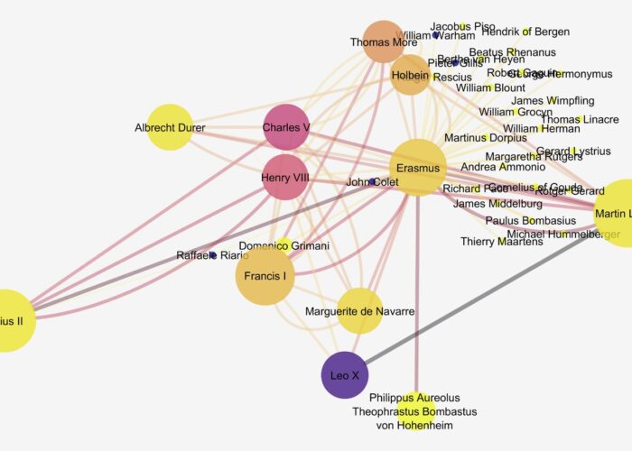
The humanities students had started their visualization process using Palladio again. As in its mapping function, Palladio allows for faceting networks, so at this stage students could see all the connections based on friendship, for example, or isolate how and where clerics fit into the network (Figure 3).

Network of connections between rulers and other figures, visualized by humanities students using Palladio. The network is drab but readable. Nodes sized by number of connections.
Figure 3. Rulers’ network, as visualized using Palladio.

Palladio, however, is a tool for visualization and not for computational analysis. It can’t actually work with edge weights, which as humanists we had found to be such an important and complex issue. So at this point the Collaboratory stepped in again with an introduction to Cytoscape. Cytoscape would allow students to visualize the data, while at the same time furnishing a richer understanding of the underlying mathematical analysis of their networks. Cytoscape was developed for analyzing networks of data in systems biology research, as practitioners in this field were not proficient in the use of R (Shannon 2003). As a platform, however, it is discipline-agnostic: data sets of all types and from varied fields, including the humanities, can be analyzed and visualized, and as a result Cytoscape has become a platform researchers in the humanities are comfortable using.

Students were introduced to Cytoscape on the last day of class, and because it was introduced so late in the semester it was advertised as a way for interested students to build another skill and continue querying the dataset they had thus far created and visualized. Students were fascinated by the insights gained from network analyses possible in Cytoscape, but unavailable in Palladio. In addition, they responded favorably to the powerful suite of options within the visualization environment of Cytoscape. For instance, the appearance of nodes and edges can be customized prior to analysis to isolate certain types of values, or the researcher can use the results of statistical analysis to draw out nodes and connections of greater importance within the network. Also of considerable value is the ability of Cytoscape to parse larger datasets, or focus in on specific nodes to make sense of networks within networks, which can be selected and excised into separate visualizations (Figure 4).

Network of Erasmus’s network, visualized using Cytoscape. Both nodes and edges are colored, and the nodes are sized, so that more information about centrality, edge weight, and clustering coefficient can be seen.
Figure 4. Visualization in Cytoscape version 3.7.2, showing a sub-network centering on Erasmus. The nodes are scaled in correspondence with their betweenness centrality (i.e., how much a node bridges other nodes, indicating a key player in a network) and color-coded according to their clustering coefficient (the degree to which nodes cluster together, moving from light to dark as values increase), and the edges are scaled and color-coded (from light to dark) according to their weight.

Interpreting the Visualized Data

For the humanities students, it was the process and outcome of visualization that made the data intriguing to interpret. But crucially, the data had been created by them, over a period of months, before they could move ahead with visualizing and interpreting it. It was only then that they could see, for instance, that certain thinkers held key positions between powerful figures while others, extremely famous in our day, were on the margins of the main humanist network. Persons who wrote a great deal, be it sermons or conduct books or even letters, might have an enormous “degree centrality” (or number of connections), even while the edge weight of many of their connections was relatively low. Some secondary figures who we would have thought to be quite outside our network assumed rather central positions in it. What, we asked, should we make of these unexpected findings?

Because students had developed the data themselves, and had in the process become very familiar with individual figures within the network, they were better able to interpret the positions of each major person. And because of their previous experience with mapping, they had extra knowledge that informed their interpretation of the network. For instance, a figure who travelled very little—say, Raphael—was hampered in his network-building despite his enormous historical influence. This led the class to question both their art-historical preconceptions—for example, that as a superstar, Raphael would be at the center of a network—but also to pose further humanistic questions that the data could not answer. Network-building was crucial for some figures (Aretino springs to mind) but of limited importance for others. What were the alternatives? Creating, visualizing, and then interpreting data was a means of creating new knowledge and a stimulus to further thinking.  This further thinking was based on humanistic knowledge and posed  questions that would be answered through those means. The shuttle back and forth between quantifiable data and humanistic inquiry through data and its visualization was a hugely fruitful exercise (Drucker 2011).

While producing reasonably well-designed networks, the engineering students studiously avoided connecting networks to a more textual analysis. For example, Figure 5 on the left shows the most common output (from ~90% of the groups) when students were asked to portray the network (an open-ended question). When asked to focus on one or more attributes, every group produced a gender network (Figure 5 on the right). This happened despite the relative abundance of other types of attributes and of group and individual knowledge specific to each of the humanists.

Two visualizations of humanist networks made by engineering students using R. One shows all links between figures, and the other separates out networks of women from those of men.
Figure 5. Humanist networks as visualized in R by engineering students. The full network, and a network distinguished by gender.

Conclusion

Humanists were challenged by the idea of extracting data from context, taking facts (“Do we believe in facts in this class?” one student had asked) and turning them into quantifiable data.  The more they discretized and structured the data, the more resistant they became to compromise, to what they perceived as flattening out the nuance of individual relationships or even professional identities. However, once the data were visualized, class members were well prepared to read those results and return them to a humanist framework. Without caring particularly how the networks themselves looked, they approached the data with a more historically informed eye than did the engineers and moved quickly to interpretation. For instance, they already knew well the limitations on women’s travel and connections—we had read primary sources about women’s education—and so that and other historical aspects of the network were more revealing to them.

Much of engineering pedagogy focuses on design techniques to solve a problem. In the engineering R class, the design techniques were tuned toward learning about visualization (e.g., color ramps), how to code and design visualization features that draw attention to features of the visualization that are relevant to the analytical objective. This approach to the exercise resulted in networks that lacked texture, despite the interesting and often provocative information on the humanists that students gathered prior to the class. Engineers tend to gravitate toward well-produced visualizations (e.g. appropriately labeled axes, titles that are descriptive, etc.) or portray some important design feature. When the data cannot be understood without context, engineers are less able to navigate the tension between accuracy and context.

Engineers are, however, more alert to the subtleties of the visualization itself and how it communicates information about the data. The caveat here is that the engineering students seem unable to bring noted visualization subtleties back to the data context. In other words, they produce beautiful graphics but do not reflexively use these visualizations to think more about the problem from which their data emerges. Alternatively, humanists, even art historians, have not been trained to care about the aesthetic and persuasive presentation of data. Perhaps this is because humanists see themselves as talking mostly with one another, moving rather quickly from visualized data back to humanistic queries and a written argument. It may be that the humanist students need to be formally trained to make their visualizations an integral part of their textual analysis story. It might also be useful to the future of the humanities, particularly a public-facing humanities, if humanists were not only more comfortable with data, but also with using it to speak beyond the confines of the classroom or the pages of a scholarly journal.

Bibliography

Bok, Marten Jan, Harm Nijboer, and Judith Brouwer, eds. n.d. ECARTICO: Linking cultural industries in the early modern Low Countries, ca. 1475 – ca. 1725. Accessed October 17, 2020. http://www.vondel.humanities.uva.nl/ecartico/.

Bradley, Adam James. 2018. “Visualization and the Digital Humanities.” IEEE Computer Graphics and Applications 38, no. 6: 26–38.

Csárdi, Gábor, and Tamás Nepusz. 2006. “The igraph software package for complex network research.” InterJournal Complex Systems: 1695. https://igraph.org.

Crawley, Edward, Johan Malmqvist, Soren Ostlund, Doris Brodeur, and Kristina Edstrom. 2007. “Rethinking Engineering Education.” The CDIO Approach 302: 60–62.

Drucker, Johanna. 2011. “Humanities Approaches to Graphical Display.” Digital Humanities Quarterly 5, no. 1. http://www.digitalhumanities.org/dhq/vol/5/1/000091/000091.html.

Handelman, Matthew. 2015. “Digital Humanities as Translation: Visualizing Franz Rosenzweig’s Archive.” TRANSIT 10, no. 1. https://escholarship.org/uc/item/69d0g81v.

Harley, J.B. 2001. “Maps, Knowledge, and Power” and “Silences and Secrecy: The Hidden Agenda of Cartography in Early Modern Europe.” In The New Nature of Maps, 51–107. Johns Hopkins.

Hicks, Stephanie C., and Rafael A. Irizarry. 2018. “A Guide to Teaching Data Science.” The American Statistician 72, no. 4: 382–391. https://doi.org/10.1080/00031305.2017.1356747.

Humanities + Design. n.d. Accessed October 17, 2020. https://hdlab.stanford.edu/palladio/.

Lincoln, Matthew. 2016. “Social Network Centralization Dynamics in Print Production in the Low Countries, 1550–1750.” International Journal of Digital Art History 2: 134–152.

Manovich, Lev. 2015. “Data Science and Digital Art History.” International Journal for Digital Art History, no. 1 (June). https://doi.org/10.11588/dah.2015.1.21631.

Moretti, Franco. 2011. “Network Theory, Plot Analysis.” New Left Review 68: 80–102.

Muñoz, Trevor. 2013a. “What IS on the Menu? More Work with NYPL’s Open Data, Part One.” http://trevormunoz.com/notebook/2013/08/08/what-is-on-the-menu-more-work-with-nypl-open-data-part-one.html.

———. 2013b. “Refining the Problem — More Work with NYPL’s Open Data, Part Two.”
http://trevormunoz.com/notebook/2013/08/19/refining-the-problem-more-work-with-nypl-open-data-part-two.html.

———. 2014. “Borrow a Cup of Sugar? Or Your Data Analysis Tools? — More Work with NYPL’s Open Data, Part Three.”
http://trevormunoz.com/notebook/2014/01/10/borrowing-data-science-tools-more-work-with-nypl-open-data-part-three.html.

Neff, Gina, Anissa Tanweer, Brittany Fiore-Gartland, and Laura Osburn. 2017. “Critique and contribute: A practice-based framework for improving critical data studies and data science.” Big Data 5, no. 2: 85–97.

Paul Alexander Horton, S.S. Jordan, Steven Weiner, and Micah Lande. 2018. “Project-Based Learning among Engineering Students during Short-Form Hackathon Events.” In ASEE Annual Conference and Exposition, Conference Proceedings.

Pedersen, Thomas Lin. 2020. “A Tidy API for Graph Manipulation.” A Tidy API for Graph Manipulation. Accessed October 17, 2020. https://tidygraph.data-imaginist.com/.

R Core Team. n.d. Accessed October 17, 2020. https://www.r-project.org/about.html.

Rawson, Katie, and Trevor Muñoz. 2016. “Against Cleaning,” Curating Menus, July 7. http://www.curatingmenus.org/articles/against-cleaning/.

Savage, Richard, Katherine Chen, and Linda Vanasupa. 2008. “Integrating Project-Based Learning throughout the Undergraduate Engineering Curriculum.” Journal of STEM Education 8, no. 3.

Shannon, Paul. 2003. “Cytoscape: A Software Environment for Integrated Models of Biomolecular Interaction Networks.” Genome Research 13: 2498–2504.

Wickham, Hadley. “A Layered Grammar of Graphics.” Journal of Computational and Graphical Statistics 19, no. 1 (January 2010): 3–28. https://doi.org/10.1198/jcgs.2009.07098.

Acknowledgments

Thanks to Rebecca Levitan, who originally suggested to Elizabeth Honig the idea for this course, and who acted as her teaching assistant when she taught the class at UC Berkeley.

About the Author

Elizabeth Alice Honig is Professor of Northern European Art at the University of Maryland. She is the author of, most recently, Pieter Bruegel and the Idea of Human Nature (Reaktion, 2019), while her current research is about the experience of captivity in renaissance Europe. She curates the websites janbrueghel.net, pieterbruegel.net, and brueghelfamily.net, and her work in digital art history deriving from those projects has focused on mapping patterns of similarity between pictures produced in the Brueghel workshop network.

Deb Niemeier is the Clark Distinguished Chair in Energy and Sustainability at the University of Maryland, College Park and a professor in the Department of Civil and Environmental Engineering. She works with sociologists, planners, geographers, and education faculty to study the formal and informal governance processes in urban landscapes and the risks and disparities associated with outcomes in the intersection of finance, housing, infrastructure and environmental hazards. She is an AAAS Fellow, a Guggenheim Fellow, and a member of the National Academy of Engineering.

Christian Cloke specializes in the archaeology of the ancient Mediterranean world, employing a range of digital methods and technologies to do so. In service to his archaeological fieldwork (in Italy, Jordan, Armenia, Albania, and Greece), he builds and works with custom databases, Geographical Information Systems (GIS), and a wide array of imaging techniques. He holds a PhD in Classical Archaeology from the University of Cincinnati and is currently the associate director of the Michelle Smith Collaboratory for Visual Culture at the University of Maryland, College Park, where he works on varied digital research and pedagogical projects with students and faculty.

Quint Gregory specializes in seventeenth-century Dutch and Flemish art, as well as museum theory and practice. He is the creator and director of the Michelle Smith Collaboratory for Visual Culture, a center within the University of Maryland’s Department of Art History and Archaeology committed to supporting students, faculty, staff, and members of the broader community who are interested in adopting digital humanities methods and tools in their work and practice. He is especially interested in using offline and online platforms and skills in the causes of social and racial justice and to repair our relationship with the planet.

Spiral of books
0

Supporting Data Visualization Services in Academic Libraries

Abstract

Data visualization in libraries is not a part of traditional forms of research support, but is an emerging area that is increasingly important in the growing prominence of data in, and as a form of, scholarship. In an era of misinformation, visual and data literacy are necessary skills for the responsible consumption and production of data visualizations and the communication of research results. This article summarizes the findings of Visualizing the Future, which is an IMLS National Forum Grant (RE-73-18-0059-18) to develop a literacy-based instructional and research agenda for library and information professionals with the aim to create a community of praxis focused on data visualization. The grant aims to create a diverse community that will advance data visualization instruction and use beyond hands-on, technology-based tutorials toward a nuanced, critical understanding of visualization as a research product and form of expression. This article will review the need for data visualization support in libraries, review environmental scans on data visualization in libraries, emphasize the need for a focus on the people involved in data visualization in libraries, discuss the components necessary to set up these services, and conclude with the literacies associated with supporting data visualization.

Introduction

Now, more than ever, accurately assessing information is crucially important to discourse, both public and academic. Universities play an important role in teaching students how to understand and generate information. But at many institutions, learning how to effectively communicate findings from the research process is considered idiosyncratic for each field or the express domain of a particular department (e.g. applied mathematics or journalism). Data visualization is the use of spatial elements and graphical properties to display and analyze information, and this practice may follow disciplinary customs. However, there are many commonalities in how we visualize information and data, and the academic library, at the heart of the university, can play a significant role in teaching these skills. In the following article, we suggest a number of challenges in teaching complex technological and methodological skills like visualization and outline a rationale for, and a strategy to, implement these types of services in academic libraries. However, the same argument can be made for any academic support unit, whether college, library, or independently based.

Why Do We Need Data Visualization Support in Libraries?

In many ways the argument for developing data visualization services in libraries mirrors the discussion surrounding the inclusion and extension of digital scholarship support services throughout universities. In academic settings, libraries serve as a natural hub for services that can be used by many departments and fields. Often, data visualization (like GIS or text-mining) expertise is tucked away in a particular academic department making it difficult for students and researchers from different fields to access it.

As libraries already play a key role in advocacy for information literacy and ethics, they may also serve as unaffiliated, central places to gain basic competencies in associated information and data skills. Training patrons how to accurately analyze, assess, and create data visualizations is a natural enhancement to this role. Building competencies in these areas will aid patrons in their own understanding and use of complex visualizations. It may also help to create a robust learning community and knowledge base around this form of visual communication.

In an age of “fake news” and “post-truth politics,” visual literacy, data literacy, and data visualization have become exceedingly important. Without knowing the ways that data can be manipulated, patrons are not as capable of assessing the utility of the information being displayed or making informed decisions about the visual story being told. Presently, many academic libraries are investing resources in data services and subscriptions. Training students, faculty and researchers in ways of effectively visualizing these data sources increases their use and utility. Finally, having data visualization skills within the library also comes with an operational advantage, allowing more effective sharing of data about the library.

We are the Visualizing the Future Symposia, an Institute of Museum and Library Services National Forum Grant-funded group created to develop instructional and research materials on data visualization for library professionals and a community of practice around data visualization. The grant was designed to address the lack of community around data visualization in libraries. More information about the grant is available at the Visualizing the Future website. While we have only included the names of the three main authors; this work was a product of the work of the entire cohort, which includes: Delores Carlito, David Christensen, Ryan Clement, Sally Gore, Tess Grynoch, Jo Klein, Dorothy Ogdon, Megan Ozeran, Alisa Rod, Andrzej Rutkowski, Cass Wilkinson Saldaña, Amy Sonnichsen, and Angela Zoss.

We are currently halfway through our grant work and, in addition to providing publicly available resources for teaching visualization, are also in the process of synthesizing and collecting shared insights into developing and providing data visualization instruction. This present article represents some of the key findings of our grant work.

Current Environment

In order to identify some broad data visualization needs and values, we reviewed three environmental scans. The first was carried out by Angela Zoss, who is one of the co-investigators on the grant, at Duke University (2018) based on a survey that received 36 responses from 30 separate institutions. The second, by S.K. Van Poolen (2017), focuses on an overview of the discipline and includes results from a survey of Big Ten Academic Alliance institutions and others. And the final report by Ilka Datig for Primary Research Group Inc (2019) provides a number of in-depth case studies. While none of the studies claim to provide an exhaustive list of every person or institution providing data visualization support in libraries, in combination they provide an effective overview of the state of the field.

Institutions

The combined environmental scans represent around thirty-five institutions, primarily academic libraries in the United States. However, the Zoss survey also includes data from the Australian National University, a number of Canadian universities, and the World Bank Group. The universities represented vary greatly in size and include large research institutions, such as the University of California Los Angeles, and small liberal arts schools, such as Middlebury and Carleton College.

Some appointments were full-time, while others reported visualization as a part of other job responsibilities. In the Zoss survey, roughly 33% of respondents reported the word “visualization” in their job title.

Types of activities

The combined scans include a variety of services and activities. According to the Zoss survey, the two most common activities (i.e. activities that the most respondents said they engaged in) were providing consultations on visualization projects and giving short workshops or lectures on data visualization. After that other services offered include: providing internal data visualization support for analyzing and communicating library data; training on visualization hardware and spaces (e.g. large scale visualization walls, 3D CAVEs); and managing such spaces and hardware.

Resources needed

These three environmental scans also collectively identify a number of resources that are critical for supporting data visualization in librarians. One of the key elements is training for new librarians, or librarians new to this type of work, on visualization itself and teaching/consulting on data visualization. They also mention that resources are required to effectively teach and support visualization software, including access to the software, learning materials, but also ample time is required for librarians to learn, create and experiment themselves so that they can be effective teachers. Finally they outline the need for communities of practice across institutions and shared resources to support visualization.

It’s About the People

In all of our work and research so far, one important element seems worth stressing and calling out on its own: It is the people who make data visualization services work. Even visualization services focused on advanced instructional spaces or immersive and large scale displays, require expertise to help patrons learn how to use the space, maintain and manage technology, schedule events to create interest, and, especially in the case of advanced spaces, create and manage content to suggest the possibilities. An example of this is the North Carolina State University Libraries’ Andrew W. Mellon Foundation-funded project “Immersive Scholar” (Vandegrift et al.), which brought visiting artists to produce immersive artistic visualization projects in collaboration with staff for the large scale displays at the library.

We encourage any institution that is considering developing or expanding data visualization services to start by defining skill sets and services they wish to offer rather than the technology or infrastructure they intend to build. Some of these skills may include programming, data preparation, and designing for accessibility, which can support a broad range of services to meet user needs. Unsupported infrastructure (stale projects, broken technology, etc.) is a continuing problem in providing data visualization services, and starting any conversation around data visualization support by thinking about the people needed is crucial to creating sustainable, ethical, and useful services.

As evidenced by both the information in the environmental scans and the experiences of Visualizing the Future fellows, one of the most consistently important ways that libraries are supporting visualization is through consultations and workshops that span technologies from Excel to the latest virtual reality systems. Moreover, using these techniques and technologies effectively requires more than just technical know-how; it requires in-depth considerations of design aesthetics, sustainability, and the ethical use and re-use of data. Responsible and effective visualization design requires a variety of literacies (discussed below), critical consideration of where data comes from, and how best to represent data—all elements that are difficult to support and instruct without staff who have appropriate time and training.

Services

Data visualization services in libraries exist both internally and externally. Internally, data visualization is used for assessment (Murphy 2015), marketing librarians’ skills and demonstrating the value of libraries (Bouquin and Epstein 2015), collection analysis (Finch 2016), internal capacity building (Bouquin and Epstein 2015), and in other areas of libraries that primarily benefit the institution. 

External services, in contrast, support students, faculty, researchers, non-library staff, and community members. Some examples of services include individual consultations, workshops, creating spaces for data visualization (both physical and virtual), and providing support for tools. Some libraries extend visualization services into additional areas, like the New York University Health Sciences Library’s “Data Visualization Clinic,” which provides a space for attendees to share and receive feedback on their data visualizations from their peers (Zametkin and Rubin 2018), and the North Carolina State University Libraries’ Coffee and Viz Series, “a forum in which NC State researchers share their visualization work and discuss topics of interest” that is also open to the public (North Carolina State University Libraries 2015).

In order to offer these services, libraries need staff who have some interest and/or experience with data visualization. Some models include functional roles, such as data services librarians or data visualization librarians. These functional librarian roles ensure that the focus is on data and data visualization, and that there is dedicated, funded time available to work on data visualization learning and support. It is important to note that if there is a need for research data management support, it may require a position separate from data visualization. Data services are broad and needs can vary, so some assessment on the community’s greatest needs would help focus functional librarian positions. 

Functional librarian roles may lend themselves to external facing support and community building around data visualization outside of internal staff. A needs assessment can help identify user-centered services, outreach, and support that could help create a community around data visualization for students, faculty, researchers, non-library staff, and members of the public. Having a community focused on data visualization will make sure that services, spaces, and tools are utilized and meeting user needs. 

There is also room to develop non-librarian, technical data visualization positions, such as data visualization specialists or tool-specific specialist positions. These positions may not always have an outreach or community building focus and may be best suited for internal library data visualization support and production. Offering data visualization support as a service to users is separate from data visualization support as a part of library operations, and the decision on how to frame the positions can largely be determined by library needs. 

External data visualization services can include workshops, training sessions, consultations, and classroom instruction. These services can be focused on specific tools, such as Tableau, R, Gephi, and so on. They can be focused on particular skills, such as data cleaning and normalizing, dashboard design, and coding. They can also address general concerns, such as data visualization transparency and ethics, which may be folded into all of the services.

There are some challenges in determining which services to offer:

  • Is there an interest in data visualization in the community? This question should be answered before any services are offered to ensure services are utilized. If there are any liaison or outreach librarians at your institution, they may have deeper insight into user needs and connections to the leaders of their user groups.
  • Are there staff members who have dedicated time to effectively offer these services and support your users?
  • Is there funding for tools you want to teach?
  • Do you have a space to offer these services? This does not have to be anything more complicated than a room with a projector, but if these services begin to grow, it is important to consider the effectiveness of these services with a larger population. For example, a cap on the number of attendees for a tool-specific workshop might be needed to ensure the attendees receive enough individual support throughout the session.

If all of these areas are not addressed, there will be challenges in providing data visualization services and support. Successful data visualization services have adequate staffing, access to the required tools and data, space to offer services (not necessarily a data wall or makerspace, but simply a space with sufficient room to teach and collaborate), and community that is already interested and in need of data visualization services. 

Literacies

The skills that are necessary to provide good data visualization services are largely practical. We derive the following list from our collective experience, both as data visualization practitioners and as part of the Visualizing the Future community of practice. While the following list is not meant to be exhaustive, these are the core competencies that should be developed to offer data visualization services, either from an individual or as part of a team. 

A strong design sense: Without an understanding of how information is effectively conveyed, it is difficult to create or assess visualizations. Thus, data visualization experts need to be versed in the main principles of design (e.g. Gestalt, accessibility) and how to use these techniques to effectively communicate visual information.

Awareness of the ethical implications of data visualizations: Although the finer details are usually assessed on a case by case basis, a data visualization expert should be able to interpret when a visualization is misleading and have the agency to decline to create biased products. This is a critical part of enabling the practitioner to be an active partner in the creation of visualizations. 

An understanding, if not expertise, in a variety of visualization types: Network visualizations, maps, glyphs, Chernoff Faces, for example. There are many specialized forms of data visualization and no individual can be an expert in all of them, but a data visualization practitioner should at least be conversant in many of them. Although universal expertise is impractical, a working knowledge of when particular techniques should be used is a very important literacy.

A similar understanding of a variety of tools: Some examples include Tableau, PowerBI, Shiny, and Gephi. There are many different tools in current use for creating static graphics and interactive dashboards. Again, universal expertise is impractical, but a competent practitioner should be aware of the tools available and capable of making recommendations outside their expertise.

Familiarity with one or more coding languages: Many complex data visualizations happen at the command line (at least partially) so there is a need for an effective practitioner to be at least familiar with the languages most commonly used (likely either R or Python). Not every data visualization expert needs to be a programmer, but familiarity with the potential for these tools is necessary.

Conclusion

The challenges inherent in building and providing data visualization instruction in academic libraries provide an opportunity to address larger pedagogical issues, especially around emerging technologies, methods, and roles in libraries and beyond. In public library settings, the needs for services may be even greater, with patrons unable to find accessible training sources when they need to analyze, assess, and work with diverse types of data and tools. While the focus of our grant work has been on data visualization, the findings reflect the general difficulties of balancing the need and desire to teach tools and invest in infrastructure with the value of teaching concepts and investing in individuals. It is imperative that work teaching and supporting emerging technologies and methods focus on supporting the people and the development of literacies rather than just teaching the use of specific tools. To do so requires the creation of spaces and networks to share information and discoveries.

Bibliography

Bouquin, Daina and Helen-Ann Brown Epstein. 2015. “Teaching Data Visualization Basics to Market the Value of a Hospital Library: An Infographic as One Example.” Journal of Hospital Librarianship 15, no. 4: 349–364. https://doi.org/10.1080/15323269.2015.1079686.

Datig, Ilka. 2019. Profiles of Academic Library Use of Data Visualization Applications. New York: Primary Research Group Inc.

Finch, Jannette L. and Angela R. Flenner. 2016. “Using Data Visualization to Examine an Academic Library Collection.” College & Research Libraries 77, no. 6: 765–778. https://doi.org/10.5860/crl.77.6.765.

“Immersive Scholar.” Accessed June 26, 2020. https://www.immersivescholar.org/.

LaPolla, Fred Willie Zametkin and Denis Rubin. 2018. “The “Data Visualization Clinic”: a library-led critique workshop for data visualization.” Journal of the Medical Library Association 106, no. 4: 477–482. https://doi.org/10.5195/jmla.2018.333.

Murphy, Sarah Anne. 2015. “How data visualization supports academic library assessment.” College & Research Libraries News 76, no. 9: 482–486. https://doi.org/10.5860/crln.76.9.9379.

North Carolina State University Libraries. “Coffee & Viz.” Accessed December 4, 2019. https://www.lib.ncsu.edu/news/coffee–viz

Van Poolen, S.K. 2017. “Data Visualization: Study & Survey.” Practicum study at the University of Illinois. 

Zoss, Angela. 2018. “Visualization Librarian Census.” TRLN Data Blog. Last modified June 16, 2018. https://trln.github.io/data-blog/data%20visualization/survey/visualization-librarian-census/.

About the Authors

Negeen Aghassibake is the Data Visualization Librarian at the University of Washington Libraries. Her goal is to help library users think critically about data visualization and how it might play a role in their work. Negeen holds an MS in Information Studies from the University of Texas at Austin.

Matthew Sisk is a spatial data specialist and Geographic Information Systems Librarian based in Notre Dame’s Navari Family Center for Digital Scholarship. He received his PhD in Paleolithic Archaeology from Stony Brook University in 2011 and has worked extensively in GIS-based archaeology and ecological modeling.  His research focuses on human-environment interactions, the spatial scale environmental toxins and community-based research.

Justin Joque is the Visualization Librarian at the University of Michigan. He completed his PhD in Communications and Media Studies at the European Graduate School and holds a Master of Science in Information (MIS) from the University of Michigan.


Two adults sitting side-by-side looking at their laptop screens.
0

Data Literacy in Media Studies: Strategies for Collaborative Teaching of Critical Data Analysis and Visualization

Abstract

This essay addresses challenges of teaching critical data literacy and describes a shared instruction model that encourages undergraduates at a large research university to develop critical data literacy and visualization skills. The model we propose originated as a collaboration between the library and an undergraduate media and cultural program, and our specific intervention is the development of a templated data-visualization instruction session that can be taught by many people each semester. The model we describe has the dual purpose of supporting the major and serving as an organizational template, a structure for building resources and approaches to instruction that supports librarians as they develop replicable pedagogical strategies, including those informed by a cultural critical lens. We intend our discussion for librarians who are teaching in an academic setting, and particularly in contexts involving large-scale or programmatic approaches to teaching. The discussion is also useful to faculty in the disciplines who are considering partnering with the library to interject aspects of data or information literacy into their program.

Learning that emphasizes data literacy and encourages analysis within multimedia visualization platforms is a growing trend in higher education pedagogy. Because data as a form of evidence holds a privileged position in our cultural discourse, interdisciplinary undergraduate degree programs in the social sciences, humanities, and related disciplines increasingly incorporate data visualization, thus elevating data literacy alongside other established curricular outcomes. When well-conceived, critical data literacy instruction engenders a productive blend of theory and practice and positions students to examine how race-based bigotry, gender bias, colonial dominance, and related forms of oppression are implicated in the rhetoric of data analysis and visualization. Students can then create visualizations of their own that establish counternarratives or otherwise confront the locus of power in society to present alternative perspectives.

As scholarship in media, communications, and cultural studies pedagogy has established, data visualizations “reflect and articulate their own particular modes of rationality, epistemology, politics, culture, and experience,” so as to embody and perpetuate “ways of knowing and ways of organizing collective life in our digital age” (Gray et al. 2016, 229). Catherine D’Ignazio and Lauren F. Klein (2020, 10) explain this dialectic more pointedly in Data Feminism, arguing, “we must acknowledge that a key way power and privilege operate in the world today has to do with the word data itself,” especially the assumptions and uses of it in daily life. Critical instruction positions undergraduates to question how data, in its composition, analysis, and visualization, can often perpetuate an unjust socio-cultural status quo. Undergraduates who are introduced to frames for interpreting culture also need to be exposed to tools—literal and conceptual—that help them critique data visualizations. The goal is to enable a holistic critical literacy, through which students can find data, structure it with a research question in mind, and produce accurate, inclusive visualizations.

However, data instruction is challenging, and planning data learning within the context of an existing course requires an array of skills. Effective data visualization pedagogy demands that instructors locate example datasets, clean data to minimize roadblocks, and create sample visualizations to initiate student engagement with first-order cultural-critical concepts. These steps, a substantial time investment, are necessary for teaching that enables data novices to contend with the mechanics of data manipulation while remaining focused on social and political questions that surround data. When charged with developing data visualization assignments and instructional assistance, faculty often seek the support and expertise of librarians and educational technologists, who are located at the nexus of data learning within the university (Oliver et al. 2019, 243).

Even in cases where librarians and instructional support staff are well-positioned to assist, the demand for teaching data visualization can be overwhelming. It can become burdensome to deliver in-person instruction to cohort courses with a large student enrollment, across many sections and in successive semesters. In order to initiate and maintain an effective, multidisciplinary data literacy program, teaching faculty, librarians, and educational technologists must establish strong teaching partnerships that can be replicated and reimagined in multiple contexts.

This essay addresses some challenges of teaching critical data literacy and describes a shared instruction model that encourages undergraduates at a large research university to develop critical data literacy and visualization skills. Although anyone engaged in teaching critical data literacy can draw from this essay, we intend our discussion for librarians who are teaching in an academic setting, and particularly in contexts involving large-scale or programmatic approaches to teaching. In addition, we believe our essay is particularly pertinent to those designing program curricula within discipline-specific settings, as our ideas engage questions of determining scale, scope, and learning outcomes for effective undergraduate instruction.

The teaching model we propose originated as a collaboration between the New York University Libraries and NYU’s Media, Culture, and Communications (MCC) department, and our specific intervention is the development of an assignment involving data visualization for a Methods in Media Studies (MIMS) course. The distributed teaching model we describe has the dual purpose of supporting the major and serving as an organizational template, a structure for building resources and approaches to instruction that supports librarians as they develop replicable pedagogical strategies, including those informed by a cultural critical lens. In this regard, we believe that collaborative instruction empowers librarians and faculty from many disciplines to develop their own data literacy competency while growing as teachers. And, it enables the library to affect undergraduate learning throughout the university.

There is already an extensive body of research about the role of critical data literacy instruction, including critical approaches to the technical elements of data visualization (Drucker 2014; Sosulski 2019; Engebresten and Kennedy 2020). While we draw from that scholarly discussion, we focus instead on the upshot of programmatic, extensible teaching partnerships between libraries and discipline-specific undergraduate programs. Along the way, we engage two crucial questions: What is the value of creating replicable lesson plans and materials, to be taught by an array of library staff repeatedly? How can the librarians who design these materials strike a balance between creating a step-by-step lesson plan that library instructors follow and structuring a guided lesson that is flexible and capacious enough for instructors to experience meaningful teaching encounters of their own?

Data Literacy in Undergraduate Education

Several curricular initiatives and assessment rubrics in higher education pedagogy recognize the need for students to develop fluidity with digital media and quantitative reasoning, a precursor to effective data visualization. In 2005, Association of American Colleges and Universities (AAC&U) began a decade-long initiative called Liberal Education and America’s Promise (LEAP), which resulted in an inventory of 21st century learning outcomes for undergraduate education. Quantitative literacy is on the list of outcomes (Association of American Colleges and Universities 2020). A corresponding AAC&U rubric statement asserts that “[v]irtually all of today’s students … will need basic quantitative literacy skills such as the ability to draw information from charts, graphs, and geometric figures, and the ability to accurately complete straightforward estimations and calculations.” The rubric urges faculty to develop assignments that give students “contextualized experience” analyzing, evaluating, representing, and communicating quantitative information (Association of American Colleges and Universities 2020). The substance of the LEAP initiative informed the development of our collaborative teaching model, for it allowed us to ground our curricular interventions within larger university curricular trends that had already emerged.

Although quantitative literacy is important, there are other structures for teaching that see data fluidity and visualization as being tied to larger information seeking practices. For this reason, we also turned to the Framework for Information Literacy for Higher Education, developed by the Association of College and Research Libraries (ACRL). The Framework embraces the concept of metaliteracy, which promotes metacognition and a critical examination of information in all its forms and iterations, including data visualization. One of the six frames posed by the document, “Information Creation as a Process,” closely aligns with data competency, including data visualization. This frame emphasizes that the information creation process can “result in a range of information formats and modes of delivery” and that the “unique capabilities and constraints of each creation process as well as the specific information need determine how the product is used.” Within the Framework, learning is measured according to a series of “dispositions,” or knowledge practices that are descriptive behaviors of those who have learned a concept. Here, the Framework is apropos, as students who see information creation as a process “value the process of matching an information need with an appropriate product” and “accept ambiguity surrounding the potential value of information creation expressed in emerging formats or modes” (ACRL 2016). The Framework recognizes that evolved undergraduate curricula must incorporate active, multimodal forms of analysis and production that synthesize information seeking, evaluation, and knowledge creation.

Other organizations and disciplines also advocate for quantitative literacy in the undergraduate curriculum. For instance, Locke (2017) discusses the relevance of data in the humanities classroom and points to ways undergraduate digital humanities projects can incorporate data analysis and visualization to extend inquiry and interpretation. And Beret and Phillips (2016, 13) recommend that every journalism degree program provide a foundational data journalism course, because interdisciplinary data instruction cultivates professionals “who understand and use data as a matter of course—and as a result, produce journalism that may have more authority [or] yield stories that may not have been told before.” In sum, LEAP, the ACRL Framework, and movements for data literacy in the disciplines influenced the Libraries’ collaboration with the Media and Cultural Communications department, and this informed the effort to create and support a meaningful learning experience for students in this major.

Learning-by-Teaching: Structured, Programmatic Instruction and Libraries

Our collaborative model evolved with the conviction that structured, programmatic teaching can foster professional growth for librarians and library technologists. In addition to creating impactful learning for students, programmatic teaching provides a structure that allows for educators to expand the contexts in which they can teach. In many cases, librarians who specialize in information literacy are less adroit regarding the concepts and mechanics of working with data. Teaching data as a form of information, then, necessarily requires a baseline technical expertise.

Several studies published within the past decade indicate that learning with the intent to teach can lead to better understanding, regardless of the content in question. One such study finds that learners who were expecting to teach the material to which they were being introduced show better acquisition than learners who were expecting only to take a test, theorizing that learning-by-teaching pushes the learner beyond essential processing to generative processing, which involves organizing content into a personally meaningful representation and integrating it with prior knowledge (Fiorella and Mayer 2013, 287). Another study finds that learners who were expecting to teach show better organizational output and recall of main points than those who were not expecting to teach, which suggests that learners who anticipate teaching tend to put themselves “into the mindset of a teacher,” leading them to use preparation techniques—such as concept organizing, prioritizing, and structuring—that double as enhancements to a learner’s own encoding processes (Nestojko, et al. 2014, 1046). This evidence boosts our belief that learning-by-teaching is a good strategy for librarians to build foundational data literacy skills, and it informed the development of our program.

Development and Implementation of the Collaborative Teaching Model

Situated in NYU’s Steinhardt School of Culture, Education, and Human Development, the MCC program covers global and transcultural communication, media institutions and politics, and technology and society, among other related fields. MCC program administrators, who were looking to incorporate practical skills into what had previously been a theory-heavy degree, approached the library to co-develop instructional content that would expose students to applied data literacy and multimedia visualization platforms. The impetus for the program administrators to reach out to the library was their participation in a course enhancement grant program, which testifies to the lasting effects that school or university-based curriculum initiatives can have on undergraduate learning. In this case, what emerged was a sustained teaching partnership. Though the support was refined over time, its core remained constant: individual sections of a media studies methods class would attend a librarian-led class session that prepares students to evaluate data and construct a visualization exploring some element of media and political economy, grounded in an assigned reading that asserts ownership of or access to media and communications infrastructure is intrinsically related to the well-being and development of countries around the world.

The class is a first-year requirement in Media, Culture, and Communication, one of NYU’s largest majors. The course tends to be taught by beginning doctoral students, and is by design a highly fluid teaching environment. In early iterations of library support, we designed a module that attempted to have students perform a range of analysis and visualization tasks. Students were introduced to basic socio-demographic datasets and were invited to create a visualization that investigates a research question of their choosing, provided that the question adhered generally to the themes of media and political economy. The assignment as initially constituted expected the student to frame a question, find a dataset and clean it, choose a visualization platform, and generate one or more visualizations that imply a causal relationship between variables that they had identified.

The learning outcomes and assignment developed in this initial sequence turned out to be too ambitious. The assignment had fairly loose parameters, which proved problematic, and the 75-minute class session could not provide sufficient preparation. Students struggled with developing viable research questions, finding data sets, and cleaning the data (the multivalent process of normalizing, reshaping, redacting, or otherwise configuring data to be ingested and visualized in online platforms without errors). Also, we had pointed them to an overwhelming array of data analysis software tools, including ESRI’s ArcMap, Carto, Plot.ly, Raw, and Tableau. We found they had great difficulty with both selecting a tool and learning how to use it, in addition to the connected process of finding a dataset to visualize within it. The Libraries tried to accommodate, but ultimately realized that the module needed significant adjustment going forward, especially since the MCC department decided to expand the project to include up to 10 sections of the course each semester.

Besides struggling with research questions, datasets, and tools, it was also apparent that students had trouble connecting this work to the broader ideas of media and political economy intrinsic to the assignment. Informed by these first-round outcomes, we came together again to revise the instructional content and assignment. Taking our advice into account, the MCC teaching faculty and program administrators refined the learning outcomes as such:

  • Become familiar with the principles, concepts, and language related to data visualization
  • Investigate the context and creation of a given dataset, and think critically about the process of creating data
  • Emphasize how online visualization platforms allow users to make aesthetic choices, which are part and parcel of the rhetoric of visualization

The librarians also created a student-facing online guide as a home base for the module and decided to distribute the teaching load by inviting Data Services specialists from the Libraries’ Data Services department to help teach the library sessions (MCC-UE 2019). And to provide a better lead-in to the library session, a preparatory lesson plan was developed for the MCC instructors to present in the class prior to the library visit.

After further feedback from program administrators and consideration, we inserted a scaffolding component into the library session lesson plan to better prepare students for their assignment. The component involved comparing four sample visualizations created from the very same data, and it included questions for eliciting a discussion about the origins and constructions of data. Scenario-based exercises for creating visualizations in Google sheets and Carto were also incorporated into the lesson, giving students practice before tackling the actual assignment. The assignment was also redesigned with built-in support. Students would no longer be expected to find their own dataset and attempt to clean extracted data, tasks that had caused them frustration and anxiety. Instead, they would choose from a handful of prescribed and pre-cleaned datasets. Data Services staff worked to remediate a set of interesting datasets to anticipate the kind of visualization students would attempt. Also, rather than having to choose from a confusing array of data visualization tools, they would be directed to use Google sheets or Carto only. Assuming the task of identifying, cleaning, and preparing datasets meant extra front-loaded work on the Libraries’ part, but it also freed students to focus on the higher order activity of investigating the relationship between visualizing information and examining social or political culture.

Instructional Support from a Wide Community of Teachers: Growing a Base

Another issue at hand was the strain the project was having on the members of the Data Services team and Communications Librarian, who taught all ten library sessions that were offered each semester. To achieve sustainability going forward, a broader group of librarians would be needed to help teach the library sessions. Moving forward, the Data and Communications librarians decided to recruit other NYU librarians to participate as instructors. Most of the recruits were data novices, but they viewed the invitation as an opportunity to learn data basics, expand their instruction repertoire, and strengthen their teaching practice. Calling on colleagues to teach outside their comfort zone is a big ask, one that requires strong support and administrative buy-in. So recruits were provided with a thorough lesson plan, a comprehensive hands-on training session, and the opportunity to shadow more experienced instructors before teaching the module solo (MCC-UE 2019).

By including a more robust roster of instructors, the structure also gave us the ability to further tie our lesson to what was planned in the MIMS curriculum. A new reading was chosen by the media studies faculty, “Erasing Blackness: the media construction of ‘race’ in Mi Familia, the first Puerto Rican situation comedy with a black family,” by Yeidy Rivero. The article grounds the students’ exploration of the relationship between media and political economy within the MIMS class, and it also provides a good entry point to explore critical data literacy concepts. According to Rivero, the show Mi Familia, deliberately represents a “flattened,” racially homogeneous “imagined community” of lower-middle class black family life that erases Puerto Rico’s hybrid racial identity. This flattening, Rivero argues, is part and parcel of multidimensional efforts to “Americanize” Puerto Rico and align its culture with the interests of the U.S. Furthermore, since the Puerto Rican media is regulated by the U.S. Federal Communication Commission (FCC) and owned by U.S. corporations, Puerto Ricans themselves had little recourse to question the portrayal of constructed racial identities in the mainstream culture (Rivero 2002).

Students were instructed to complete the reading prior to the library session. During the session, the library instructor referred to the reading and introduced a dataset with particular relevance to it. The instructor engaged students in a discussion about the importance of reviewing the dataset description and variables in order to form a question that can be reasonably asked of the data. With students following along, the instructor then modeled how to use Google sheets to manipulate the data and create a visualization that speaks to the question.

The selected dataset resulted from a study of the experiences and expressions of racial identity by young adults who lived in first and second-generation immigrant households in the New York City area during the late 1990s (Mollenkopf, Kasinitz, and Waters 2011). The timeframe of this article and the dataset line up well. The sitcom mentioned in the article first aired in 1994, but had been picked up in Telemundo’s NYC area affiliates by the late 1990s, so it is highly possible that this sitcom would have been on the air in the homes of study participants. The dataset, which is aggregated at the person level, includes variables about participants’ family and home context, patterns of socialization, exposure to media, and sense of self. In order to foreground the analytic process of looking at data, ascertaining its possibilities, and gesturing at potential visualizations, we created a simplified version of the raw data, which omits some columns and imputes other variables for easier use. To accompany this dataset, we also created some simple data visualizations in Google Sheets, ArcGIS Online, and Tableau, which are intentionally “impoverished,” thus designed to elicit discussion from students about the claims made by the visualizations.

Undoubtedly, these adjustments to the module led to students performing better on the assignment. Improvements to the lead-in session provided by the MCC instructors ensured that the students were prepared with context for the library workshop and an understanding of why the library was supporting the assignment. Basing the assignment on a specific article made it possible for librarians to model a way of bridging the theoretical concepts of the class to a question that could be asked of data. There was also more time for two pair-and-share discussions and group work in Google Sheets and Carto, which addressed a fundamental and recurring frustration in the students’ understanding of the assignment: the ability to ask an original question of a dataset, and to ask a question that would address a larger theme of media and political economy.

From the standpoint of instructors in NYU Libraries, we also found that the model provided a strengthened group of teachers. Several people who worked with sections of MIMS contributed ideas to the instructor manual and created ancillary slides and examples that are tailored to their own interest in the claims about racial and national identity that the Rivero article makes. For us, this flexibility is an important element of the collaborative teaching model; it offers both the structure for those who are new to data analysis and visualization to teach effectively, yet it also contains enough pathways for discussion to be meaningful and personal, should individual instructors want to branch out in their own teaching.

Conclusion

Despite being familiar with technology, many students arrive at college without a holistic ability to interpret, analyze, and visualize data. Educators now recognize the need to provide foundational data literacy to undergraduates, and many teaching faculty look to the library for support in instructional design and implementation. In this article, we recognize that creating integrated, meaningful data learning lessons is a complex task, yet we believe that the collaborative teaching model can be applied in various disciplinary contexts. Sustainability of this model depends on equipping a wide range of librarians with necessary data literacy skills, which can be achieved with a learning-by-teaching approach. After developing a teaching model that calls upon the expertise of teachers across the library, we gained some important insights on maintaining the communication and support to make it sustainable, building the workshop itself, and balancing the labor that all of this requires.

Good communication and organization between the MCC department and librarians was also key in maintaining the scalability of this instruction program. Given the heavy rotation of new teachers on both the library and MCC side, we needed to provide module content that was streamlined and assignment requirements that were clear cut in order to quickly on-board teachers to the goals, process, and output of the module. When recruiting library instructors, we emphasized that volunteers will not only build their data literacy skill set, but will also expand their pedagogical knowledge and teaching range. Finally, to ensure that volunteer instructors have a successful experience, we also provide support mechanisms such as a step-by-step lesson plan, thorough train-the-trainer sessions, opportunities to observe and team-teach before going solo, and a point person to contact with questions and concerns.

There is much hidden labor in all of this work. Robust student support for the course was also crucial, and really took off when the MCC department created a dedicated student support team from graduate assistants in the program. On the library side, communicating regularly with the MCC department, assessing and revising the learning objects, organizing and hosting train the trainer sessions, and scheduling all of the library visits takes many hours of time and planning. This work should not be overlooked when considering a program of this scale.

A collaboration at this level can provide rich data literacy at scale to undergraduates, while also offering the chance for instructors in the library and in disciplinary programs to develop their own skills in numeracy and data visualization as they learn by teaching. Through time, effort, and dedicated maintenance, a program like this becomes a successful partnership that has a broad and demonstrated impact on student learning, strengthens ties between the library and the departments we serve, and allows librarians and data services specialists the opportunity to learn and grow from each other.

Related to the learning objects themselves, we had the most success when we matched the scope of the assignment closely with the time and support the students would have to complete it, and preparing a small selection of data sets for the students in advance was very helpful in this regard. We also built in a full class session of preparation before the library visit, in which MCC teachers introduced the assignment, some principles of data visualization (via a slide deck prepared by the library’s Data Services department), and how this method can connect to broader concepts of media analysis. This led to more effective learning for students. These changes to the student assignment, learning outcomes, and library lesson plan were developed through regular and structured assessments of the workshop: a survey to the instructors teaching the course, classroom visits to see the students’ final projects, and in-depth conversations with instructors on which aspects of the lesson plan were successful and which fell flat. Following each assessment the MCC administrators and the librarians would get together to discuss and iterate on the learning objects. This process of gathering feedback on the workshop, reflecting on that information and then revising the assignment enabled us to improve the teaching and learning experience over the years.

Bibliography

Association of American Colleges and Universities. n.d. “Essential Learning Outcomes.” Accessed June 2, 2020. https://www.aacu.org/essential-learning-outcomes.

Association of American Colleges and Universities (AAC&U). n.d. “VALUE Rubrics.” Accessed June 2, 2020. https://www.aacu.org/value/rubrics/quantitative-literacy.

Association of College & Research Libraries. 2016. “Framework for Information Literacy for Higher Education. “ Accessed June 2, 2020. http://www.ala.org/acrl/standards/ilframework.

Berret, Charles and Cheryl Phillips. 2016. Teaching Data and Computational Journalism. New York: Columbia Journalism School. https://journalism.columbia.edu/system/files/content/teaching_data_and_computational_journalism.pdf.

D’Ignazio, Catherine and Lauren F. Klein. 2020. Data Feminism. Boston: MIT Press. ProQuest Ebook Central.

Drucker, Johanna. 2014. Graphesis: Visual Forms of Knowledge Production. Cambridge, Massachusetts: Harvard University Press.

Engebretsen, Martin and Helen Kennedy, eds. 2020. Data Visualization in Society. Amsterdam: Amsterdam University Press. Project MUSE.

Fiorella, Logan, and Richard E. Mayer. 2013. “The Relative Benefits of Learning by Teaching and Teaching Expectancy.” Contemporary Educational Psychology 38, no. 4: 281–288. https://doi.org/10.1016/j.cedpsych.2013.06.001.

Gray, Jonathan, Lillian L. Bounegru, Stefania Milan, and Paolo Ciuccarelli. 2016. “Ways of Seeing Data: Toward a Critical Literacy for Data Visualizations as Research Objects and Research Devices.” In Innovative Methods in Media and Communication Research edited by Sebastian Kubitschko and Anne Kaun, 227–252. Cham, Switzerland: Palgrave Macmillan. ProQuest Ebook Central.

Locke, Brandon T. 2017. “Digital Humanities Pedagogy as Essential Liberal Education: A Framework for Curriculum Development.” Digital Humanities Quarterly 11, no. 3. http://www.digitalhumanities.org/dhq/vol/11/3/000303/000303.html.

Nestojko, John F., Dung C. Bui, Nate Kornell, and Elizabeth Ligon Bjork. 2014. “Expecting to Teach Enhances Learning and Organization of Knowledge in Free Recall of Text Passages.” Memory & Cognition 42, no. 7: 1038–1048. https://doi.org/10.3758/s13421-014-0416-z.

Mollenkopf, John, Phillip Kasinitz, and Mary Waters M. 2011. Immigrant Second Generation in Metropolitan New York. Ann Arbor: Inter-university Consortium for Political and Social Research [distributor]. https://doi.org/10.3886/ICPSR30302.v1/.

“MCC-UE 14 Media & Cultural Analysis.” 2019. New York University. https://guides.nyu.edu/mims/.

Oliver, Jeffry, Christine Kollen, Benjamin Hickson, and Fernando Rios. 2019. “Data Science Support at the Academic Library.” Journal of Library Administration 59, no. 3: 241–257. https://doi.org/10.1080/01930826.2019.1583015.

Rivero, Yeidy. M. 2002. “Erasing Blackness: The Media Construction of ‘Race’ in Mi Familia, the First Puerto Rican Situation Comedy with a Black Family.” Media, Culture & Society 24, no. 4: 481–497. https://doi.org/10.1177/016344370202400402.

Sosulski, Kristen. 2018. Data Visualization Made Simple: Insights into Becoming Visual. London: Routledge. ProQuest Ebook Central.

Acknowledgments

This teaching partnership, data, and associated resources would not have been possible without the work of many people in NYU Libraries and Data Services, as well as the NYU Steinhardt Methods in Media Studies program including: Bonnie Lawrence, Denis Rubin, Dane Gambrill, Yichun Liu, and Jamie Skye Bianco.

About the Authors

Andrew Battista is a Librarian for Geospatial Information Systems at New York University and teaches regularly on data visualization, geospatial software, and the politics of information.

Katherine Boss is the Librarian for Journalism and Media, Culture, and Communication at New York University, and specializes in information literacy instruction in media studies.

Marybeth McCartin is an Instructional Services Librarian at New York University, specializing in teaching information literacy fundamentals to early undergraduates.

Digital Building Blocks for Original Research

This submission details a digital and collaborative encyclopedia entry assignment as a building block for creating research literacy and confidence. Using Padlet, an online platform that enables students and faculty to create digital bulletin boards, students compile and visualize diverse sources into one interactive project.

For many college students, tackling original research can feel a bit like climbing the insurmountable. For a variety of reasons, ranging from teacher time constraints to increased focus on testing, many students arrive at college never having written a research paper (Wood 2010; Carter and Harper 2013). And as a report from Primary Research Group in 2018 noted, colleges are requiring fewer long-form writing assignments and students are OK with that (Whitford 2018).During fall 2018 (and again this fall), I taught Religion in Native North America, a 200-level undergraduate Religious Studies course. Taking it as a truth that research and writing remain integral skills, but recognizing my students’ concerns and probable lack of experience, I designed building block assignments throughout the semester to increase research literacy and build analytical confidence. One such assignment, was a collaborative encyclopedia entry created using the free online platform Padlet, a digital bulletin board that enables teachers and students to share images, links, videos, and text in an easily created and manipulated format.

An encyclopedia entry assignment offered students an opportunity to combine multiple sources in a single project, but remained a step away from requiring the development of an original research question or argument. I also explicitly introduced the project as a building block toward their final research papers, helping to alleviate some of the anxieties about performing research. Padlet’s easy drag and drop format enabled students to visualize and manipulate the data in ways akin to laying out flash cards. Content could be easily moved around the screen, color coded, and connected by arrows. The easy inclusion of videos and images made for richer storytelling and broadened students’ perspectives on the types of sources available for research. Students also enjoyed playing with the aesthetics of their projects, which helped students move beyond seeing each source as its own island and physically create and visualize connections. The digital format was highly accessible and easy to learn, and simply, more fun than a traditional annotated bibliography.

Blocks of text, images, and videos are easily integrated on Padlet bulletin boards
Figure 1. An encyclopedia entry example for the Northern Arapaho. Text boxes can be colored to correspond to various types of information; videos and photos can easily be dropped and moved around as new information is added.

The Assignment

Students were asked to work in groups of two or three to research a Native American community through the lens of religion. A month before the assignment was due, we met in the library with our Research & Instruction Librarian to explore available research databases, discuss academic sources, and begin to learn how to use the digital platform. Using a minimum of five sources, they had to find information on the Tribe, including language, geographic movement, arts, history, interaction with other Tribes, Anglo settlers, missionaries, and soldiers, as well as details about religious, political, and social organization and practices. Throughout, students highlighted the connections between religious beliefs and practices and other aspects of life. For example, a creation story often directly ties the Tribe to a specific location, helps to explain social patterns and gender relations, and is represented in Tribal art and storytelling.

The Platform

In an earlier version of this course, I used Moodle’s in-house wiki platform to create a similar assignment. Ultimately, I found the wiki format was too static and students struggled with the intricacies of Wikitext. Thus, in the second iteration I turned to Padlet.

I set up the homepage or base bulletin board using the canvas feature, which enables posts to be scattered across the page. Students created their own free accounts (just an email is required) and began their entries, to which they could easily add members and link to the homepage. This format brought all of the students’ work to one space, which allowed me to check in on progress, troubleshoot issues outside of office hours, and provided students with the opportunity to see the types of things their peers had uncovered.

Clickable images connect all student work to a central Padlet homepage
Figure 2. The home bulletin board on Padlet, with linked student encyclopedia entries. For this specific project I used a map of the United States that lists Native American homelands, which enabled students to locate their entries relative to the map.

Content could be easily dragged and dropped into place, moved around the screen, and color coded. Students did not need to wait to add information until the end of the project, but could post and edit in real time. In addition, Padlet can be easily produced and manipulated on a smartphone. Students at my institution come from a wide range of socio-economic backgrounds and many do not own personal computers, but the vast majority do own smartphones. Programs such as Padlet, that can be accessed successfully in a variety of formats, help breach the digital divide created by access to and use of technology (Dolan 2015).

Data can be visually connected with arrows and colors
Figure 3. The Canvas feature allows posts to be dragged around the page and connected to each other by color or arrow.

In addition to the encyclopedia entry, students were individually responsible for turning in a 250-word reflection on the research process. What was difficult or surprising about finding sources? How did you determine which sources to use? What research skills or strategies have you learned? What did you learn about your own research process and style? What do you still need to learn?

Challenges

As with all new tools, a degree of failure is expected. In two cases, students accidently deleted posts. The platform does not have a history feature or a way to retrieve deleted information, so if it’s gone, it’s gone. In addition, some students worked directly within the entry, rather than taking a middle step to analyze and gather research. This meant some of the posts on their bulletin boards were the result of a single paraphrased source, rather than achieving the greater goal of the assignment to compile information from multiple sources. As a means to help students not lose material if posts are deleted and encourage better note taking and personal analysis, in future iterations of the assignment I will recommend students keep all of their research and transcripts in Google Drive and Docs as backups.

Outcomes

On due day, students brought their devices to class and we spent the hour looking through each other’s work. Students reflected on the act of research itself, as well as the content of the entries.

For my non-Indigenous, predominately Christian students the content of this assignment helped make non-Abrahamic traditions more legible. With 573 federally recognized Tribes in the US, a focus on one community enabled students to see the more nuanced and Tribally specific frames of religious life. Significantly, Native history and religions cannot be studied without attention to settler colonialism, which has inescapably altered and harmed the communities under study (Avalos 2018). By focusing on one community, students were able to not only see the historical realities of colonialism, but the contemporary ramifications in a smaller, easier to digest case study of their own making.

As a form, the assignment gave students the opportunity to find and compile academic sources using campus databases in a lower stakes project. The collaborative bulletin board format enabled students to play with how the information was presented and helped students visualize how different sources and ideas could be connected. In addition to enjoying the project, students’ reflections noted that the following two assignments, an annotated bibliography and final research paper, felt more achievable after completing their encyclopedia entries.

Bibliography

Avalos, Natalie. 2018. “Decolonial Approaches to the Study of Religion: Teaching Native American and Indigenous Religious Traditions.” Teaching Religion as Anti-Racism Education, Spotlight on Teaching, Religious Studies News (October). http://rsn.aarweb.org/spotlight-on/teaching/anti-racism/decolonial-approaches

Carter, Michal J. and Harper, Heather. (2013) “Student Writing: Strategies to Reverse Ongoing Decline,” Academic Questions 26: 285–295.

Dolan, Jennifer E. 2016. “Splicing the Divide: A Review of Research on the Evolving Digital Divide Among K–12 Students.” Journal of Research on Technology in Education 48.1: 16–37. https://doi.org/10.1080/15391523.2015.1103147

Whitford, Emma. 2018. “Minimal Writing? No problem.” InsideHigherEd (July 31, 2018): https://www.insidehighered.com/news/2018/07/31/new-study-shows-few-students-see-need-more-writing-instruction

Wood, Peter. 2010. “‘It Messes Up My Fishing Time’: Why American High School Teachers Don’t Assign Research Papers.” National Association of Scholars. (October 14, 2010) https://www.nas.org/blogs/dicta/it_messes_up_my_fishing_time_why_american_high_school_teachers_dont_assign_

About the Author

Brennan Keegan is the Ainsworth Visiting Scholar of American Culture at Randolph College, where she teaches Native American and Religious Studies courses. She holds a PhD from Duke University.

Teaching Twentieth Century Art History with Gender and Data Visualizations

Nancy Ross, Dixie State University

Abstract

In this article, the author draws on her experience teaching an undergraduate art history course using student-built interactive data visualizations to explore the social relationships of 20th century women artists. This approach increased student engagement despite the conservative environment of Dixie State University. Students learned to critique secondary sources, used digital tools to find results, and engaged in transformative learning advocated by critical pedagogy (Freire et al. 2000). This evidence supports the argument that digital tools and methods should be used not only in advanced scholarly research, but in undergraduate classrooms as well.


Art history, in my opinion, is a surprisingly traditional field. Art history textbooks are full of Western European men who were deified by later Western European men employing some variant of the Great Man theory (Carlyle 1888, 2). Today, many art historians employ contemporary methodologies that move art history away from its past, but some art historians still teach the gender biases of the past.

The discipline of art history has a lot to gain from employing digital methods, but has not yet reached a level of digital sophistication. In his blog post on the future of digital art history, Bob Duggan (2013) asks, “Can the study of art history stop looking like ancient history itself?” Murtha Baca and Anne Helmreich (2013) believe that it can and outline five phases of development in digital humanties, which they offer as inspiration for digital art history. Phase one began with digitizing works of art and texts related to art. Phase two involved building new tools like Zotero and Omeka. The third phase focused on using new technology to create visualizations and recreations and the fourth phase implemented open peer review. In the fifth phase, scholars have engaged in research enabled by “computational analytics.”

Many institutions are diligently working on the first phase. A good example of this is The Getty, which recently released a number of high-resolution images of works of art in its collections to the public domain (Cuno 2013). There are some second phase tools available, such as ARTstor and the Google Art Project, but digital art history has stalled in the third phase.

Perhaps the fastest way to change the discipline of art history is to teach the change you want to see, to rephrase Gandhi. Art historians need to embrace digital tools, but they also have other challenges, such as addressing long-held gender biases. Critical pedagogy in a university setting addresses the question, “How can university teachers practice pedagogy which is attentive to how their students might as citizens of the future influence politics, culture and society in the direction of justice and reason?” (McLean 2006, 1). In approaching the teaching of Twentieth Century Art at Dixie State, a conservative university in southern Utah, this question was foremost in my mind. I knew most of my students before the semester started, having had them in previous classes. These students openly and privately expressed concerns over issues of gender and sexuality. Many reported that they had experienced outright discrimination or social or family difficulty when their actions did not match the traditional gender roles or heterosexual norms to which many in southern Utah subscribe. In the community and in the university, there were too few venues for students to discuss these issues. I decided that the class would tackle these topics with an unconventional approach to the art history of the twentieth century. I thought that if I could put their personal issues with gender and sexuality into a larger context, that would validate their experiences. Students might even begin having further conversations about gender and sexuality in our conservative community, closing the loop of critical pedagogy.

A typical class on twentieth century art would normally focus on the canon of that century, meaning the major works that appear in most textbooks on the topic. A good example of such a textbook is Arnason and Mansfield’s History of Modern Art (2013). Unfortunately, the canon of twentieth century art, like the canon of every other period in art history, contains very few works of art by women. “Most schools continue to run a male-centered curriculum, and a survey showed work by women artists makes up only 3%-5% of major permanent collections in the US and Europe” (Chicago 2012). I changed the focus of the course from the canon to works of art by women, who had also experienced discrimination on the basis of gender and sexuality.

The main text for the new and revised course was Whitney Chadwick’s Women, Art, and Society (2012). Using that book, we traced the development of women artists’ careers and experiences in the art world. Statements made by male artists, art dealers, and critics about women artists and their work were often very negative. Comments such as the following were typical of art critics throughout history. “The woman of genius does not exist. When she does, she is a man” (quoted in Chadwick 2012, 31). Many male artists in the early twentieth century viewed male sexual energy as the main source of their creative power, leaving no room for the creative power of women artists (ibid., 279). Chadwick tries to rectify the imbalance by focusing on works of art by women. My students reported that they liked Women, Art, and Society and found that it was an engaging text.[1]

This text sensitized my students to issues of gender. At the beginning of the semester, a few students reported that they had not witnessed discrimination based on their gender or sexuality. After two months of reading the Chadwick text, these same students described a shift in their view and reported seeing gender bias in action in their lives.

Early in the course, I was pleased with student engagement. The majority of the class members regularly contributed to in-class discussions. As I had anticipated, students wanted to discuss issues of gender in art and we periodically discussed issues of gender in the lives of the students.

Beyond the indirect measure of the quality and participation levels of class discussions, I had some further evidence that students were engaging with the course material. I set the first major assessment, a slide test, one month into the course. The results of the first major assessments in upper-division classes are often broadly scattered as students try to find their footing in the class, shown in the table below. In the Twentieth Century Art class, the results were still scattered, but the average was high. Moreover, several students’ written answers showed a level of art historical and gender analysis that went beyond class discussions and assigned reading material. This demonstrated a level of student engagement I had not previously seen at that early stage of the semester.

Ross1

In the second month of the course, I travelled to New York to attend THATCamp CAA, where I also visited The Museum of Modern Art (MoMA). At MoMA, I was most interested in seeing works of art from the early Modern period in the exhibition Inventing Abstraction, 1910-1925, which overlapped with the content of my Twentieth Century Art class. At the entrance to the exhibit, there was a large wall showing the social connections between Early Modern artists. This data visualization is reproduced in the exhibition’s interactive website, with photos of the artists and short biographies, and explained in The Modern Art Notes Podcast (Green and Dickerman 2013). I knew that the interactive online material would interest my students and I was interested in this example of Phase Three digital art history (Baca and Helmreich 2013).

My excitement about the MoMA visualization was reinforced by a talk I heard a few days later at THATCamp CAA. Paul B. Jaskot (2013) spoke about “Digital Visualizations as Art Historical Research: The Question of Scale.” Jaskot works on the Spatial History Project in the area of Holocaust Geographies. I was intrigued by how data visualizations gave him insight into the building activities at concentration camps, insights he had not gained through conventional study.

Ted Underwood (2013) has had similar insights, but claims that his colleagues in English literature “just don’t think it’s plausible that quantification will uncover fundamentally new evidence, or patterns we didn’t previously expect.” I think it is fair to say that many art historians would agree with Underwood’s colleagues. Underwood employs text mining in his work, a new methodology that uses computers and algorithms to analyze large bodies of texts. He asks a simple question of literary history, for which there are no answers in current scholarship, and shows how text mining can begin to answer the question. Using data-driven methodologies, he argues, scholars can make new discoveries in the humanities that can reshape our understanding of our disciplines.

Underwood’s work is the literary equivalent of Baca and Helmreich’s Phase Five. Jaskot’s work is part of Phase Three digital art history. It is at this phase that digital tools no longer serve as organizational assistants, but as real drivers of research outcomes. If only scholars could see their work represented differently, not as an extensive series of notes but as data visualizations, they could understand their work differently.

Before attending THATCamp, I did not think about my academic work as data collection or interpretation. I thought of my work, as a medieval art historian, as a matter of identifying and connecting written sources with works of art in a conventional way using my memory. I saw how reliance on my memory was a limited method, as I forgot important details, only to rediscover them later. I was primarily trying to hold tables of information in my mind and making only minimal use of tables in spreadsheets.

As a graduate student, I saw many of my peers approaching humanities research in the same way. I thought about my work in this conventional way even though I regularly used and created lists and tables in the process of research. I was using these tools in a Phase Two way, as organizational assistants, instead of in a Phase Three way, to help me reach new conclusions. My computer scientist husband even helped me create a diagram for my PhD dissertation, technically a data visualization. This visualization summarized my research but did not enhance it. When I heard Jaskot’s talk, I realized that I was missing out on a new and interesting approach to art history. I had previously used technology to record, organize, and even represent my work as part of a larger conventional framework. I had not used technology to help me better understand my work or to help me draw new conclusions.

After visiting THATCamp and MoMA, I was interested in seeing if data visualizations could help my students further engage in the course content. I hypothesized that through research and using graphics to visualize their research, I could help my students better understand gender bias in art history. They were already aware of it, having learned about it through our textbook, but I wanted to see if they could further internalize these lessons and detect it on their own. The data visualization would be the visible proof of their conclusions.

I returned to my Twentieth Century Art class and showed them the MoMA visualization. Fully immersed in Chadwick’s book, my students quickly noted that few female artists were included, even though the New York Times reviewer, Roberta Smith, praised the show for its inclusion of female artists (Smith 2012). My students counted a total of 88 artists and only 10 were women. They were not as impressed with the gender balance of the exhibit.

At this point in the semester, we were anticipating another major assessment. In the middle of the semester, I typically let the upper-division students collectively set the essay, while I make the rubric. The students decided to create their own visualization in response to the MoMA one. The student data visualization would show the social connections of women artists to other artists (men and women) from about 1910 through to the 1970s. Each of my fifteen students chose a woman artist covered in Women, Art, and Society, investigated their social circles, and wrote a brief biography.

To create the visualization, each student entered their artist’s social connections into a spreadsheet, pictured below. They used Google Docs because of the ease of sharing and editing as a group. The names of the women artist are in the first column and each of their artistic friends or acquaintances are in the columns to the right. Each individual’s gender is labeled on the spreadsheet, and the sexual orientations of our fifteen primary individuals are also labeled (straight, lesbian, bisexual). Primary individuals are also numbered, both in the first column and wherever else they appear on the spreadsheet.

Ross2

In creating the visualization, we were trying to figure out how women artists worked and socialized compared with the men, who met and socialized with each other in clubs and cafés. The men directly influenced each other’s work, inviting each other to their studios. These social relationships became the means by which artistic influence spread. Women artists sometimes participated in these circles, often as partners or spouses of male group members.

We wanted to know if women had parallel artistic networks, meeting together in clubs and cafés, or if they were they isolated from each other. In Women, Art, and Society, Chadwick discusses female artists’ relationships to major movements in the twentieth century. Some women clearly worked independently, such as Romaine Brooks, and rejected the influence of the larger movements that did not accept women. Some worked within movements but struggled to have their work accepted on its own merits, as was the case with Lee Krasner who was married to the superstar Jackson Pollock. We wanted to understand if and how women artists worked with each other and hoped that a data visualization would offer insight into this question.

Even though this assessment involved writing an essay, an activity that does not normally excite students, the level of student engagement increased with the visualization component. I think that the prospect of creating a digital tool was an exciting and novel idea for my arts and humanities-focused students. They demonstrated their increased engagement in a variety of ways. Essay instructions always suggest that students use the library, library databases, and interlibrary loan to find appropriate readings for essays, but students rarely do these things or only do the absolute minimum. For this assessment, many students in the class interlibrary loaned books, all of them used the physical library, and all of them used library databases. I know that they did these things because we dedicated some class time to working on this project and students brought the library and interlibrary loan books with them to class. After reading these outside resources, students shared a number of amusing stories and information that they thought would interest the rest of the class. One student came to class and shared the exhibition reviews she had found on the New York Times website, both of contemporary and historical exhibitions. In the end, several students wrote essays that were in excess of twelve pages, above and beyond the essay requirements.

One problem that students encountered was that the secondary literature mainly discussed women’s artistic production in relation to men’s artistic production. Secondary sources were quick to point out meetings between a female artist and a more famous male artist, but few authors were interested in detailing relationships between female artists, failing a kind of art-historical Bechdel test (Stross 2008). The Bechdel test is a list of three questions that are normally applied to works of fiction to determine whether or not the work of fiction shows significant gender bias. So much of art history, as my students discovered, reveals gender bias and skewed the results for the project.

Students reported that some of the secondary sources they encountered fell into typical traps of interpreting female artists’ work in relation to their biography while ignoring larger social and political contexts (Chadwick 2012, 302). One student researching Georgia O’Keeffe came to the conclusion that views on the artist’s sexuality varied widely. Male authors tended to think she had lesbian relationships, where female authors came to other conclusions. Through these discussions, I saw my students demonstrate a depth of critical thinking I had not previously seen in my upper-division classes.

This project ended at the end of the semester, and left little time for students to draw larger conclusions about patterns of interaction. Nevertheless, we did get to see the interactive data visualization. One of my students was working on an Integrated Studies degree with Art and Visual Technologies. He used the spreadsheet and Flash to create the new data visualization, pictured below.

Ros3

It is not as fully interactive as the MoMA visualization, but it’s well-developed for a class project. The gray links are our fifteen primary individuals and the colored lines represent the social connections between artists, with each artist having her own color. If you click on one of the gray links, you can see all of other artists that that person knows. Each individual on the chart has a blue or pink bar next to their name to indicate their gender.

Like many undergraduate projects, it has its problems, including a wide focus, incompleteness, too many spelling errors, mistaken gender caused by unfamiliar French names, and the repetition of the blue/pink gender colors in the line colors. Nevertheless, it was an instructive exercise and my students expressed pride in their contributions and in the resulting visualization. I think that the experience affirmed their ability to conduct research in art history and to engage in meaningful conversations about gender, which was a direct result of the application of critical pedagogy.

In using critical sources on data visualization to evaluate the class project after the semester, there are some clear problems. Jeffrey Heer and Ben Shneiderman (2012) created “a taxonomy of tools that support the fluent and flexible use of visualizations,” which outlines goals, methods, and skills sets necessary for different kinds of projects. Their article serves as a kind of guide book and rubric for data visualization projects. First, we attempted to visualize the entire data set in a single visualization, pictured above. This resulted in a visual mess that makes the larger visualization difficult to use, although this flaw is present in the initial MoMA visualization. It does allow users to select a single artist and filter out the rest, but does not offer other types of filters, as suggested by Heer and Schneiderman. The lack of filters and different views is limiting, as the visualization does not present clear patterns to the viewer.

It is telling that in a visualization attempting to understand the relationships between women artists, there is still an overwhelming amount of blue. This study did detect one female artist network, which involved several female artists living in Mexico, including Remedios Varo, Leonora Carrington, and Kati Horna. Female artists living in Paris knew each other, but the male-dominated artistic groups formed the focal point of artistic and social activity. It would have been possible to show this visually with additional filters that showed the geographic locations of female artists and their locations over time. I am also certain that a better-executed project could show further patterns that were not addressed in the scholarship on these women. This would have allowed the class to fully achieve Phase Three digital art history.

Ross4

Students learned that the women we studied were generally connected to lots of other male artists, but not necessarily to many other women. Louise Bourgeois was the best-connected woman artist, closely followed by Remedios Varo, who is still relatively unknown. Perhaps Varo was disadvantaged in art history texts by having a higher percentage of women contacts. It would be possible to build on this project, correcting the existing errors and expanding the number of women artists included. This would allow a more thorough exploration of the relationships between women artists and would lead to clearer conclusions.

The project uncovered a lot of sexual scandal: heterosexual affairs, including those with male artists, homosexual affairs, sham marriages, and incest (thank you, Claude Cahun). Still, students revealed a lot of holes in scholarship, especially with Sonia Delaunay and Remedios Varo. Undergraduates often think of scholarship as complete, but my students now know that its not. They learned about the research process, the benefits of visualizing data, biased scholarship, and the problems of gender in the twentieth century.

At the end of the semester, many of the students reported that they thought about gender and twentieth century art differently than they had previously, that they had engaged in transformative learning. Specifically, many reported being more sensitive and aware of issues of gender. One student reported that she no longer assumed that all artists are or were heterosexual. Another student is constructing a senior project that addresses gender and the arts. A third student reported being unhappy with the secondary material on his artist, Meret Oppenheim, and is interested in researching and writing better material about her.

There were a number of successes with this class that I hope to repeat in future courses. Before the semester began, I knew that a group of students in the class were interested in issues of gender and as a result, I changed the focus of the class. Most importantly, the students were involved in shaping the class project, which stemmed from their own observations. Many students expressed interest in the digital and interactive nature of the project. When the students began the project, the outcomes were not clear. Students felt like they were engaging in real research instead of just learning prescribed course materials. All students reported positive experiences with this kind of research-based learning. Many students reported that they did not normally like working on group projects, but each student’s contribution formed a distinct and individual part of the larger project that allowed for full ownership of his or her part. This made group work more engaging and removed the stress that normally accompanies it. As a result of all of this, I will be looking to construct future class projects that are an intersection of digital humanities, course content, and gender studies.

Just as Underwood (2013) suggests that we “don’t already know the broad outlines of literary history,” I would suggest that we don’t already know the broad outlines of art history, in part because of gender bias. Students learned this first from their textbook and then applied their knowledge to a research project, where a data visualization confirmed gender bias in the history of female artists and in the scholarship on them. In class, we talked about art history in terms of data, tables, quantities, and graphics in addition to the more traditional terms of social movements, stylistic trends, and pivotal figures. Art history is changing and adapting to new technology, but this transition will be faster and smoother if digital tools and methods are introduced in undergraduate classrooms and not just in scholarly inquiry.

Bibliography

Ames, Carole. 1992. “Classrooms, goals, structures, and student motivation.” Journal of Educational Psychology 84:261-271. OCLC 425487180.

Arnason, H. Harvard and Elizabeth C. Mansfield. 2013. History of Modern Art. Boston: Pearson. OCLC 828721991.

Baca, Murtha, and Anne Helmreich. 2013. “Introduction.” Visual Resources: An International Journal of Documentation 29 (1-2): 1–4. doi: 10.1080/01973762.2013.761105. OCLC 844360251.

Bromley, Hank, and Michael W. Apple. 1998. Education/Technology/Power: Educational Computing As a Social Practice. Ithaca, NY: State University of New York Press. OCLC 42855540.

Carlyle, Thomas. 1888. On Heroes, Hero-Worship and the Heroic in History. New York: Fredrick A. Stokes & Brother. OCLC 18009935.

Chadwick, Whitney. 2012. Women, Art, and Society. New York: Thames and Hudson. OCLC 21141190.

Chicago, Judy. 2012. “We women artists refuse to be written out of history.” The Guardian. October 9. http://www.guardian.co.uk/commentisfree/2012/oct/09/judy-chicago-women-artists-history. OCLC 60623878.

Committee on Increasing High School Students’ Engagement and Motivation to Learn. 2003. Engaging Schools: Fostering High School Students’ Motivation to Learn. Washington, DC: National Academies Press. OCLC 61521032.

Cuno, James. 2013. “Open Content, An Idea Whose Time Has Come.” The Getty Iris (blog). August 12. http://blogs.getty.edu/iris/open-content-an-idea-whose-time-has-come/.

Duggan, Bob. 2013. “What Would Digital Art History Look Like?” Big Think: Picture This (blog). April 16. http://bigthink.com/Picture-This/what-would-digital-art-history-look-like.

Freire, Paulo, Myra Bergman Ramos, and Donaldo Macedo. 2000. Pedagogy of the Oppressed, 30th Anniversary Edition. New York: Bloomsbury Academic. OCLC 834096737.

Green, Tyler and Leah Dickerman. 2013. “Episode No. 60.” The Modern Art Notes Podcast. February 27. http://manpodcast.com/post/44160970344/episode-no-60-of-the-modern-art-notes-podcast.

Heer, Jeffrey, and Ben Shneiderman. 2012. “Interactive Dynamics for Visual Analysis.” Queue 10 (2). http://queue.acm.org/detail.cfm?id=2146416. OCLC 4809433462.

Hopkins, David. 2000. After Modern Art 1945-2000. New York: Oxford University Press. OCLC 43729118.

Jaskot, Paul B. 2013. “Digital Visualizations as Art Historical Research: The Question of Scale.” February 12. Paper presented at ThatCamp CAA, February 11-12, 2013.

Linnenbrink, E., and Pintrich, P. 2000. “Multiple Pathways to Learning and Achievement: The Role of Goal Orientation in Fostering Adaptive Motivation, Affect, and Cognition.” In Intrinsic and Extrinsic Motivation: The Search for Optimal Motivation and Performance, edited by Carol Sansone and Judith M. Harackiewicz, 195-227. San Diego, CA: Academic Press. OCLC 44852065.

McLean, Monica. 2006. Pedagogy and the University: Critical Theory and Practice. London: Continuum International Publishing. New York: Continuum. OCLC 229410256.

Meece, Judith L. 1991. “The Classroom Context and Student’s Motivational Goals.” In Advances in Motivation and Achievement, vol. 7, edited by Martin Maehr and Paul Pintrich, 7:261-285. Greenwich, CT: JAI Press. OCLC 40489787.

Newmann, Fred M. 1992. “Introduction.” Student Engagement and Achievement in American Secondary Schools. New York: Teachers College Press. OCLC 25833147.

Nicholls, John G. 1983. “Conception of Ability and Achievement Motivation: A Theory and its Implications for Education.” In Learning and Motivation in the Classroom, edited by Scott Paris, Gary M. Olson, and Harold Stevenson, 211-237. Hillsdale, NJ: Lawrence Erlbaum. OCLC 9575425.

Smith, Roberta. 2012. “When the Future Became Now: ‘Inventing Abstraction: 1910-1925’ at MoMA.” The New York Times, December 20. http://www.nytimes.com/2012/12/21/arts/design/inventing-abstraction-1910-1925-at-moma.html?pagewanted=all

Stross, Charles. 2008. “Bechdel’s Law.” Charlie’s Diary (blog). July 28. http://www.antipope.org/charlie/blog-static/2008/07/bechdels_law.html

Underwood, Ted. 2013. “We Don’t Already Understand the Broad Outlines of Literary History.” The Stone and the Shell (blog). February 8. http://tedunderwood.com/2013/02/08/we-dont-already-know-the-broad-outlines-of-literary-history/


[1]In the second half of the course, we read David Hopkins’ After Modern Art (2000). This text applies a more traditional, or masculine, approach to art history, which covers the canon with few references to women artists and their work. Unlike Chadwick, Hopkins references many ideas and historical events that he does not explain. Some students liked the change in style, but many reported that it seemed like the author was trying to pitch the material over their heads in an effort to show off his knowledge. Nevertheless, using the two different texts showed my students two different approaches to the same material. Next time I teach this class, I plan to assign parallel readings from both texts instead of reading them consecutively.


About the Author

Nancy Ross graduated from the University of Cambridge in 2007 with a Ph D in the History of Art. She is an Assistant Professor of Art History at Dixie State University in St. George, Utah. She led the TICE ART 1010 development team in 2011-12 and is the Contributing Editor for Medieval Art for Smarthistory at Khan Academy. She blogs about teaching art history at Experiments in Art History.

Images are for demo purposes only and are properties of their respective owners. ROMA by ThunderThemes.net

Skip to toolbar